Pinterest Board - Fragments
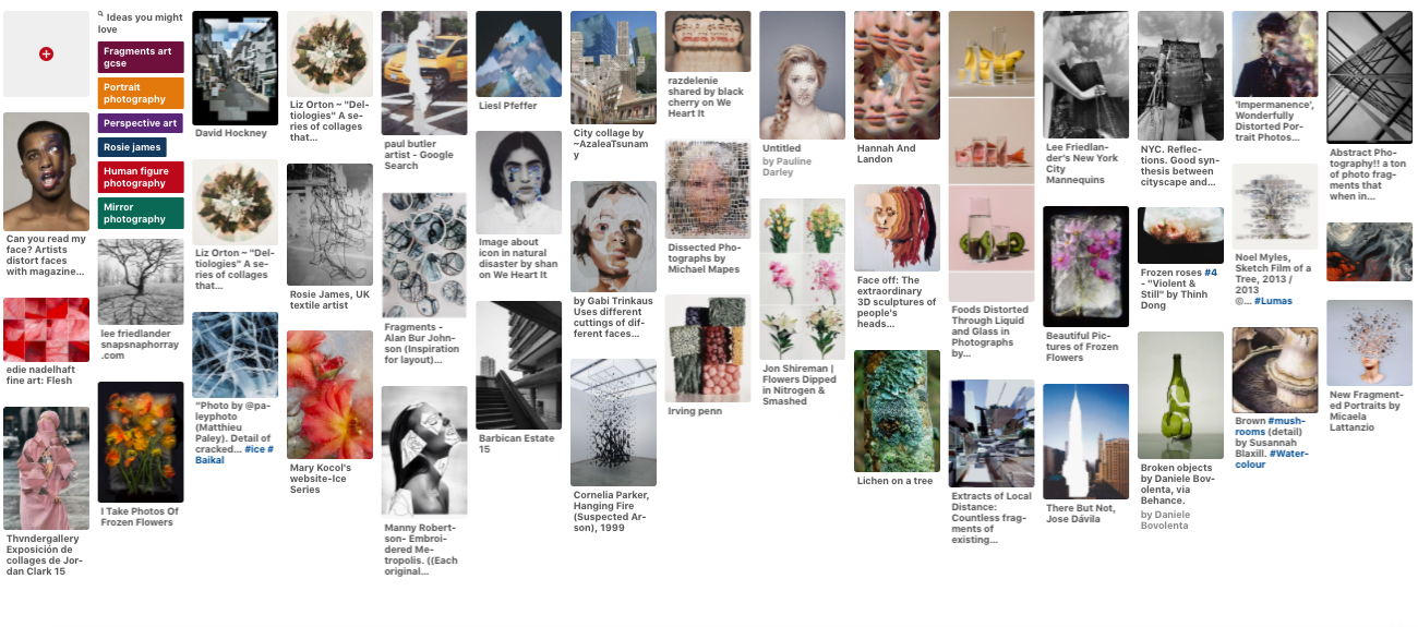
Fragments Homework
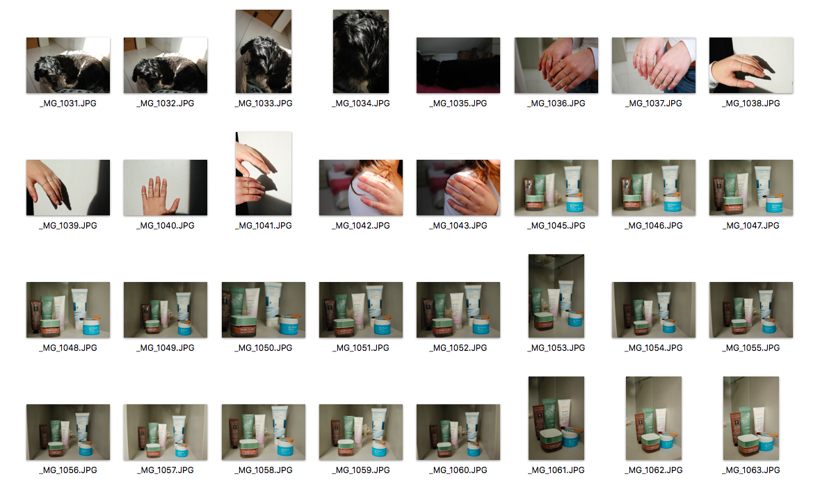
People
|
|
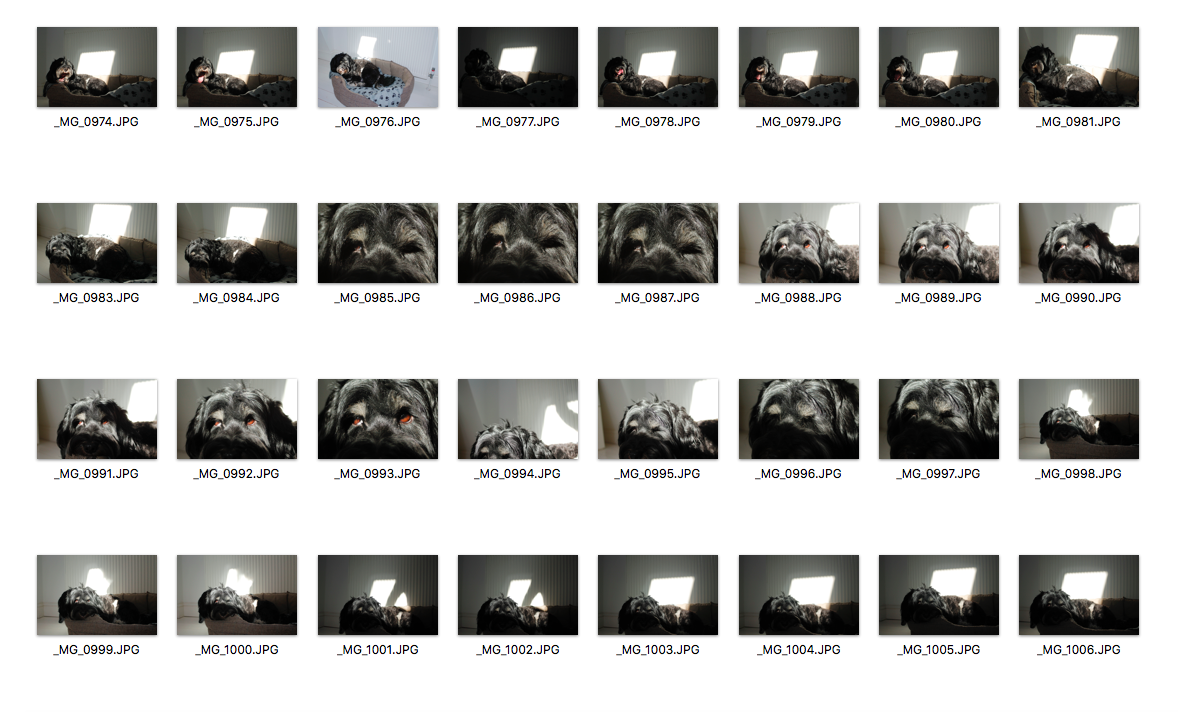
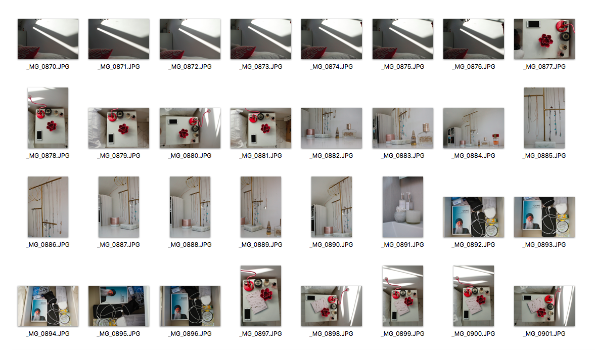
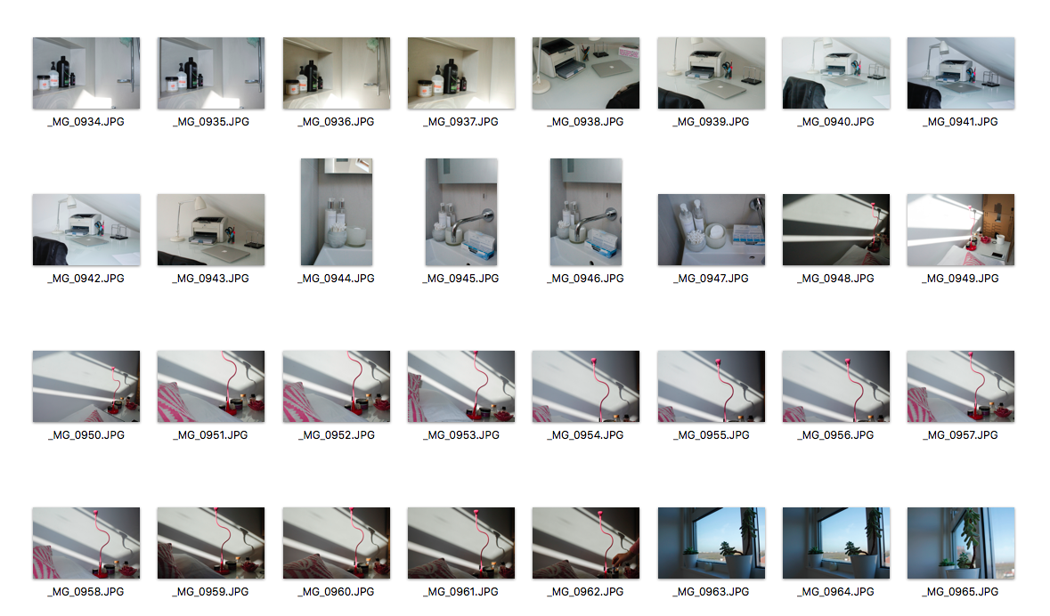
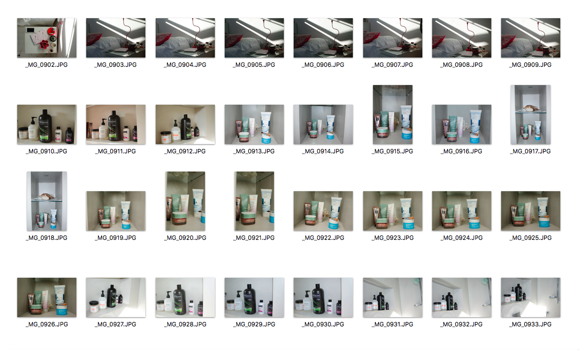
In this task, I was required to convey a story or information about a person. I had to create a series of photographs that focused on aspects of a person. Instead of taking an image of the person, I had to go beyond the obvious and look at ways I could tell a story about a person and their identity. I decided to represent my sister through objects that she owns in her room and I also chose to photograph things that I thought represented her, for example, I took a picture of her dog to show that she loves dogs and also I photographed some skincare that she owns to show that she is interested in those types of things.
I managed my exposure in all my images but I did use flash in one of my images which made it look quite harsh so I will not use flash next time. I also took photos that were appropriate to the task and they really convey information about my sister.
I managed my exposure in all my images but I did use flash in one of my images which made it look quite harsh so I will not use flash next time. I also took photos that were appropriate to the task and they really convey information about my sister.
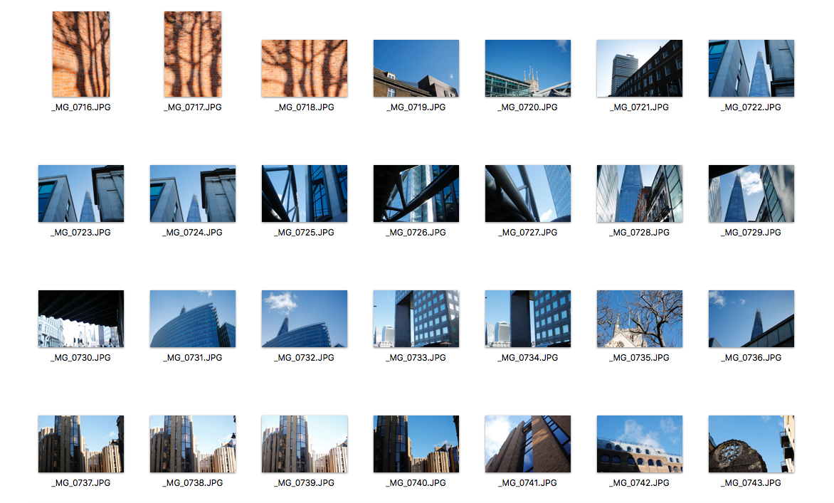
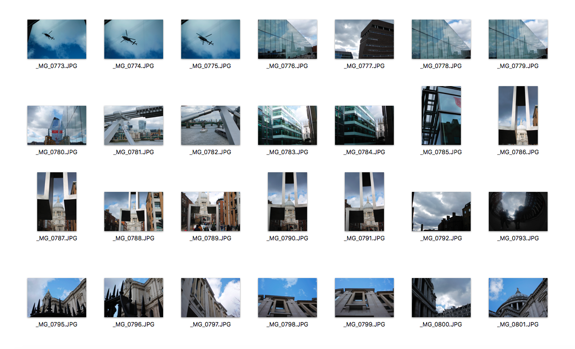
Environment
|
|
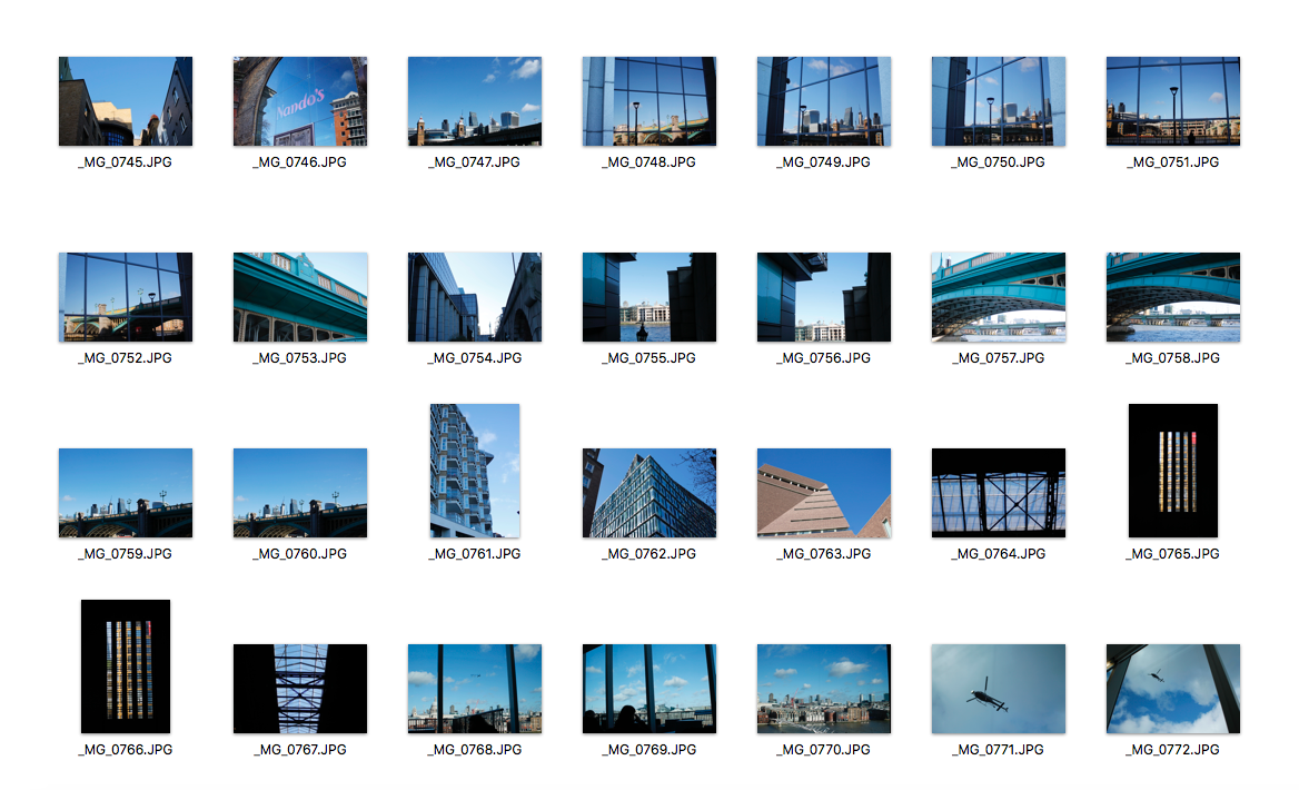
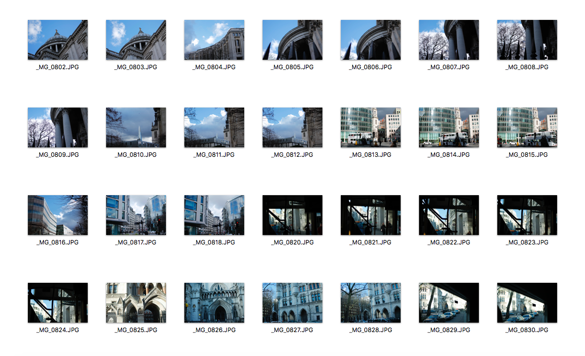
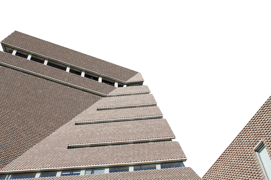
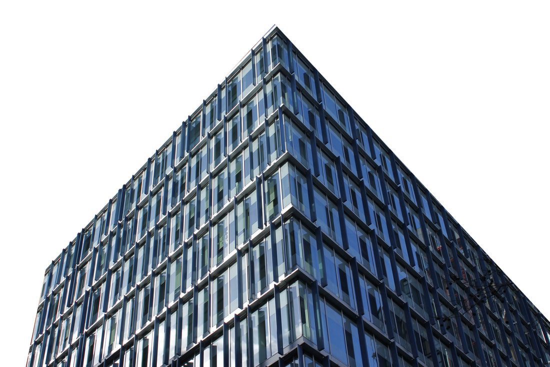
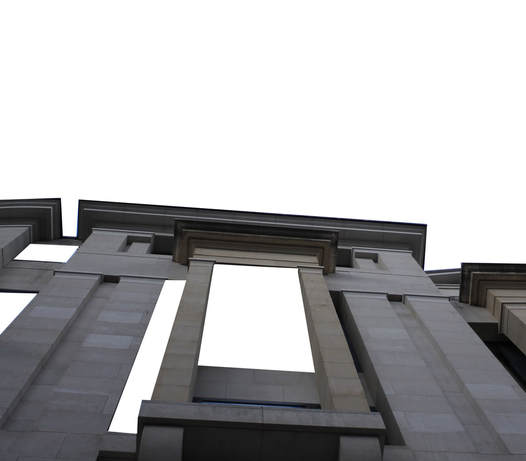
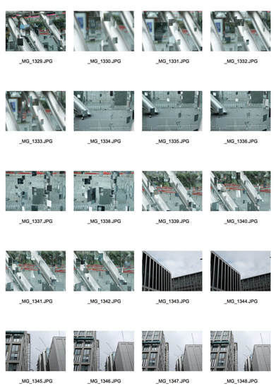
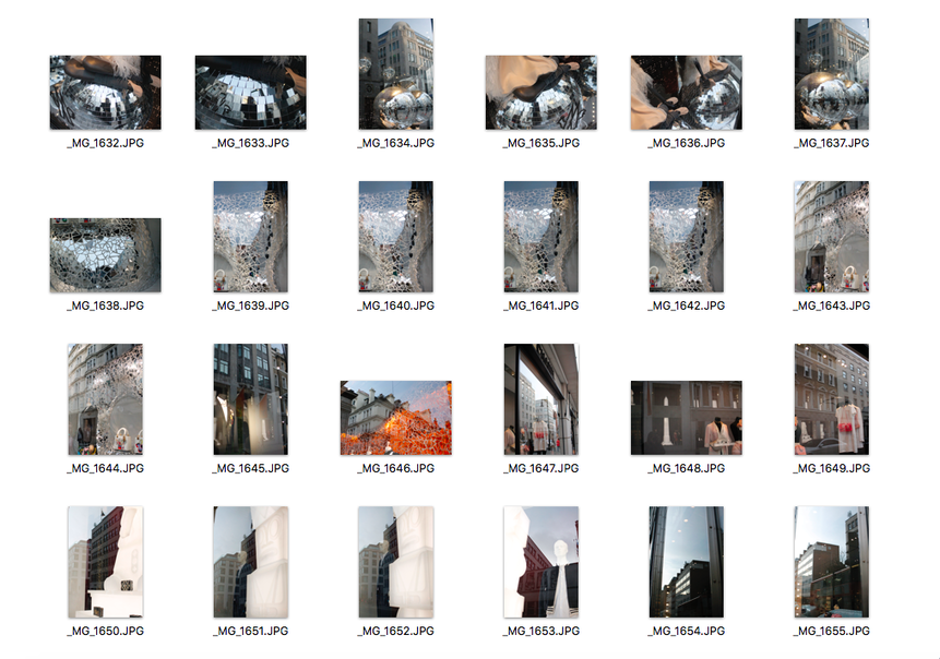
In this task, I was required to photograph fragments in the environment. This links to the theme as I am fragmenting parts of buildings by using other things in the environment to crop them. I decided to go to central London for this task as there are many tall and interesting buildings I could photograph. I managed my exposure very well in my images and my ISO was set on 200 as it was a very bright day. I also prioritised my shutter speed so that my images were not blurry. I prioritised my aperture in some of my images to manipulate depth of field. My images express my intentions which were to fragment buildings by using other things in the environment and composing them in an interesting way so that it looked like the buildings were being fragmented. A few of my images did not necessarily fit the brief as it didn't really fit with the theme of fragments as they were not really being fragmented by anything. However, I am proud with the outcome of them as I clearly thought about what I was photographing and I made sure I was taking them at the correct angles.
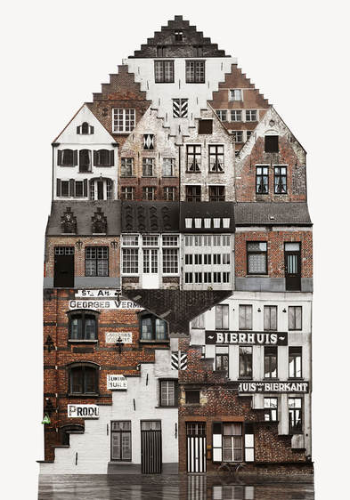
Anastasia Sarinova
|
Anastasia Sarinova's surreal composite structures piece together the essential fragments of a city. She found herself travelling through cities across different countries, looking closely at the architecture of the culture that inhabits them. She did this by using several images with dozens of associations into large-scale collages which are combined to create a architectural representation. She wanted us to consider not only a fictional architectural reality but also a mentality and way of life for the culture that they are related to. To create them, she walks around and goes to places popular among locals, looks into windows and tries to 'feel' the place. She takes photos even if the place doesn’t seem immediately distinctive at first sight. On her laptop, she assembles the fragments into her architecturally surreal images.
"I take pictures of buildings, look into windows sneakily, go to local shops, flea markets and bars, watch everyday life — all this helps to build the feeling of the place." - Anastasia Sarinova |
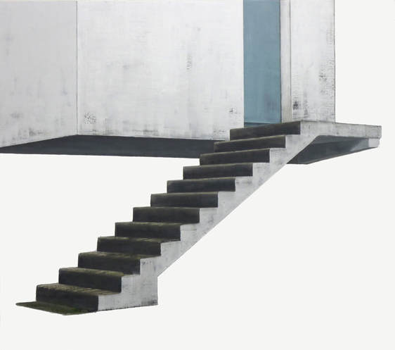
Patrick Cornillet
|
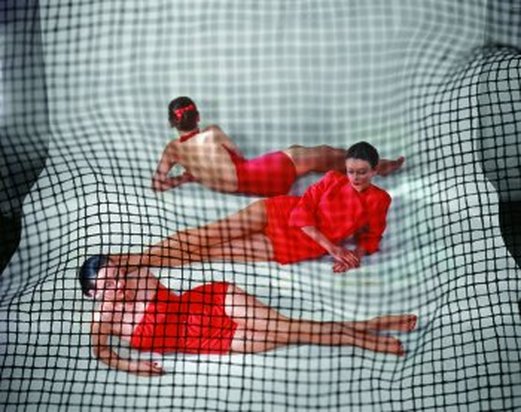
Patrick Cornillet's creates illusional images which leaves the viewer struggling as they do not know how to interpret these concrete structures. He does this by getting rid of the surroundings and just leaving these structures standing alone. For example, in this image above, we can see a concrete structure that has a stairway going up but we do not know what these stairs led up to which confuses the viewer and makes the image look quite 'naked'. Cornillet wanted us to consider the ruins of a fallen society, standing as naked as fragmented.
|
Photoshop
My Response
|
|
These are my 5 best images that were most appropriate for this task. I managed to do this task using photoshop and following the steps that I explained above in the slideshow. I really like how they look because firstly, the images are taken from a different perspective so they look more interesting, secondly, I managed to select the area I didn't want in the image very neatly. However, some of my images did not really fit the theme which made it harder for me to select areas I didn't want. Additionally, I realised that I had to actually erase parts of the building, not just the sky, so that's why I tried it again and erased some sections of building in the last image.
Objects
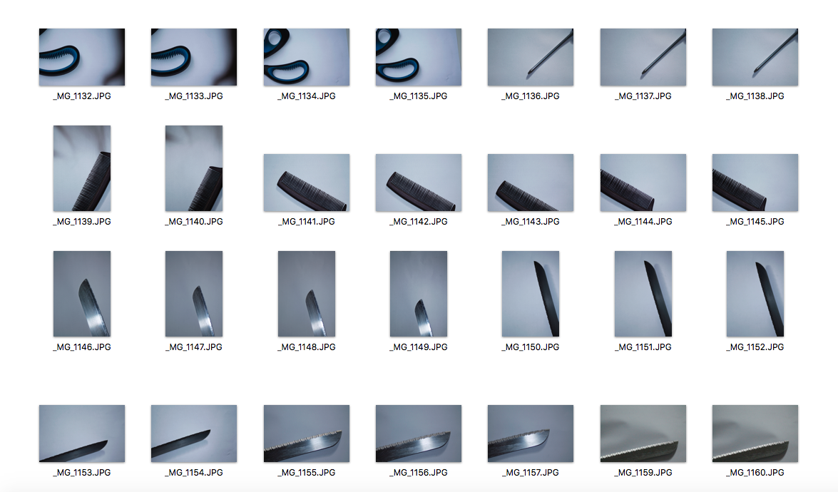
|
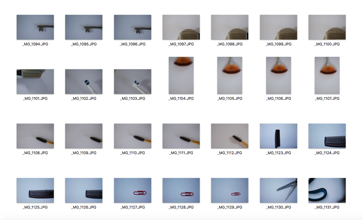
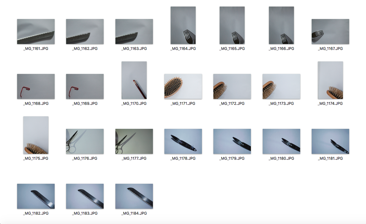
|
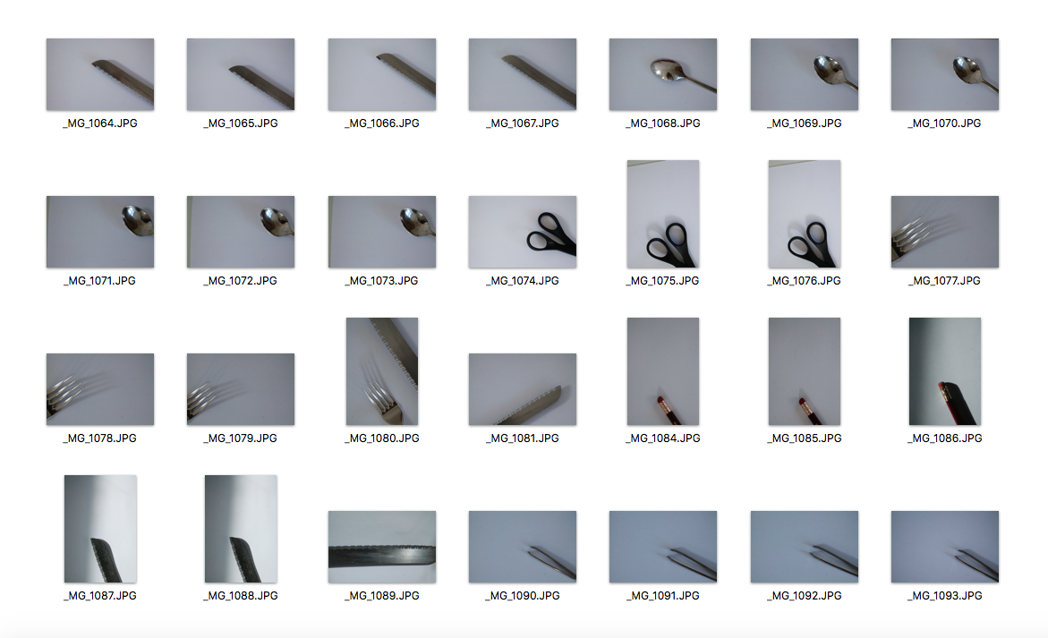
In this task I was required to photograph a series of close up images that show different perspectives of man made objects. I laid them out on a white piece of paper because I wanted the objects to be the main focus of the photograph and make them look isolated. I chose objects like a nail clipper, a knife, scissors, a comb, fork and brush. I took fragments of the objects instead of the whole object which related to the theme. My images were well exposed as the ISO was on an appropriate setting for the lighting I was in. I used flash for some of my images which I think looked quite effective as I then made them black and white which made the flash look less harsh. The black and white effect also makes the image looks more isolated which I thought looked effective.
Exhibition Visit: Andreas Gursky
On the 26th February, I visited an exhibition in the Hayward Gallery which explored the work of Andreas Gursky through photographs he has made over the past four decades. Visually, Gursky is drawn to large, anonymous, man-made spaces—high-rise facades at night, office lobbies and stock exchanges. Gursky makes photographs that are not just depictions of places or situations, but reflections on the nature of image-making and the limits of human perception.
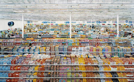
99 Cent, 1999
|
Gursky subtly enhances and adjusts the structure of his photographs, enabling viewers to assimilate and consume more than possible with our eyes alone. 99 cent is a clear example of Gursky’s alteration of an image for a totalizing effect. Modifications such as the arrangement of the store’s product aisles and the addition of a mirrored roof flatten the iconic work. The spectacle of consumerism appears composed in an organized, rigorous, formal fashion. The presented image is hyperreal. While it is rooted in reality, it is somehow more than real; it is familiar and yet there is no physical space quite like it.
|
|
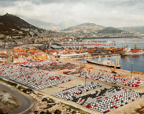
Salerno, 1990
|
In 1990, Gursky was driving with his family, sightseeing in and around Naples. Late in the afternoon, he came across the view over the harbour of Salerno. The sun was setting over the city so he said he had to really hurry. He set up his tripod and his 4x5 inch camera, then took four frames. Gursky was overwhelmed by what he saw: the complexity of the image, the accumulation of goods, the cars, the containers. He hadn't been sure the photograph would work, he just felt compelled, it was pure intuition. Only when he got back home and put together the first contact sheet did he realised what he had. He immediately saw the pattern, the pictorial density, that industrial aesthetic. This image became a turning point for Gursky, it opened up a new sense of possibility, stylistically and thematically. He tried photographing other ports, but he realised that it wasn't what had made the Salerno image work. It was the balance between great scale and a huge amount of sharp detail. |
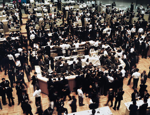
Tokyo, Stock Exchange, 1990
|
Gursky’s large-scale photographs of mass gatherings demonstrate a keen eye for patterns of social order and disarray. He used a slow shutter speed which was probably used to portray the chaotic environment. Also, the moving figures really helps the viewer imagine the madness that was going on in the image. Gursky is not interested in a particular place, he tries to convey what it says about the world today. There is no central focus or narrative, instead, the eye is invited to wander and explore the scenes of simultaneous interaction.
|
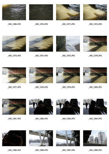
South Bank
|
|
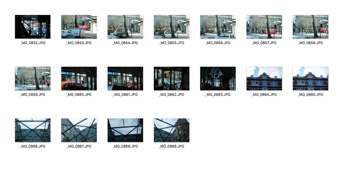
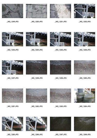
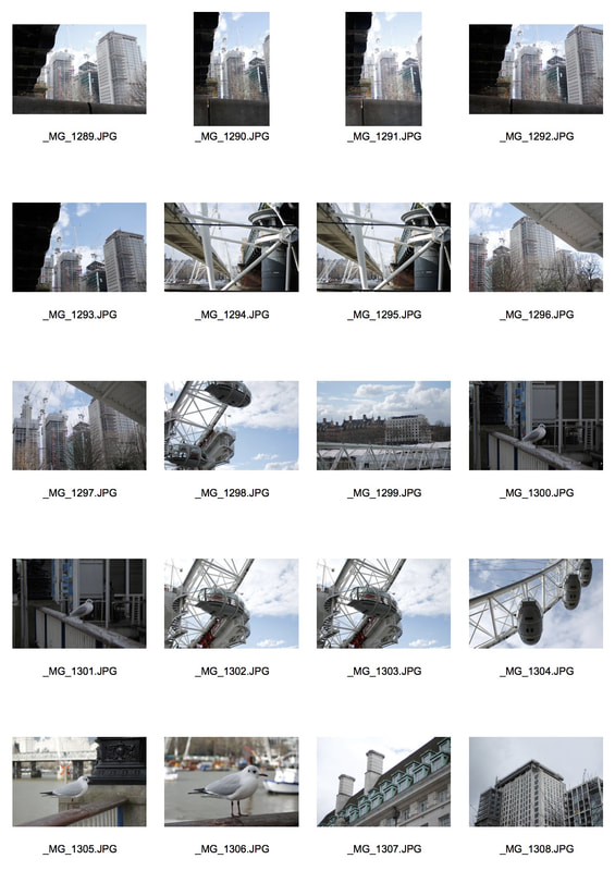
After the exhibition, we walked around South Bank and took more images in the environment that related to the theme of fragments. In some of my images I used other objects in the environment to fragment bits of the city, but in other images I found actual things in the city that were already fragmented, for example, the cracks in the pavement. I edited them into black and white which I prefer as you can also see the contrast within the image.
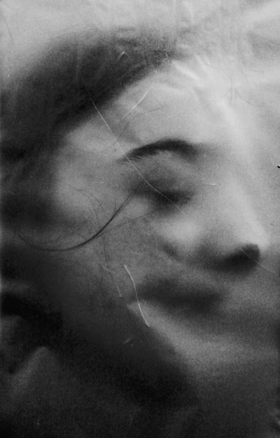
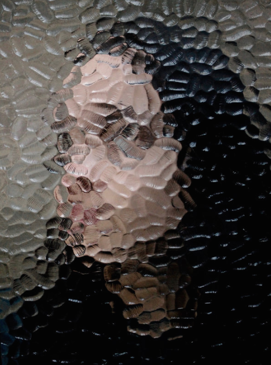
Fragments of Portraits
Erwin Blumenfield
|
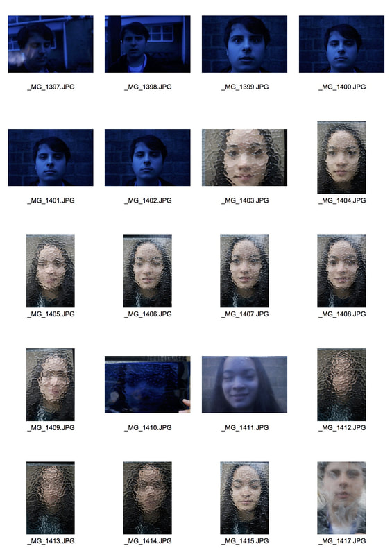
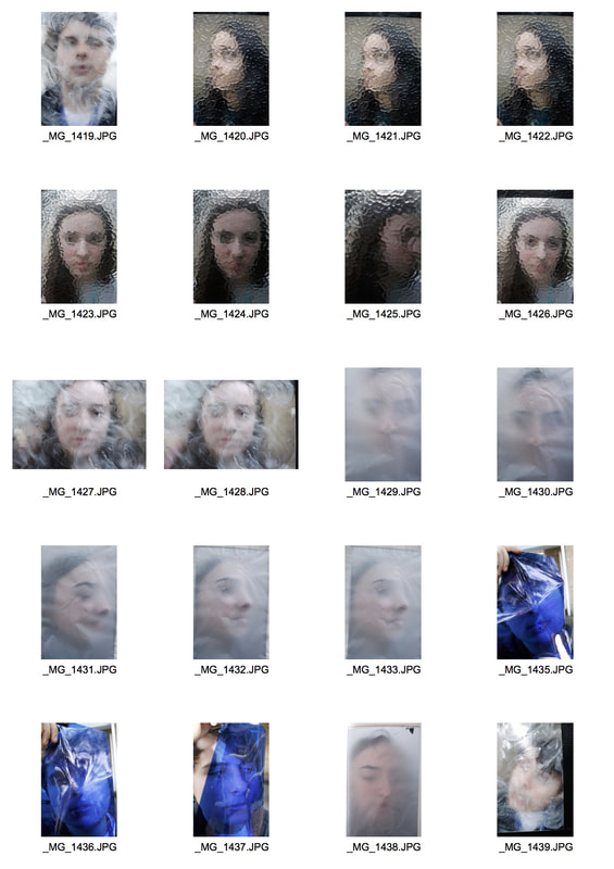
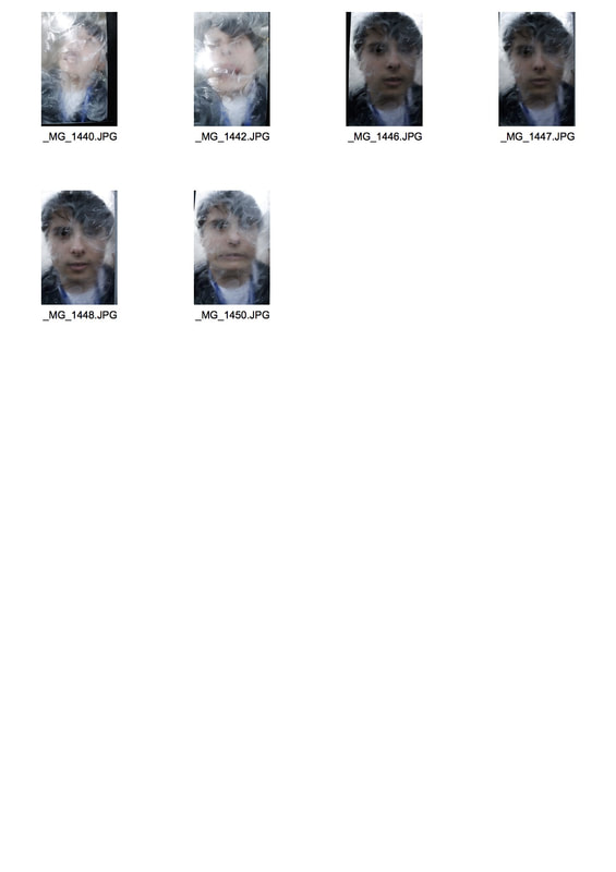
Erwin Blumenfield was a German artist and photographer, he was regarded as one of the most influential photographers of the twentieth century. An experimenter and innovator, he produced an extensive body of work throughout his thirty-five year career including black and white portraits and nudes, celebrity portraiture, advertising campaigns and his renowned fashion photography. In these images he uses colour and glass to distort his images.
|
|
|
|
|
|
In this task I was required to take portraits of people but fragment them using different types of material. This relates to the theme as we are using other objects to fragment a portrait. I photographed in natural light as I didn't want to use flash. I used objects like tracing paper and distorted glass to fragment the people I was photographing. I managed my exposure well. My ISO was set on 400. I also prioritised my shutter speed to capture a frozen moment as I didn't want my images to be blurry. I also used a tripod to avoid camera shake.
STRAND 1
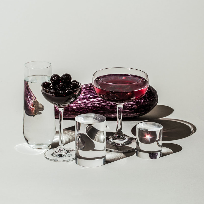
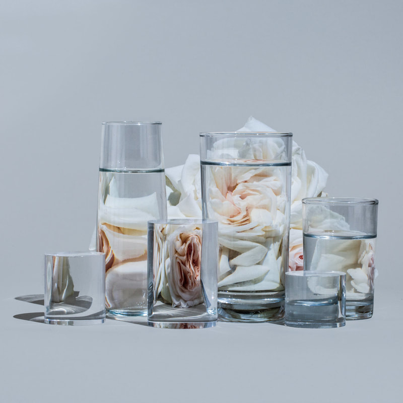
Suzanne Saroff
|
|
Transforming singular objects into distorted visions of themselves, photographer Suzanne Saroff creates fractured images of common foods and plants as seen through glasses filled with water. The series, titled ‘Perspective’, places everyday items like fruit, flowers and fish behind different vessels of liquid as well as with an interplay of light and shadow.
For this strand I am going to buy fruits and vegetables and also different coloured pieces of card for the background. I am also going to use different sized cups so that there is some variation in my images.
For this strand I am going to buy fruits and vegetables and also different coloured pieces of card for the background. I am also going to use different sized cups so that there is some variation in my images.
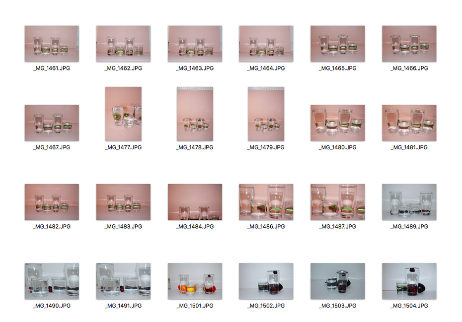
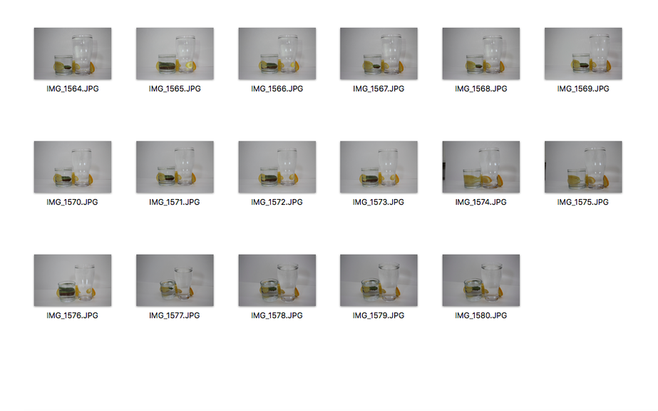
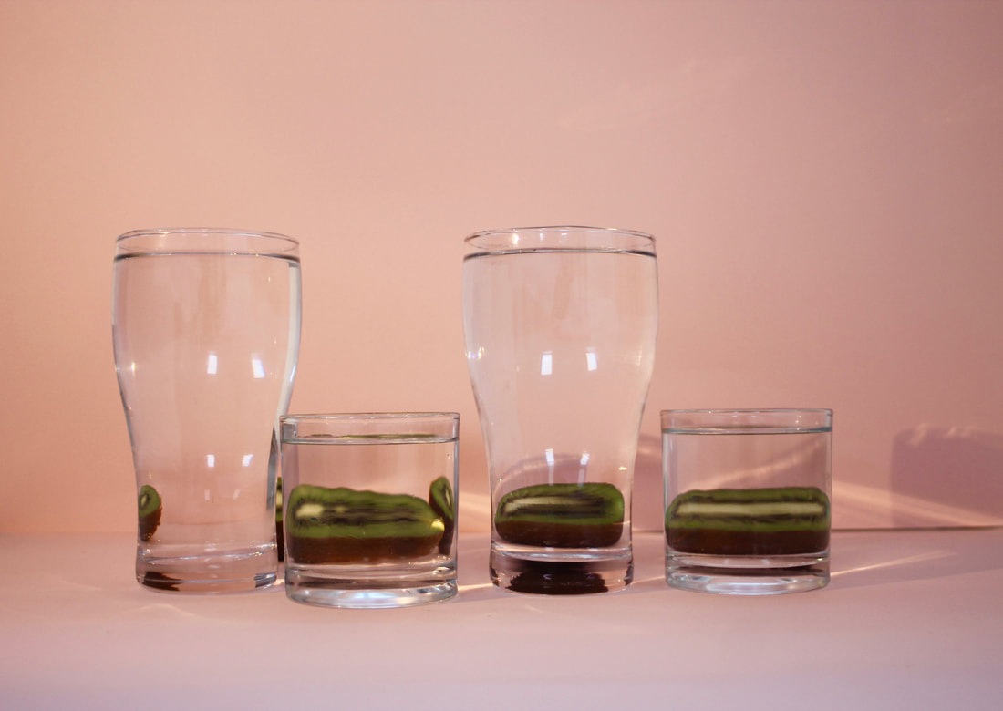
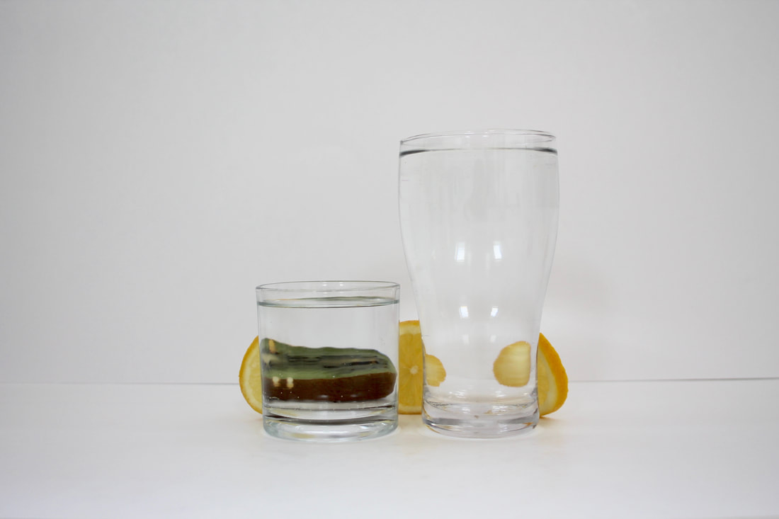
For this strand, I bought many different fruits and vegetables and placed different coloured card on the floor to create a plain background for the images. I used coloured card that would match the colours of the fruits and vegetables. Also, I chose to use pastel colours because I didn't want the main focus to be the background. I got two different sized glasses and filled them with water which distorted the fruits and vegetables behind. I like how my images turned out but it was quite difficult to get the right lighting. I tried putting a lamp above but it made the images look quite yellow, so I tried flash which made the images look quite harsh. I won't choose this as my favourite strand because I think I would be quite limited with the ways that I could develop it.
STRAND 2
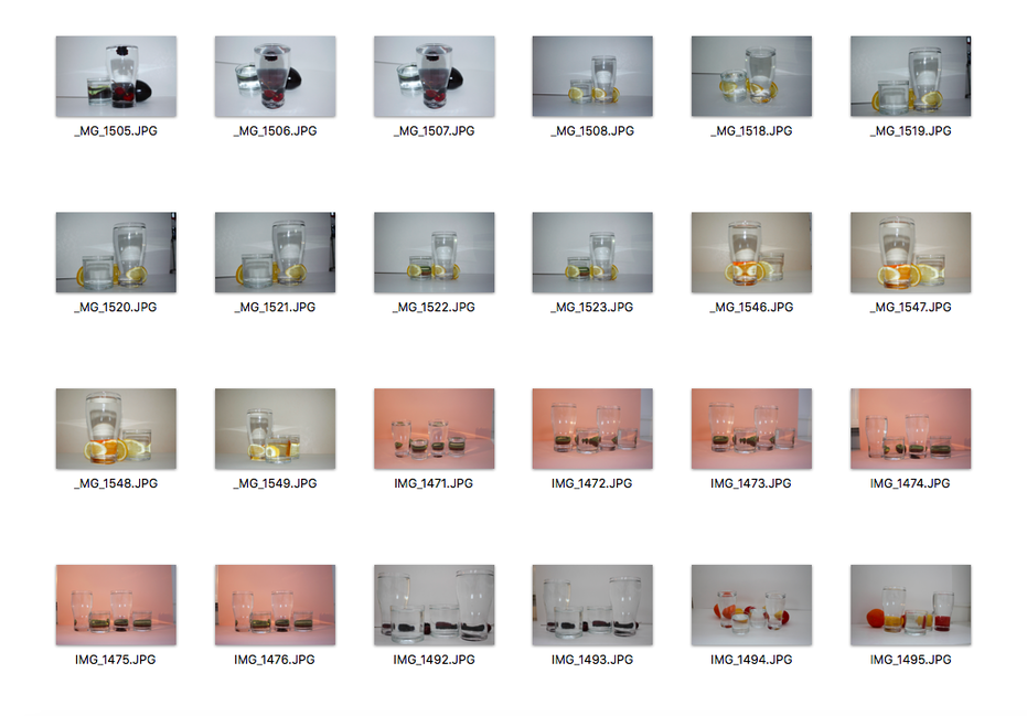
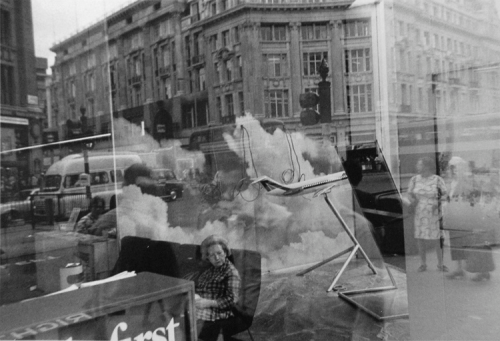
Lee Friedlander
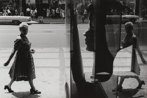
|
|
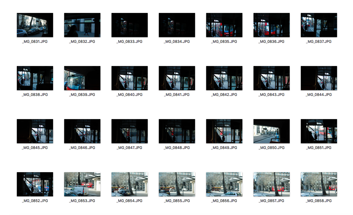
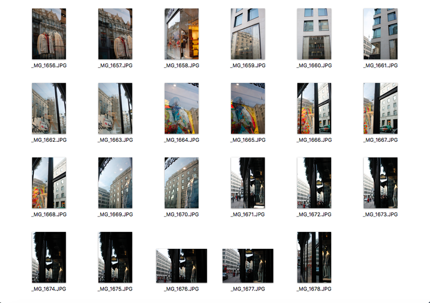
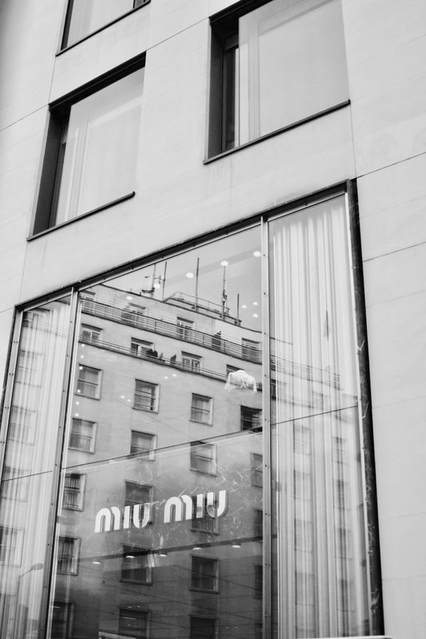
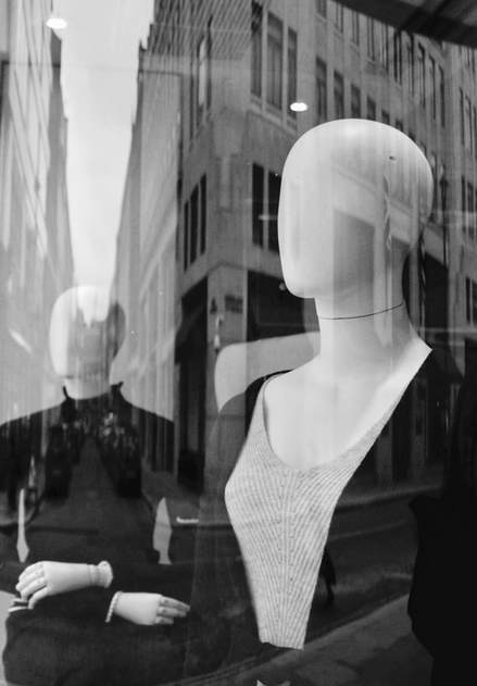
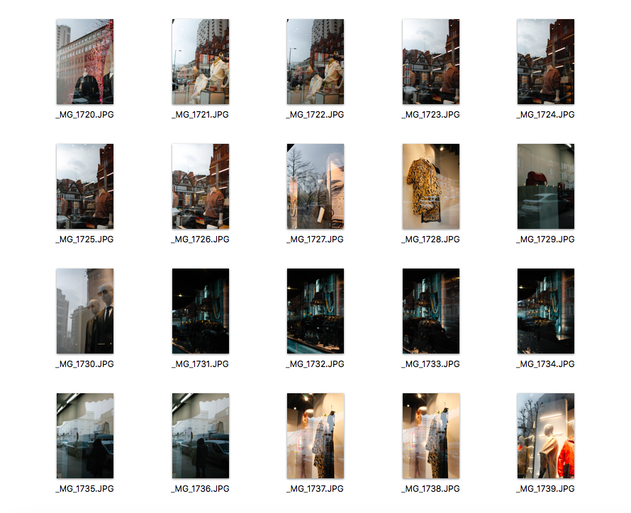
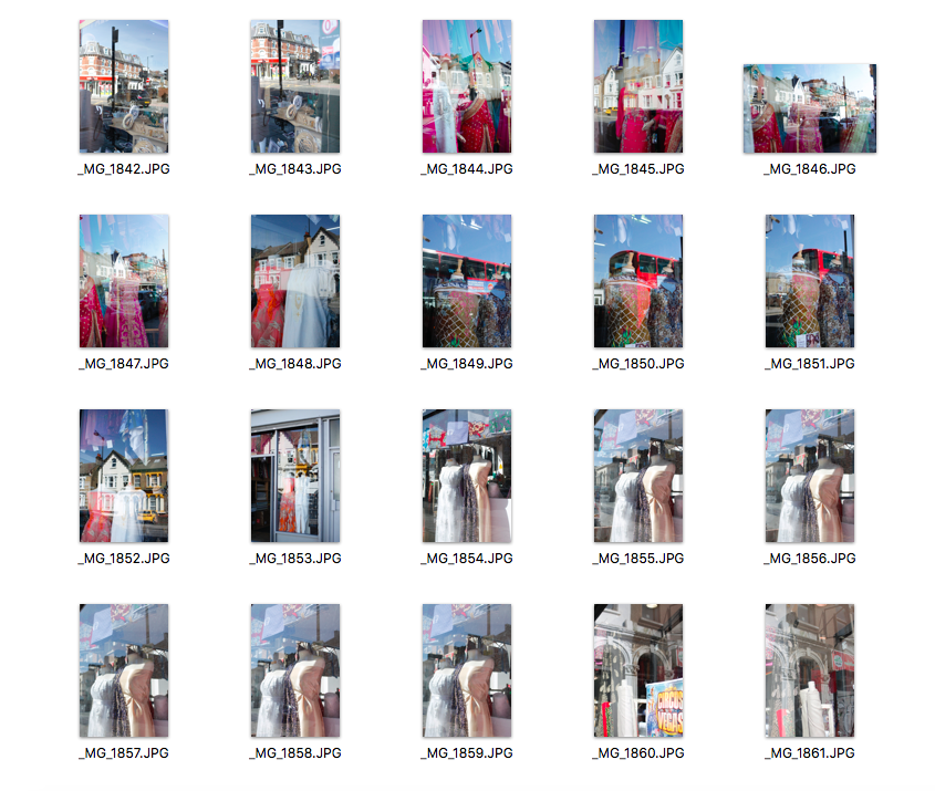
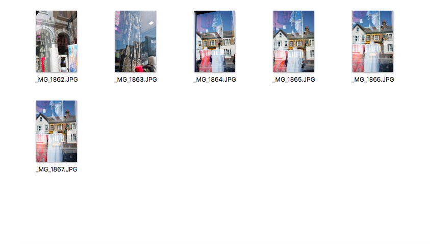
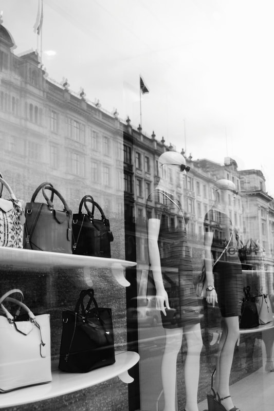
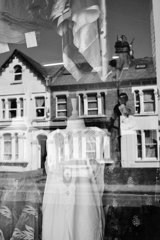
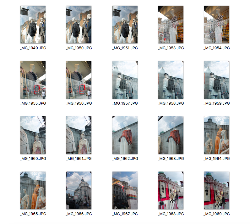
Friedlander was born in 1934 and was known for taking pictures of the social landscape. He also took pictures of many other things from nudes to monuments but one of the things that sort of defined his style for most of his career was reflections. He loved to take pictures of people reflecting in the windows of street stores or viewed through the window. He loved the play of images superimposing each other. He worked exclusively with black and white film, and organised his pictures in series, which he developed over the course of several decades. He used a Leica 35mm or a Hasselblad Superwide – two cameras that could easily be carried and pass undetected by the people on the street. He plays with shadows, angles and obstacles which he uses to frame elements and structure his compositions. Using Lee Friedlander as inspiration, I am going to go to central London and photograph reflections through shop windows.
First Development
Best Images
|
|
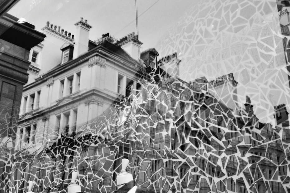
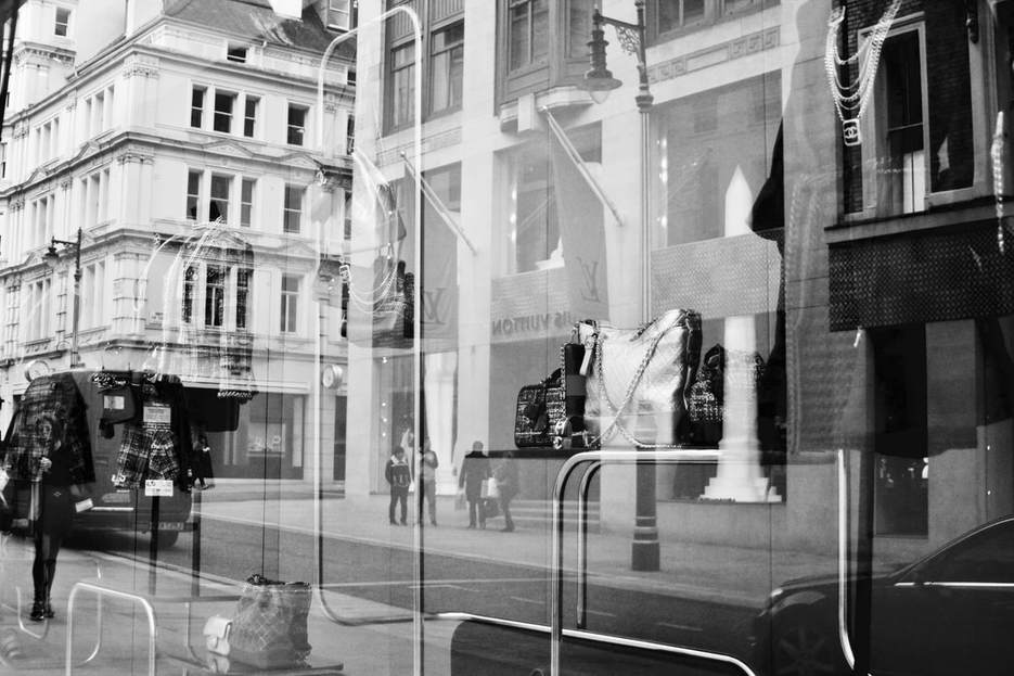
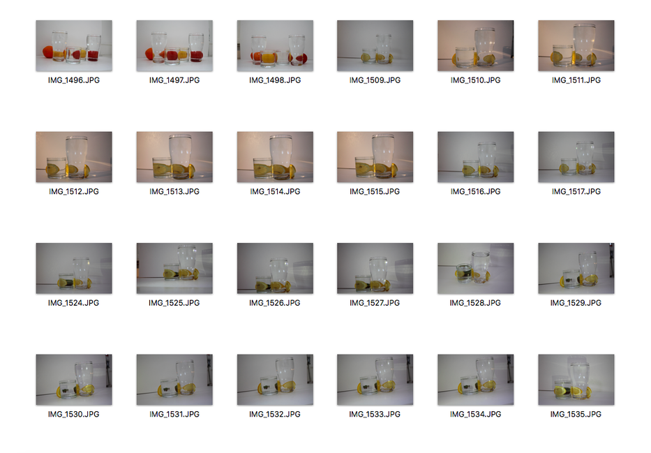
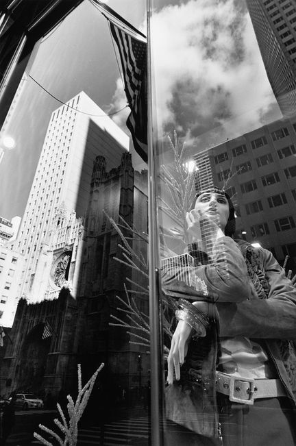
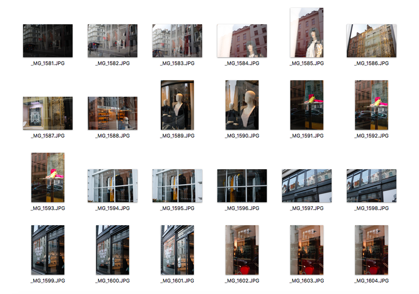
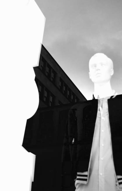
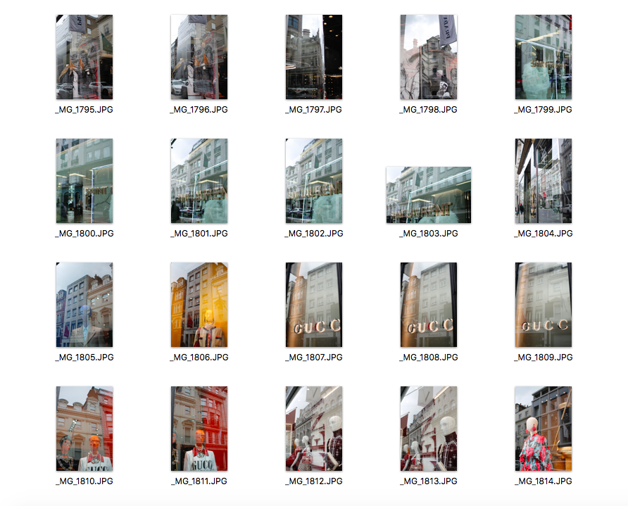
For this strand, I decided to go to Mayfair where there are lots of high-end fashion brands and big shop windows that I thought could be very interesting to photograph. My intention was to respond to Lee Friedlander's images of reflections but I didn't want to just photograph reflections, I wanted to focus on shop windows. Also, I thought that having a message behind each photograph would be much more fascinating and engaging so I decided to focus on reflections through the shops of well-known brands like Gucci, Saint Laurent, Louis Vuitton etc. I decided to focus on these high-end brands because I wanted to explore the idea of materialism and consumerism later on in my development of this strand. I am very pleased with my images as I managed my ISO well (800). I also really like how I experimented with the reflections and used different angles to capture the right reflection. I also edited some of my images into black and white which was quite similar to Lee Friedlander's.
Second Development
Victor Burgin
Over the past thirty years Victor Burgin’s work has established him as both a highly influential artist and a renowned theorist of the still and moving image. In the 1970s his work consisted mainly of large framed photographic sequences, involving printed texts either juxtaposed with or superimposed on the image. At the beginning of the 1990s he turned towards digital video, but video from the point-of-view of photography- for example, Burgin is particularly interested in the relation between stasis and movement.
After photographing and trying my second strand, I wanted to develop it and look deeper into the idea of consumerism and materialism. I decided to research a bit on these topics and I found the photographer Victor Burgin. He photographs people working in labour and he inserts texts that juxtapose the image. The image taken shows the reality of what is going on which people don't think about while they are buying items.
I am thinking of doing almost a similar thing to Burgin, but instead of photographing people working in labour, I am goint to take images of well-known high fashion brands and insert texts which will portray the ideas of materialism and consumerism; that us humans, are convinced that we can buy our way to happiness, that wealth is the path to permanent fulfilment and well-being. We still measure ‘success' in terms of the quality and price of the material goods we can buy, or in the size of our salaries. From a very young age we are being bombarded with glorification and celebration of the rich and famous in movies, advertisements, billboards, media, and so on. We are taught that being a success in this world means being rich, famous, handsome, and admired by the masses. This weekend, I am going to go to central London and photograph more well-known fashion brands and then edit them and insert text.
Barbara Kruger
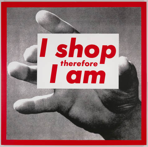
|
Another photographer that I did research on is Barbara Kruger. She is best known for her silkscreen prints where she places a direct and concise caption across the surface of a found photograph. Within a short message or statement, she synthesises a critique about society, the economy, politics, gender and culture. She catches the viewer's attention by using unexpected phrases and instead of selling a product, her works aim to sell an idea to the viewer.
Barbara Kruger and Victor Burgin have inspired me to try and add text to my images. I think by adding text I am sending a message out to the viewer and really making them think about the issue I want to portray. |
|
|
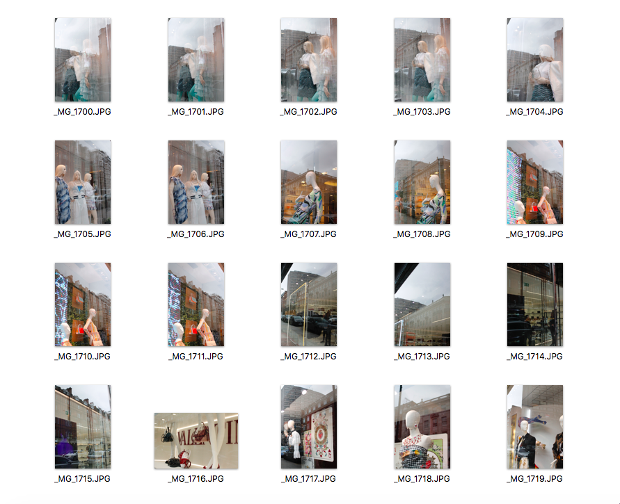
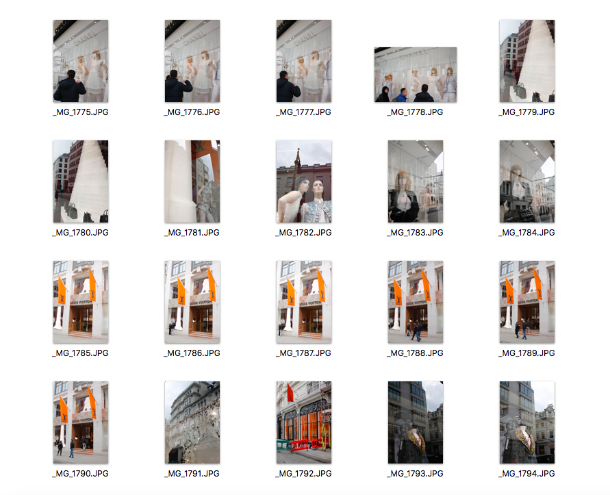
I went to Sloane Square to photograph more high-end fashion shops, and I am not very pleased with the pictures I took. The weather conditions were not right and I went too late which made the pictures quite dark. I am going to make sure that next time I go out to photograph, it is during the day where there is the most light. Additionally, the shops that were in Sloane Square didn't have very large shop windows which made it hard to capture reflection. I am going to go again to photograph more expensive shop windows and I am going to go at a good time so that there is a lot of light. When I am pleased with my reflection images I am going to try and add text like I explained before.
|
|
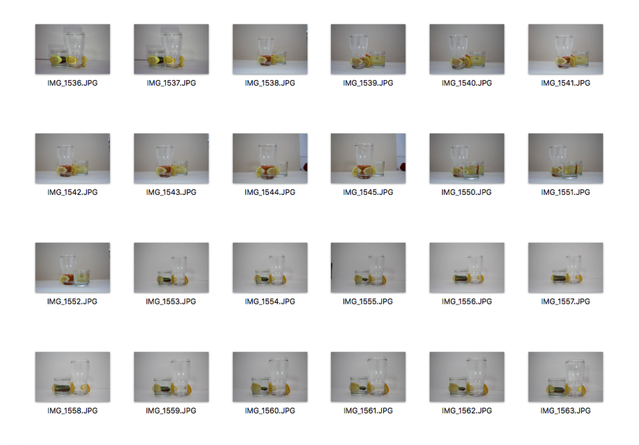
Best Images
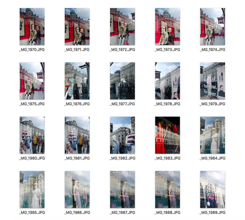
I went to Oxford Street to photograph more high end shops as I didn't like the ones I took in Sloane Square. Even though I have photographed high end shops previously, I wanted to go again to explore more shops and more interesting reflections. I feel like it might be becoming too repetitive but I really like the images I have photographed and I am looking at reflections in a different way compared to when I first started. I am going to add text to these images like I described before and see how they turn out.
Images in response to Victor Burgin and Barbara Kruger
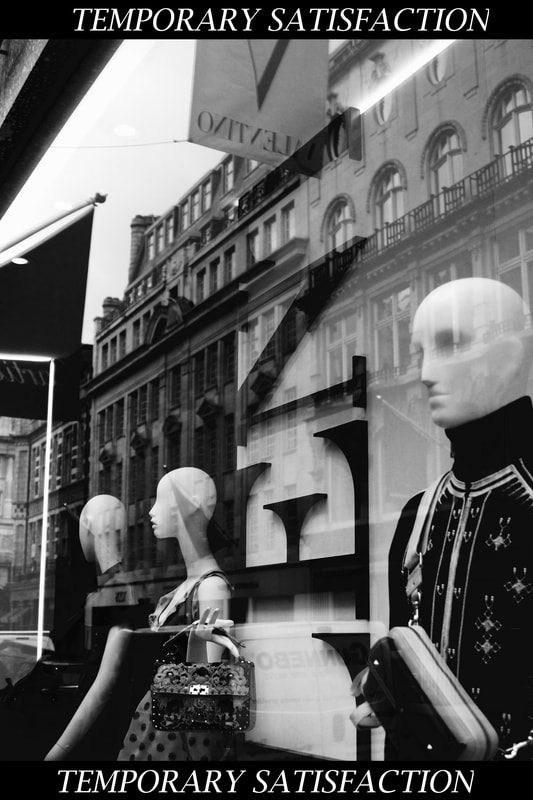
This is my response to Victor Burgin and Barbara Kruger's work. I decided to use a short phrase like Kruger as it is much more easier for the viewer to read and it says a lot even though it's only two words. I decided to use the phrase: "Temporary satisfaction" as this conveys the idea that being materialistic only gives you temporary happiness. I don't know if I want to carry on adding small phrases as I feel like it could be quite boring. For my next development I am thinking of using my most recent high-end shops pictures and placing them next to new images I am going to take of more low-end shops. By putting them next to each other to, it will really emphasise the difference between the two.
Third Development
|
|
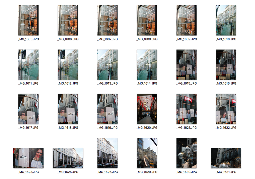
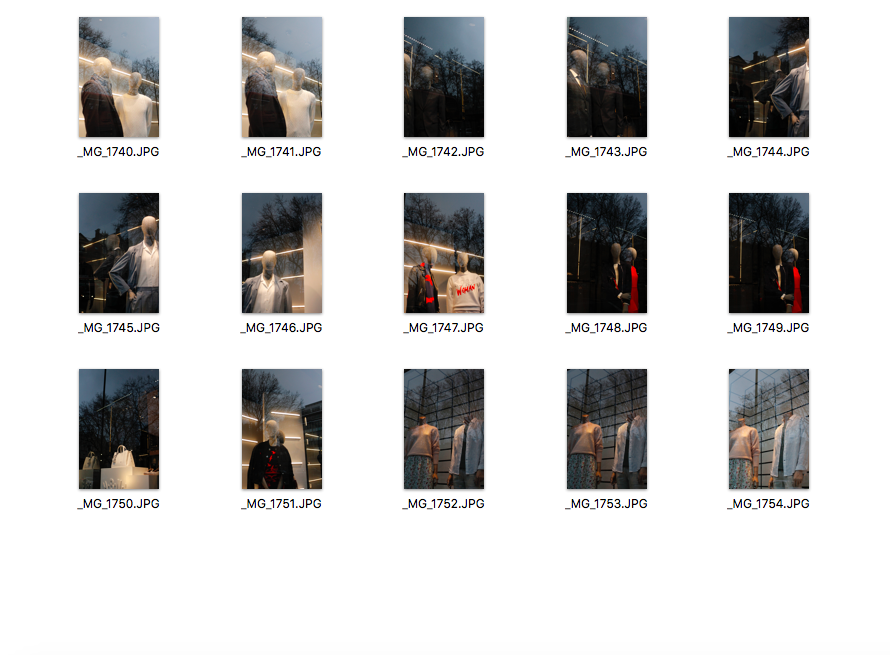
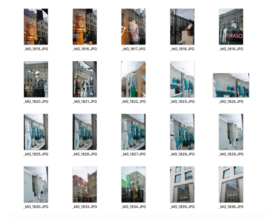
I went to Green Lanes to photograph less high-end shops to show the contrast between the more affluent and less upscale shops while still paying attention to the reflections. I noticed that the photographs I took not only succeeded in showing the type of shop, but also succeeded in showing the type of area they are in. For example, in one of my images, you can see the reflection of people's houses whereas in the more affluent, well-known shops, all the reflections are of very luxurious, elegant buildings.
In these images, I used an ISO of 600 but my pictures were not very clear as the camera was shaking and also I think I was standing too close to the show windows which meant not much of the shop was actually showing. Furthermore, even though I attempted to try this idea, I do not want to carry on with it as I don't think the difference between the two is very clear.
In these images, I used an ISO of 600 but my pictures were not very clear as the camera was shaking and also I think I was standing too close to the show windows which meant not much of the shop was actually showing. Furthermore, even though I attempted to try this idea, I do not want to carry on with it as I don't think the difference between the two is very clear.
Fourth Development
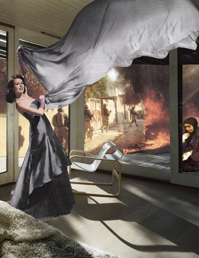
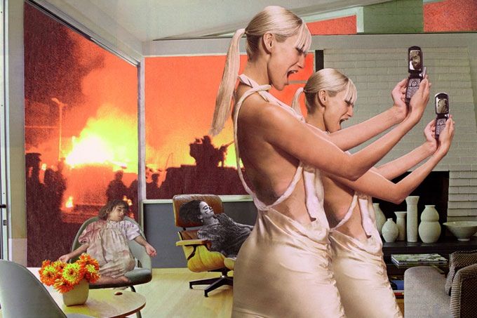
Martha Rosler
|
|
Martha Rosler is an influential artist, theorist and educator. Rosler’s work includes photography, video, installation, photomontage and performance. She has also published over fifteen books of her works and essays exploring the role of photography and art, public space, transportation, as well as public housing and homelessness. Rosler has produced a now well-known set of photomontages, in which she collages magazine photography with depictions of ideal homes, producing contrasting frames as a way of highlighting the false disconnection between these two public discourses.
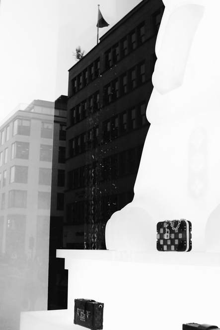
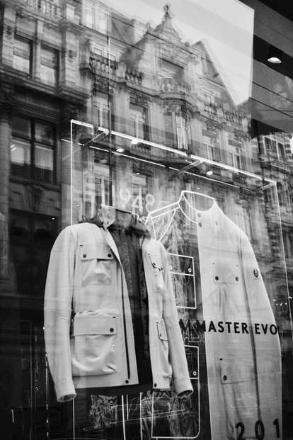
Using Martha Rosler as inspiration, I am going to go back to my high-end shop photographs and take photos of current issues in London. I will photograph headlines in newspapers. I will then combine them together on photoshop to show the difference between people's materialistic desires and what is actually going on in the world. I am sort of going back to the idea of adding captions to my images but instead of writing them myself, I am going to use headlines from newspapers.
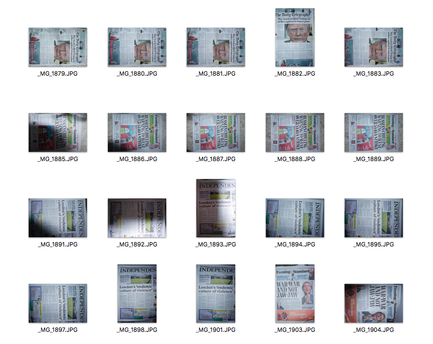
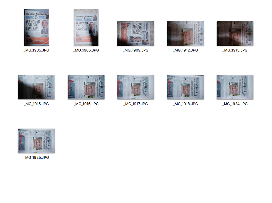
I got newspapers that had headlines which I thought would work with my images and dealt with current issues in the world and photographed them.
1. I opened my window shop reflection picture
2. I opened my image of the newspaper
3. I cropped the newspaper image and selected the section I wanted
4. And then I copied that image onto my reflection image
5. I changed the opacity so that you could still see the reflection image but also the newspaper and its headline.
6. I also erased some areas to make it fade so that it looked like it was part of the image.
I edited the two images together and then I realised that some of the headlines were not to do with London even though they were current issues in the world so next time I am going to make sure the headlines are relevant to London.
First Try
|
|
|
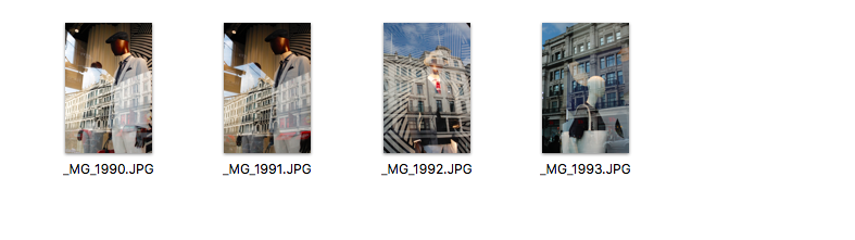
These are my first 3 images that I edited headlines on. I also searched news articles online as I only had one newspaper article that I photographed that related to news in London. I screenshotted the articles and photoshopped them on my images. I like the image that has the newspaper article which I photographed but I do not really like the other two as firstly, I did not fade them into my images properly and also I should have just used the headline instead of screenshotting the whole online article. I prefer photographing articles from newspapers instead of the ones online. For my further development, I am going to just use headlines instead of the whole article and I am going to make sure I fade it into the image well as I want it to look like it is part of the image.
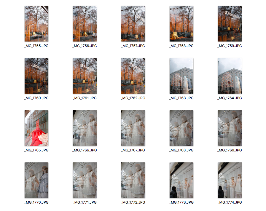
I went out again and photographed more shop windows for my final piece. It was a very bright day so I had to manage the exposure well as I didn't want my images to be over exposed.
How I edit my images into black and white
|
|
I used the photo app to edit my images into black and white. Firstly, I opened my image and I pressed the edit button (shown above). Then I selected the filter tool and selected the black and white effect. Also, I then selected the 'Adjust' tool to edit the brightness, contrast etc. |
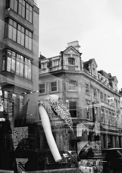
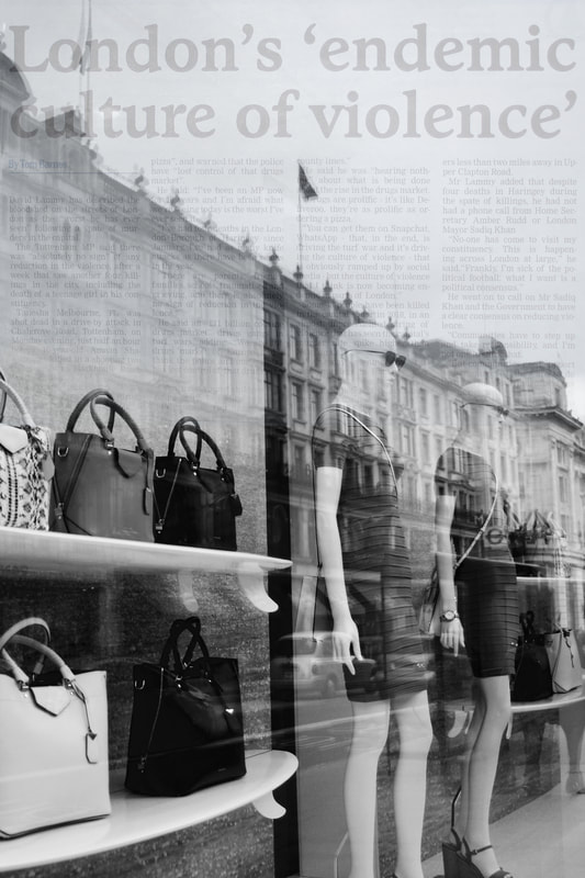
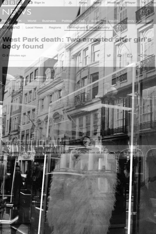
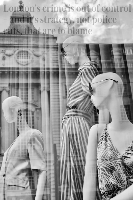
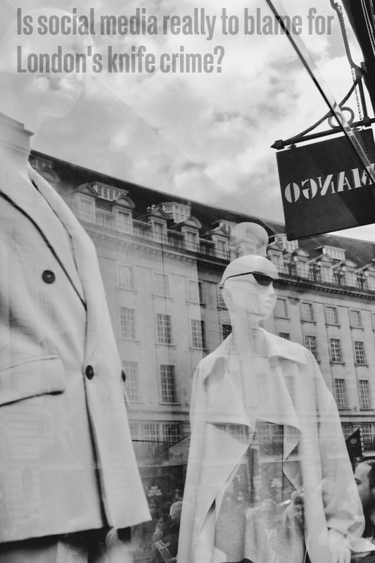
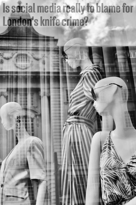
Second Try
|
|
|
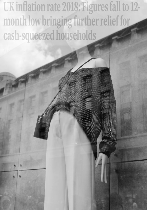
This is my second attempt editing headlines on top of my images of shop windows. I used just the headlines and faded them into my images well. Like I said before, I think they show the contrast between people's materialistic desires and what is really happening in the world that people may not always consider while they are so engrossed in buying things that they do not really need. I think having these headlines on the these images reminds the viewer that buying products that are seen as 'necessities' is far less important than issues that are currently happening.
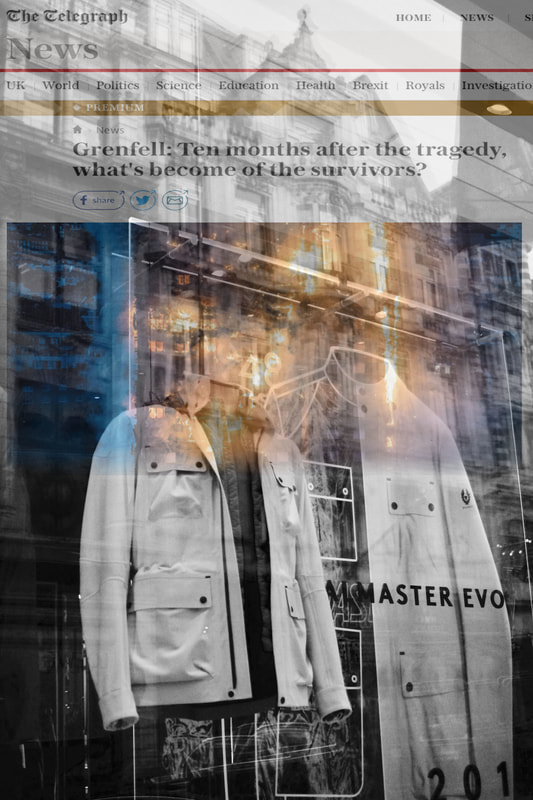
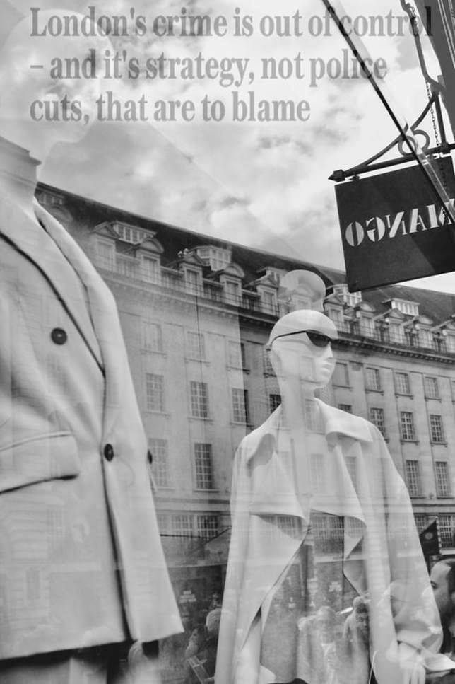
For my final piece, I made sure that the headlines were faded onto the image well so that it looked like it was part of the image. I also adjusted the contrast and brightness a bit to make them look even better. I am very proud with the final outcome as I have developed it a lot and used more than one photographer for inspiration but I especially like how I made it into my own unique idea and didn't do exactly the same thing as the photographers.
For my final piece, I made sure that the headlines were faded onto the image well so that it looked like it was part of the image. I also adjusted the contrast and brightness a bit to make them look even better. I am very proud with the final outcome as I have developed it a lot and used more than one photographer for inspiration but I especially like how I made it into my own unique idea and didn't do exactly the same thing as the photographers.
Final Piece
|
|
