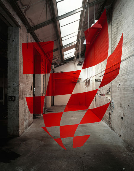
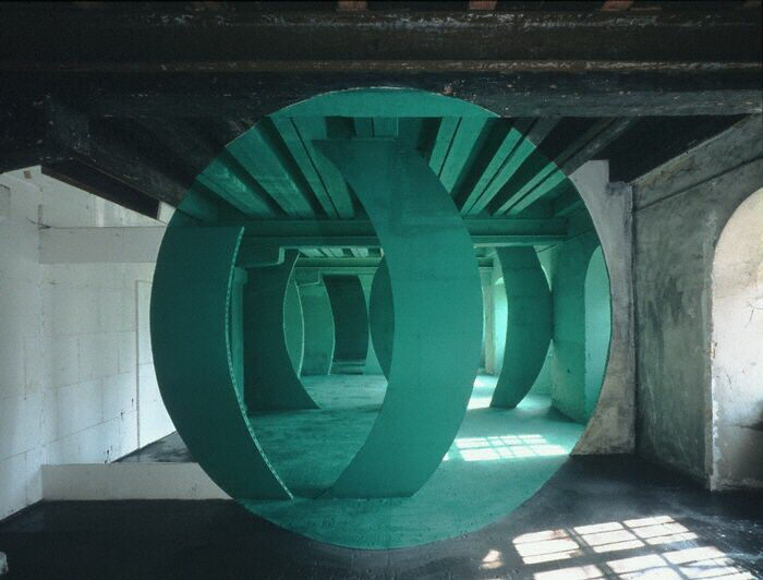
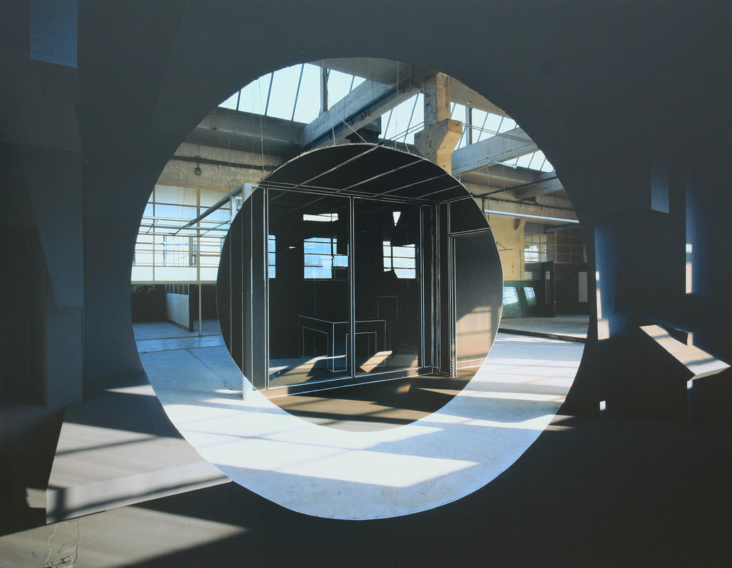
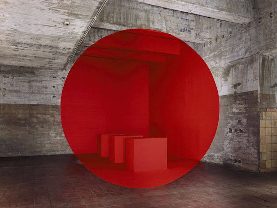
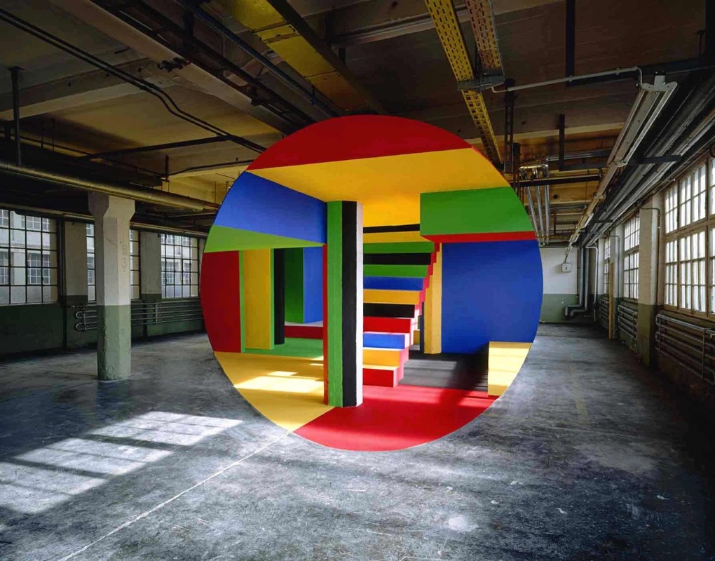
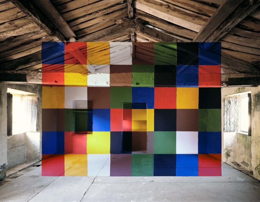
Georges Rousse
When he was 9 years old, Georges Rousse received the legendary Kodak Brownie camera as a Christmas gift. Since then, the camera has never left his side. While attending medical school in Nice, he decided to study professional photography and printing techniques, then opened his own studio dedicated to architectural photography. Soon, his passion for the medium led to devote himself entirely to photography, following in the footsteps of such great American masters as Steichen, Stieglitz and Ansel Adams.
From the early 1980s on, Georges Rousse has chosen to show his photographs on a large scale, so that his viewers participate in the work and experience the sense of space in a compelling way. His raw material is Space: the space of deserted buildings. Taking his inspiration from a site's architectonic quality and the light he finds there, he quickly chooses a « fragment » and creates a mise-en-scène, keeping in mind his ultimate goal, creating a photographic image. In these empty spaces, Georges Rousse constructs a kind of utopia that projects his vision of the world - his imaginary universe.
His creation both expresses his artistic intentions and resonates with his impressions of the site, its history and its culture. Finally, it results in a photograph, a flat plane, so the shapes he paints and draws, and the volumes and architectural constructions he creates in those massive spaces seem fractured or split on different levels. His photo brings together painting, architecture, and drawing.
Ansel Adams
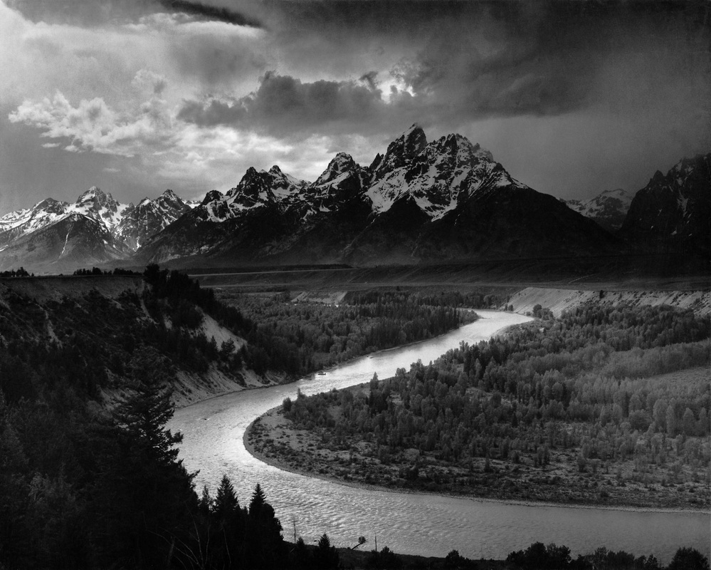
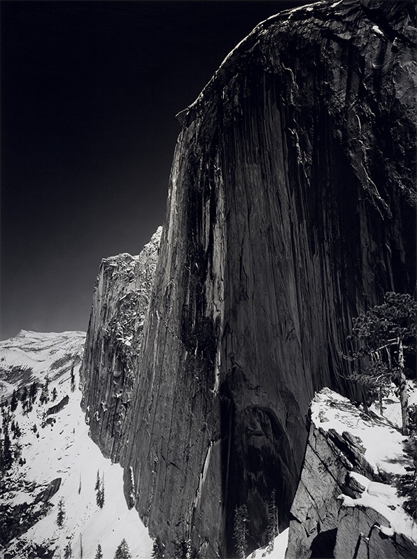
Ansel Adams was born on February 20, 1902, in San Francisco, California. Adams rose to prominence as a photographer of the American West, particularly Yosemite National Park, using his work to promote conservation of wilderness areas. His iconic black-and-white images helped to establish photography among the fine arts. He died in Monterey, California, on April 22, 1984. The most important result of Adams’s solitary and unmistakably different childhood was the joy that he found in nature, as evidenced by his taking long walks in the still-wild reaches of the Golden Gate. Nineteen twenty seven was the pivotal year of Adams’s life. He made his first fully visualized photograph, Monolith, the Face of Half Dome, and took his first High Trip. Between 1929 and 1942, Adams’ work and reputation developed. Adams expanded his repertoire, focusing on detailed close-ups as well as large forms, from mountains to factories. He spent time in New Mexico with artists including Alfred Stieglitz, Georgia O’Keeffe and Paul Strand. He began to publish essays and instructional books on photography.
Darren Almond
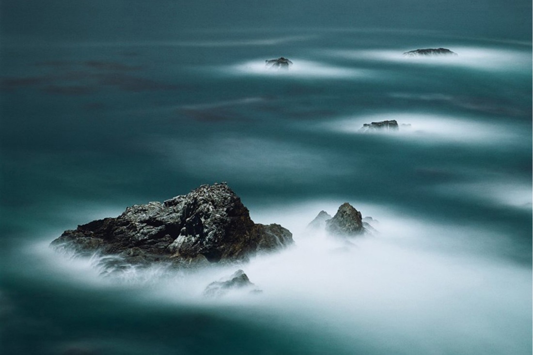
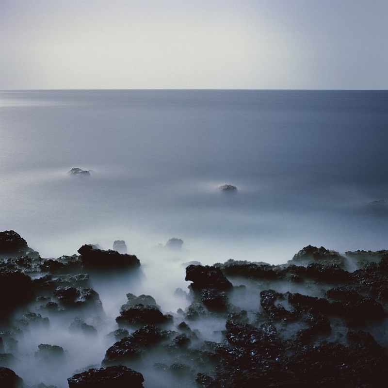
Almond is interested in the notions of geographical limits and the means of getting there – in particular, culturally specific points of arrival and departure. Since 1998, Almond has been making a series of landscape photographs known as the Fullmoons. Taken during a full moon with an exposure time of 15 minutes or more, these images of remote geographical locations appear ghostly, bathed in an unexpectedly brilliant light where night seems to have been turned into day.
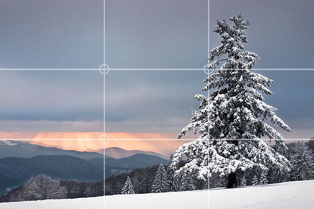
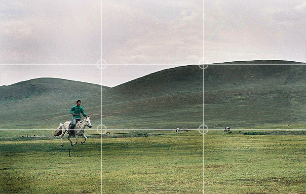
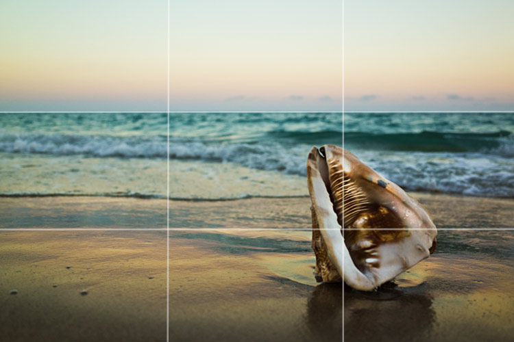
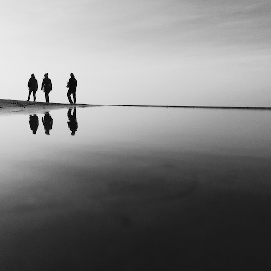
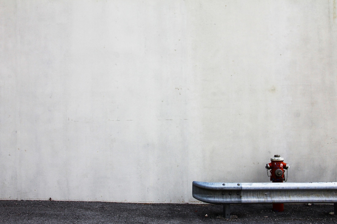
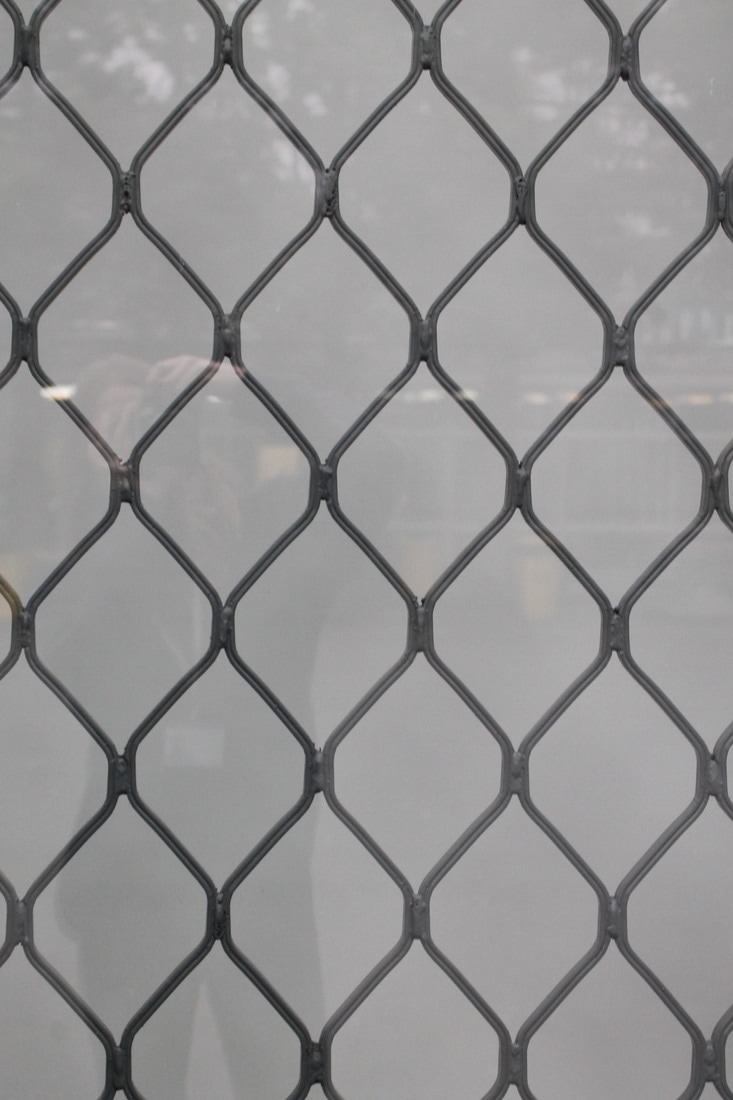
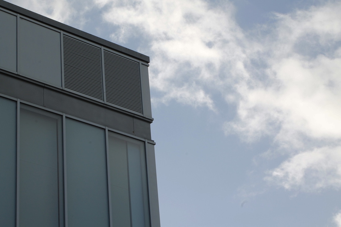
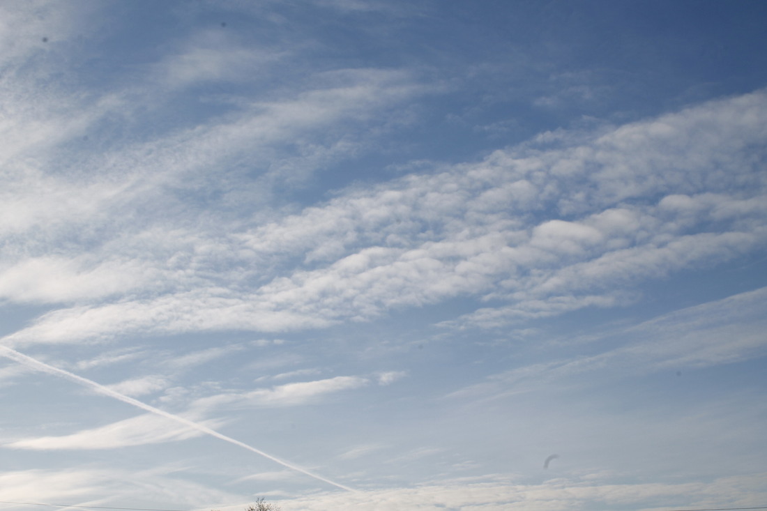
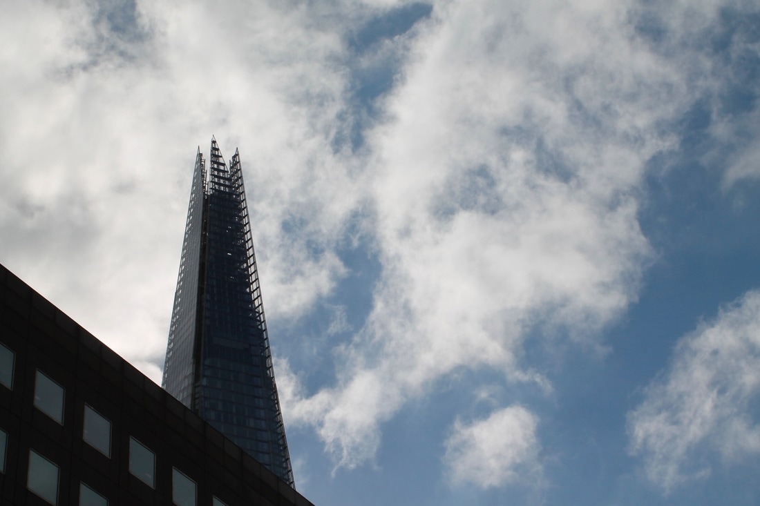
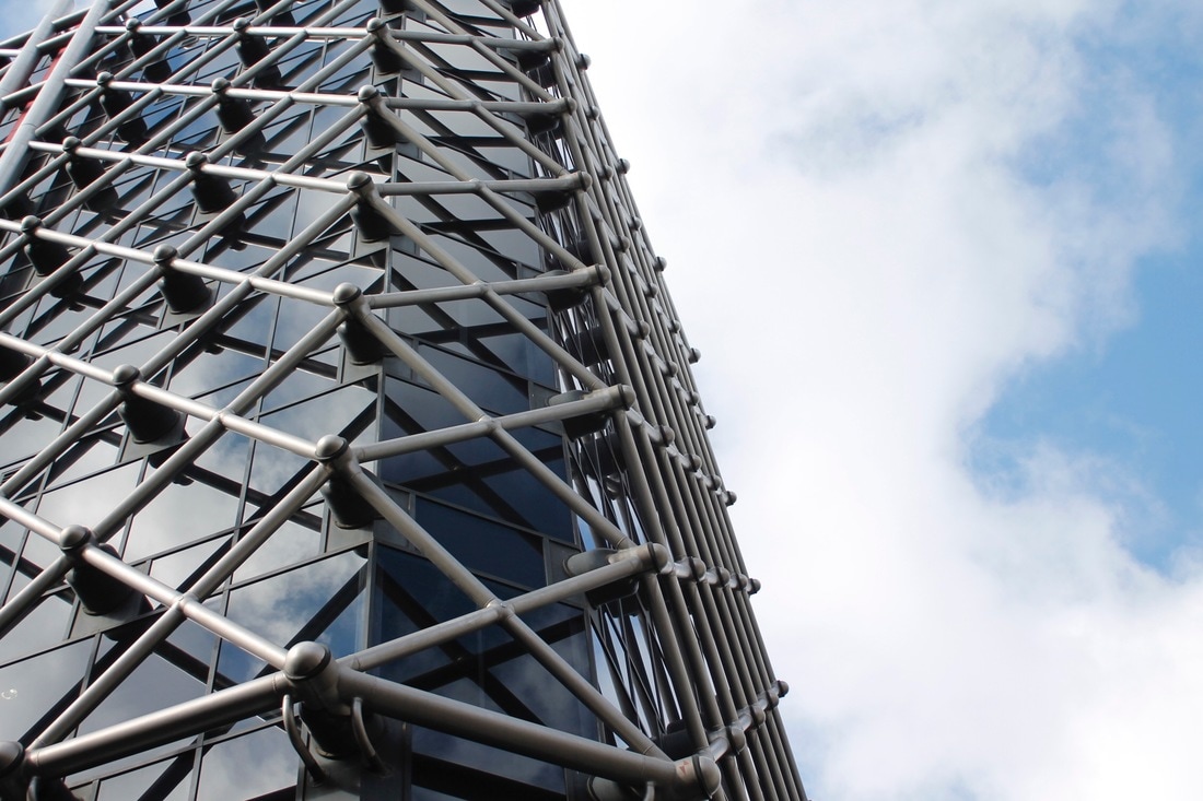
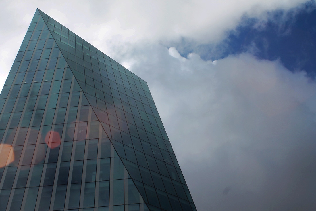
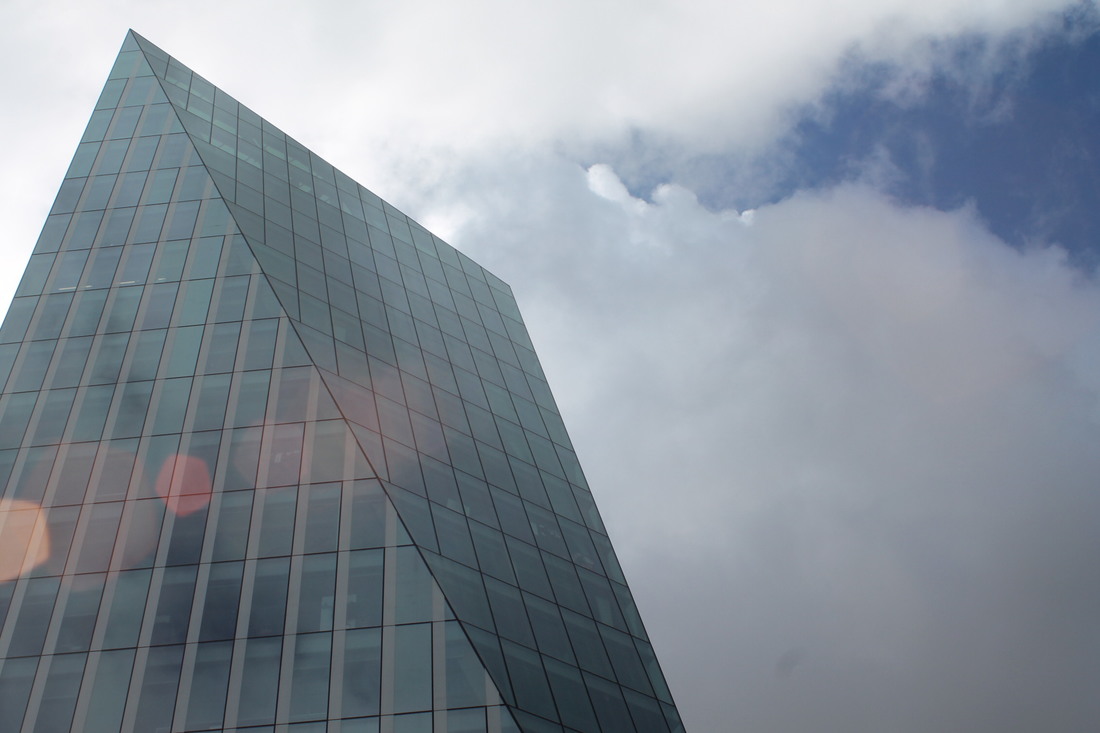
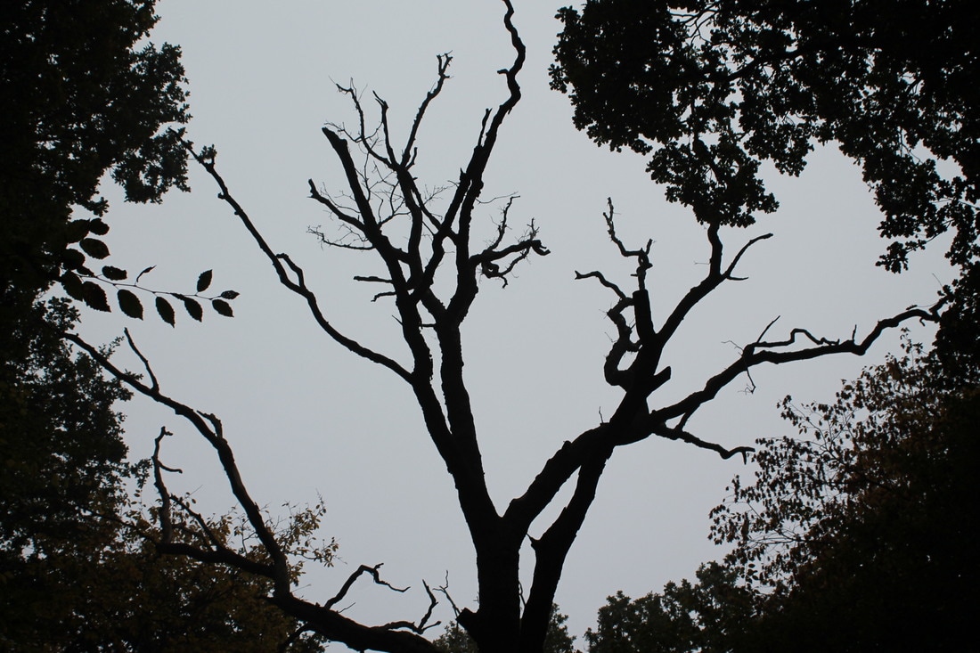
The Rule of Thirds and Negative Space
Examples of the rule of thirds
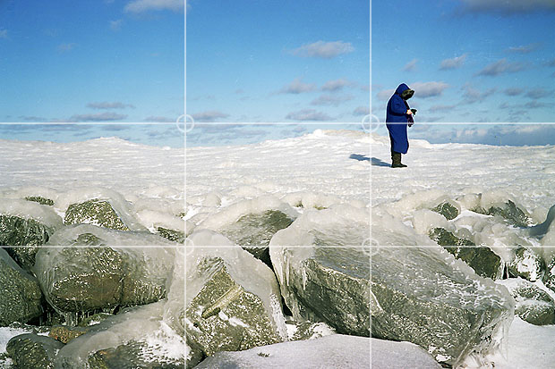
Examples of Negative Space

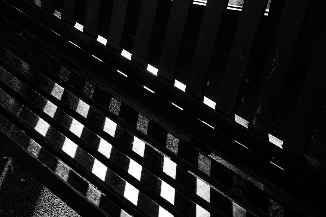
WWW: I showed clear understanding of The Rule Of Thirds and Negative Space in my images.
EBI: I could have taken more images so that I had a variety. |
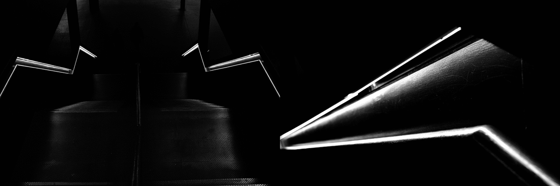
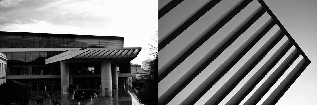
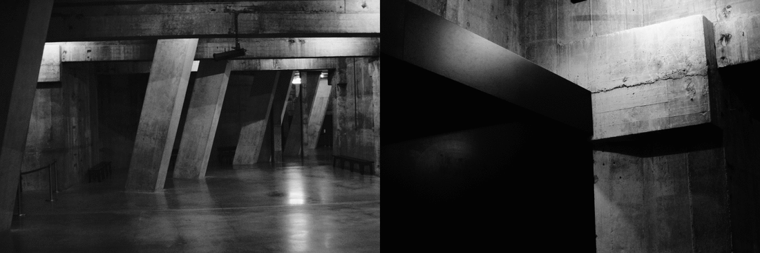
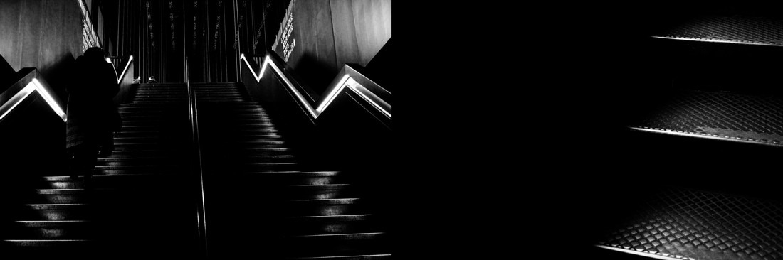
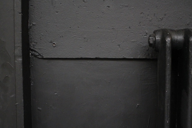
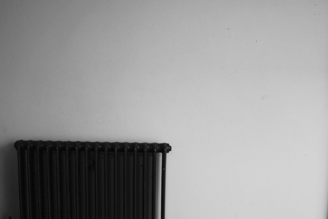
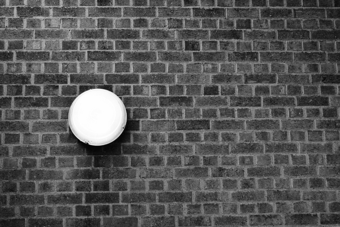
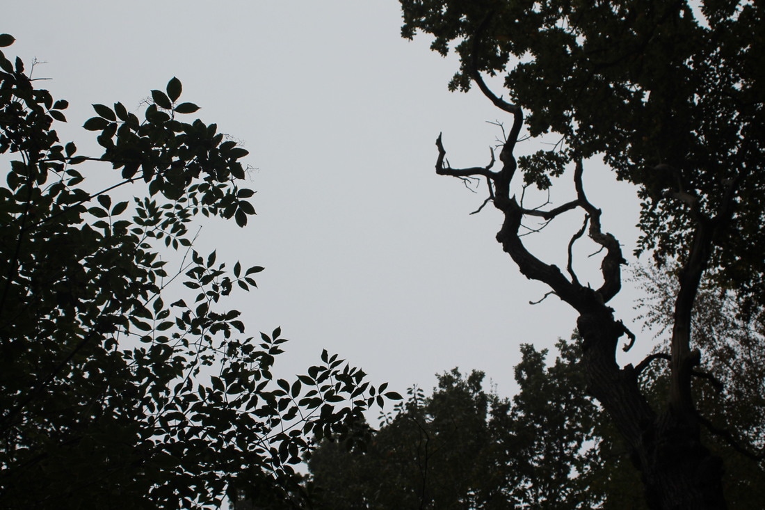
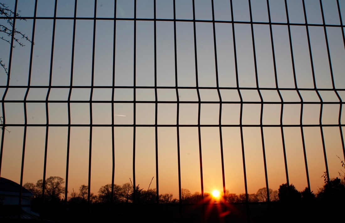
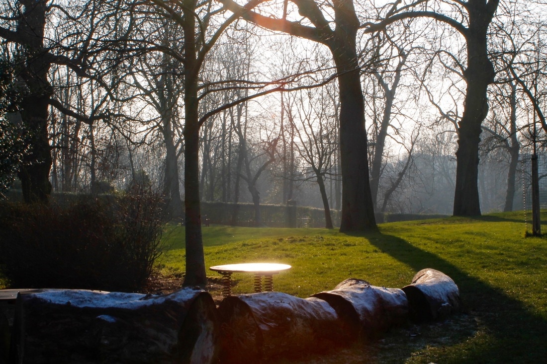
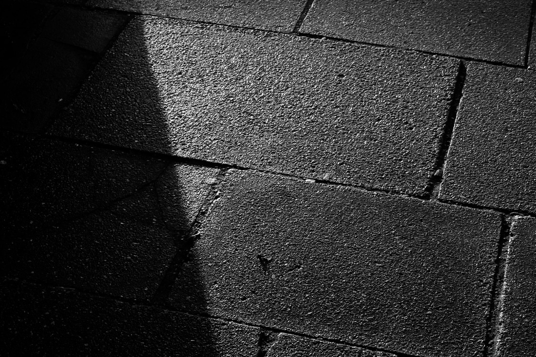
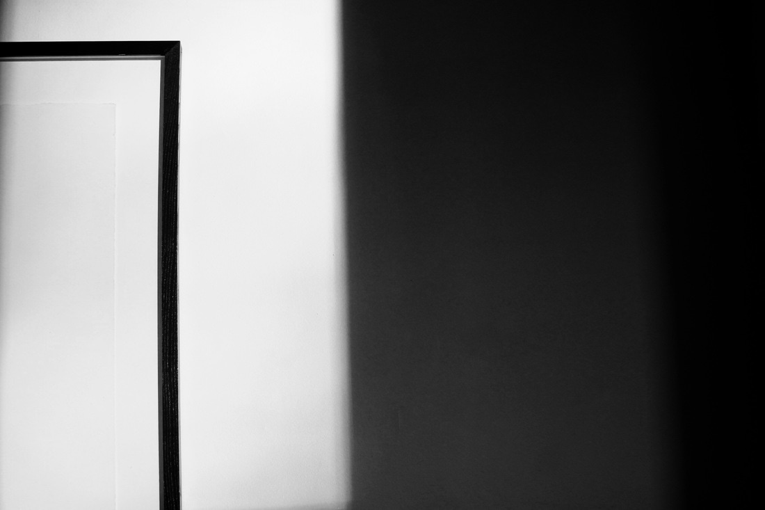
Negative space is the area which surrounds the main subject in a photo. It is used to see shapes and sizes more effectively, and produce better composed images. I used negative space in my images to make the viewer focus only on the main subject of the picture, in this case, the light.. The use of negative space makes the viewer focus on a specific point of the image.
The rule of thirds is applied by aligning a subject with the guide lines and their intersection points, placing the horizon on the top or bottom line, or allowing linear features in the image to flow from section to section. |
Cinemagraphs
|
mIn this task, we first had to take a 10 second video of someone very still but there had to be some kind of movement e.g. hair moving or eyes moving. I took a video of someone standing still and their hair moving around. I also used negative space so that the main focus of the cinemagraph was her hair moving, not the background. This was my second attempt of creating a cinemagraph and even though I understood how to create it on photoshop, the video was a bit grainy and pixelated. In the future, I will make sure that my ISO is not too high and that my shutter speed is not low.
|
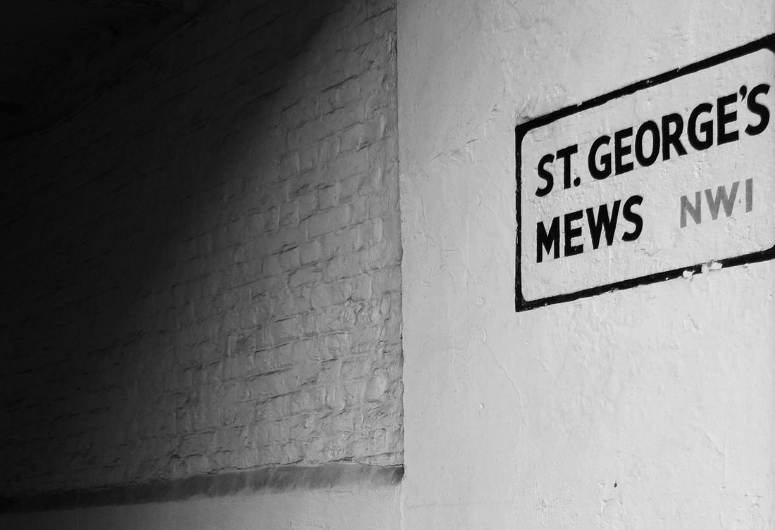
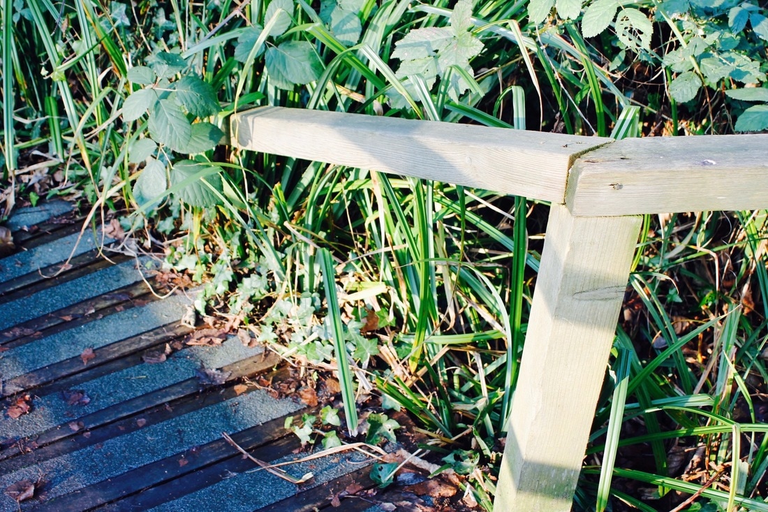
Framing the environment
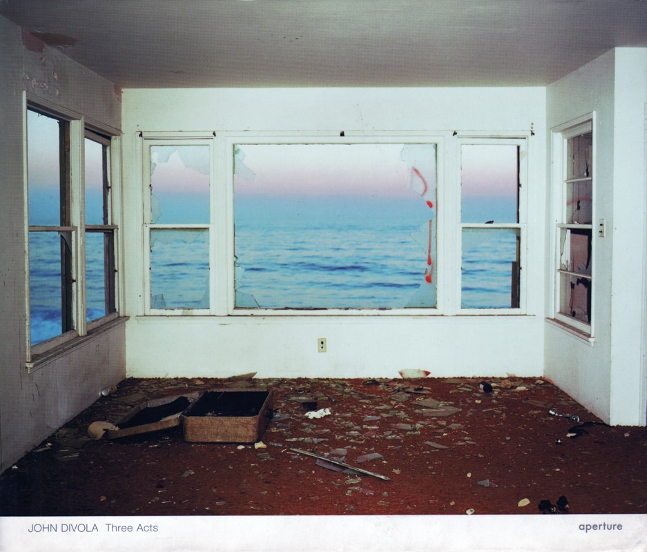
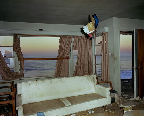
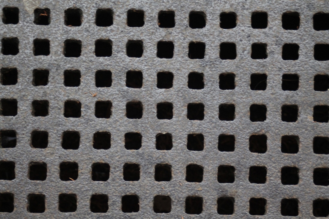
We looked at John Divola's and got the inspiration to 'Frame the environment'. John Divola is a contemporary visual artist, describing himself as exploring the landscape by looking for the edge between the abstract and the specific.
My Response
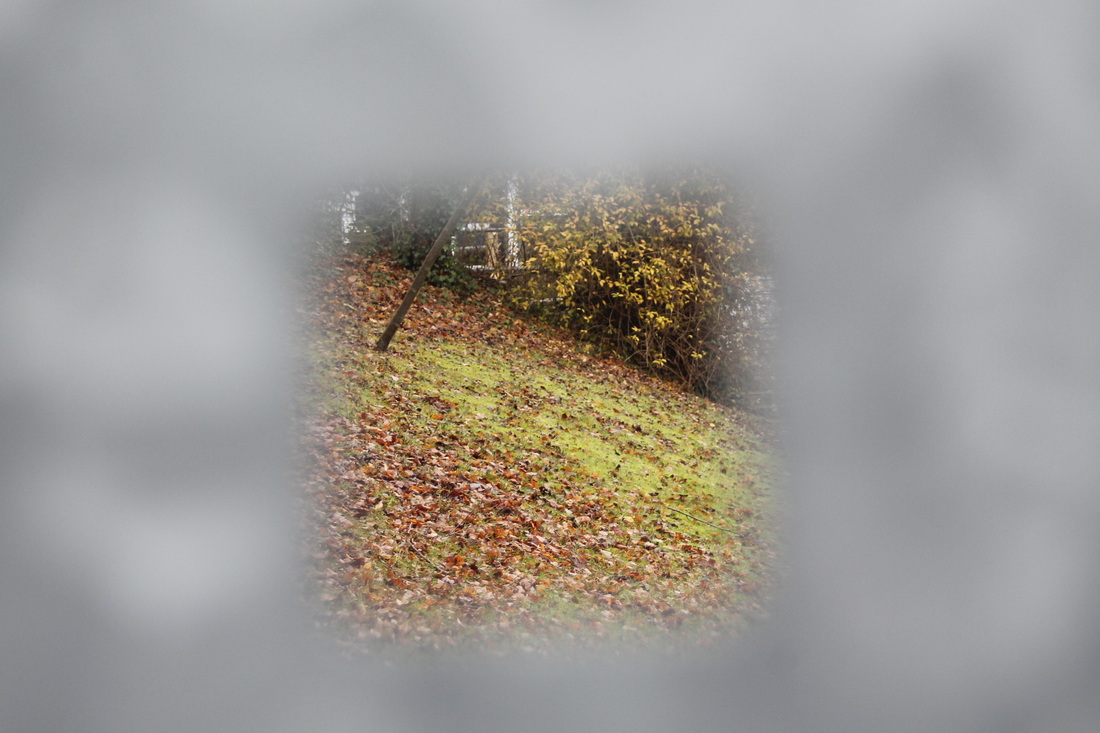
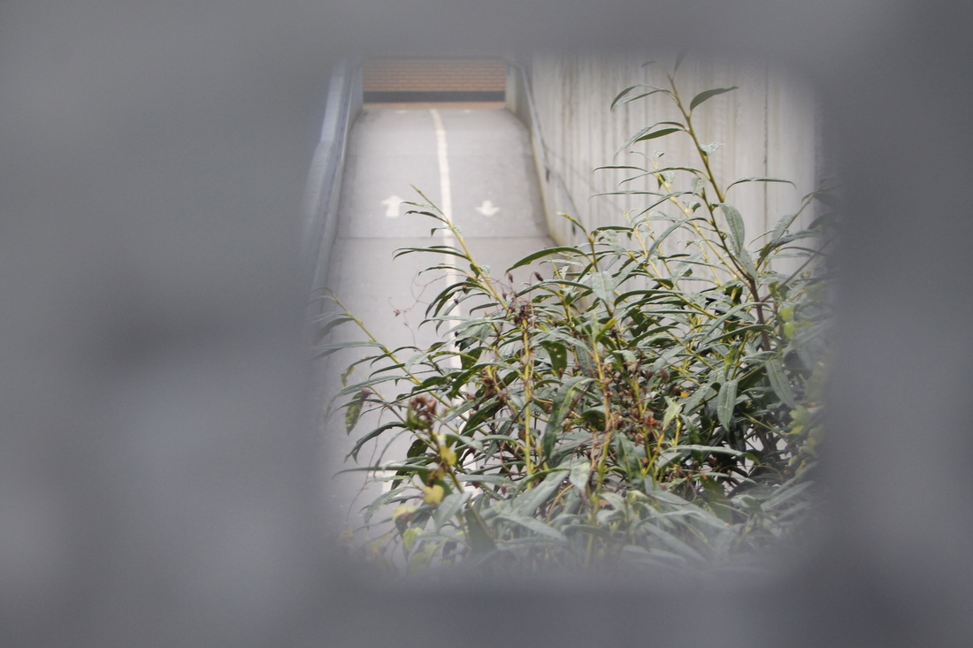
In this task, the aim was to make you look closer and to create more interesting compositions within our work. We had to find frames that captured interesting detail. I photographed through these square holes in a bridge that created a frame around the envirnoment.
I really like how the frame of the photographs are blurry because it makes your eye focus on what's behind it.
I could have taken more images with different backgrounds to show my understaning clearer.
I really like how the frame of the photographs are blurry because it makes your eye focus on what's behind it.
I could have taken more images with different backgrounds to show my understaning clearer.
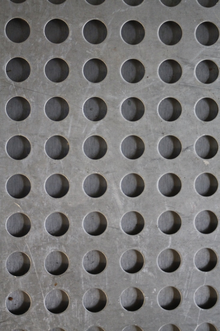
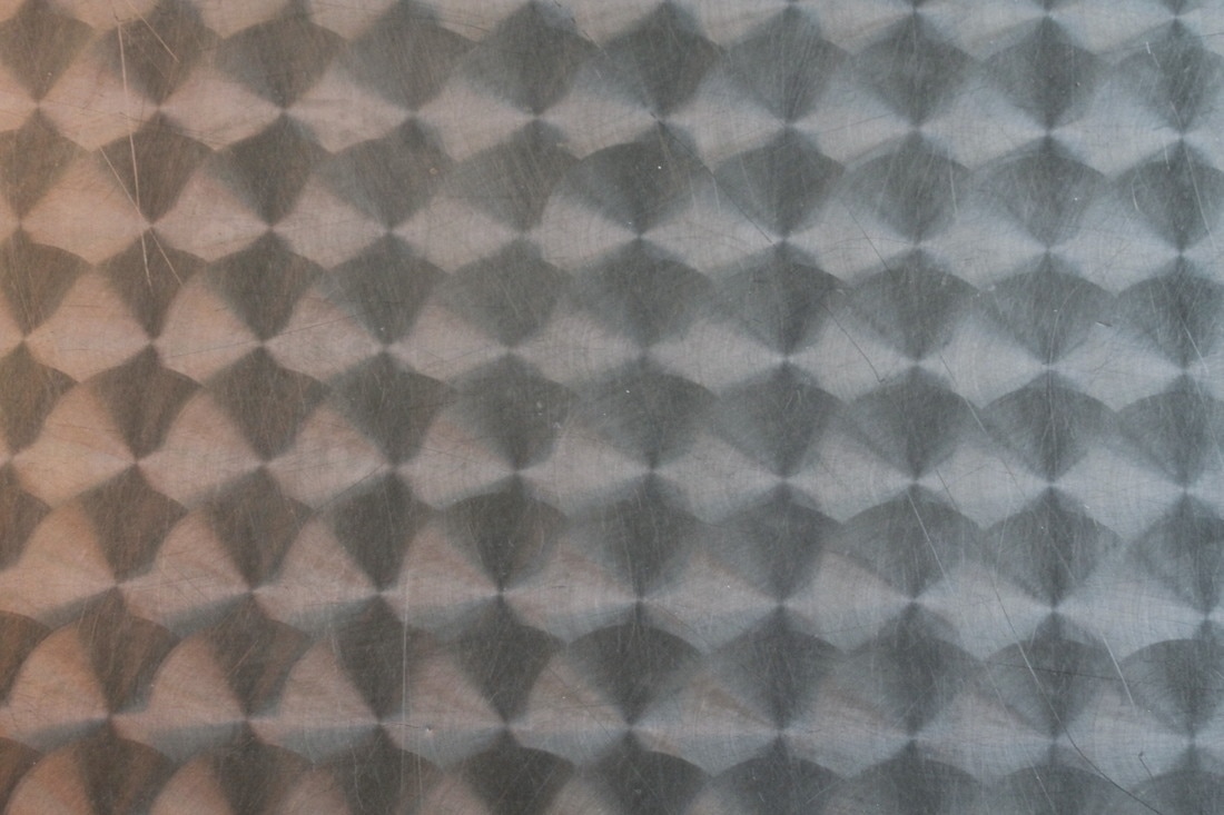
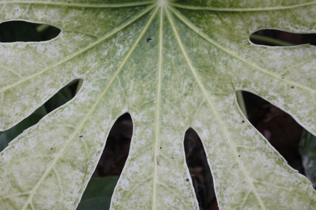
Formal Elements in Photography
What are the Formal Elements?
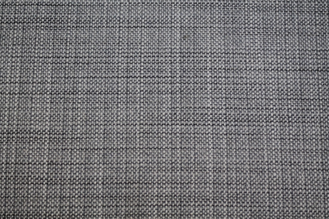
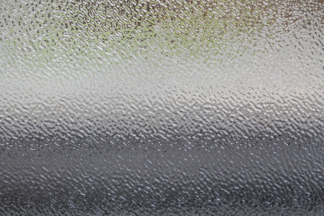
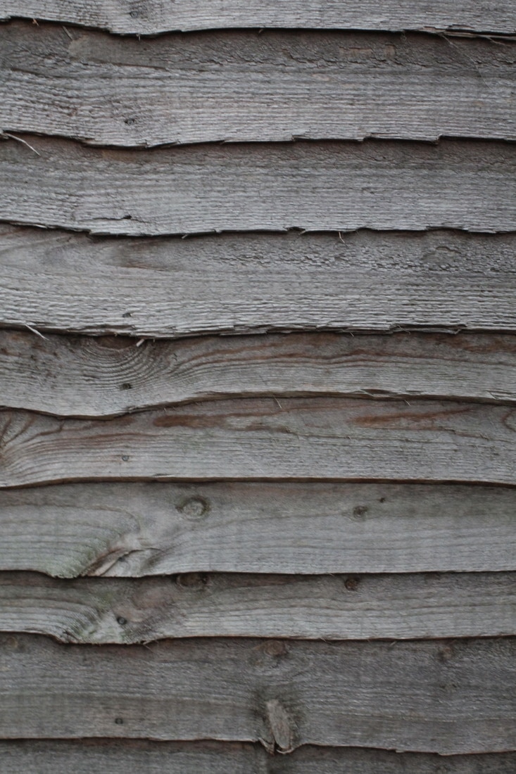
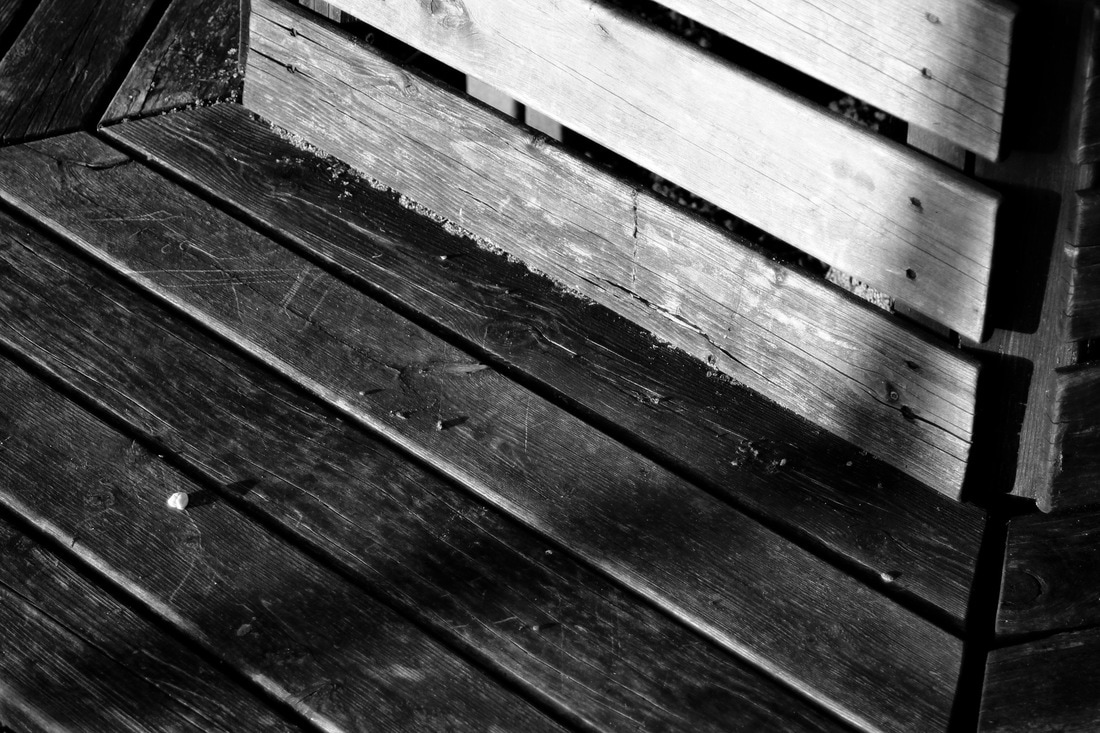
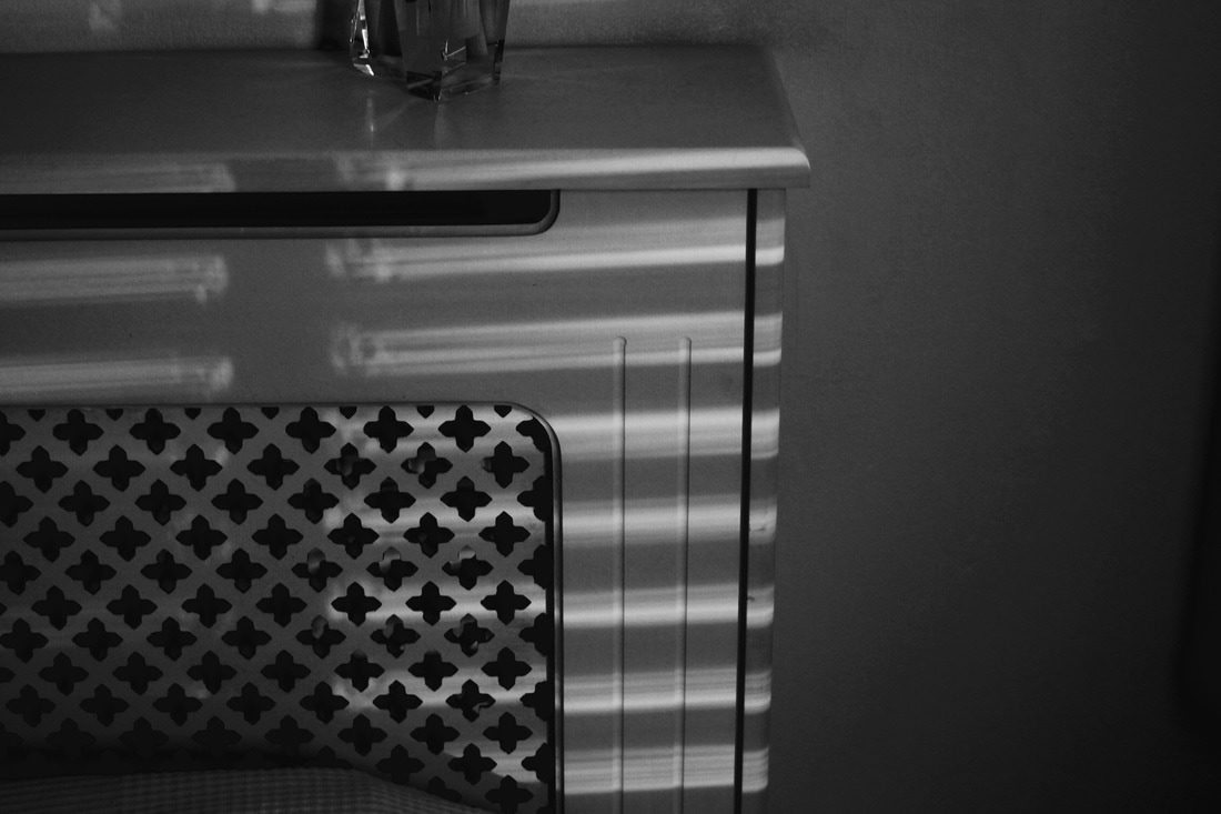
Formal elements are generally accepted as line, tone, pattern, texture, shape, form and colour. In Photography it is also refered to focus, depth of field, perspective, scale, balance and composition. We started looking at the formal element Pattern.
Formal elements are generally accepted as line, tone, pattern, texture, shape, form and colour. In Photography it is also refered to focus, depth of field, perspective, scale, balance and composition. We started looking at the formal element Pattern.
Pattern
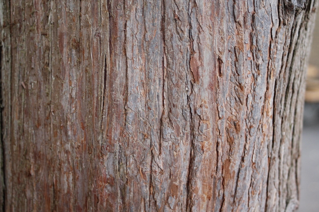
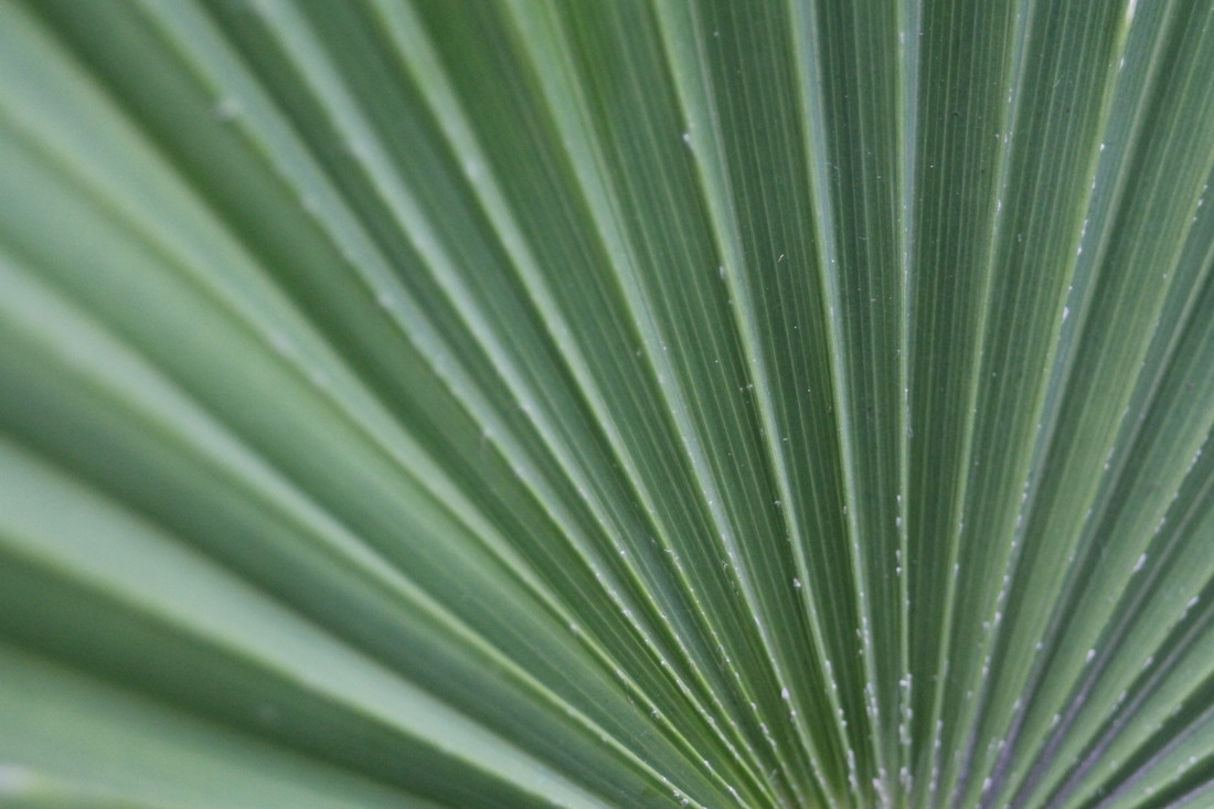
Lines
- A mark made by a moving point
- Has greater length than width
- Directs the eye - horizontal, vertical, diagonal, curvy, zig-zag, etc.
- Can be actual obvious lines or the borders or edges of shapes.
Value

- Black and White and all the greys in between
- Dark to light
- Can add drama and impact to composition
- Can give a sense of timelessness
Texture
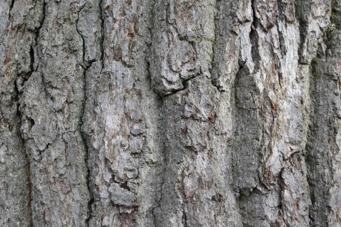
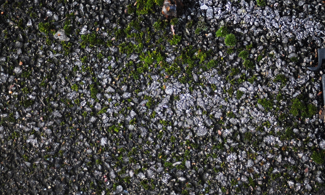
- The surface quality
- How an object feels, or how it looks like it feels
- Rough, smooth, bumpy, gooey, sharp,etc.
- Adds interest! Sense of sight and sense of touch involved
Shape/Form
- A contained area
- Can be geometric
- Can be organic (natural)
- Shapes are 2-dimensional and flat
- Forms are 3-dimensional with height, width and depth
- Used to create a sense of space and substance.
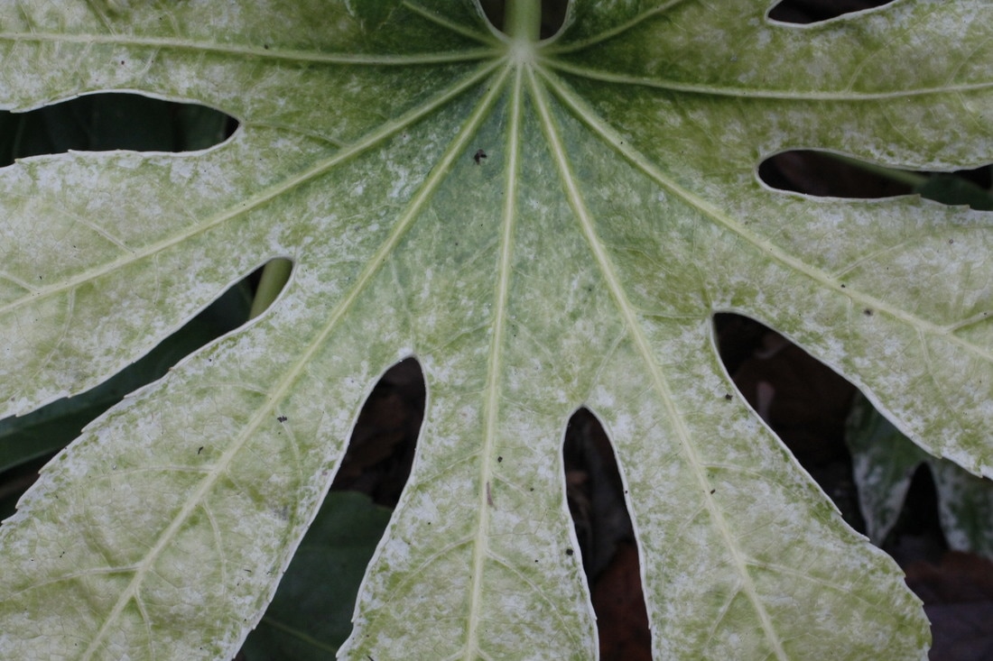
Editing Images on Photoshop
Before and after editing
The Good
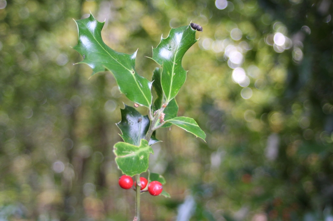
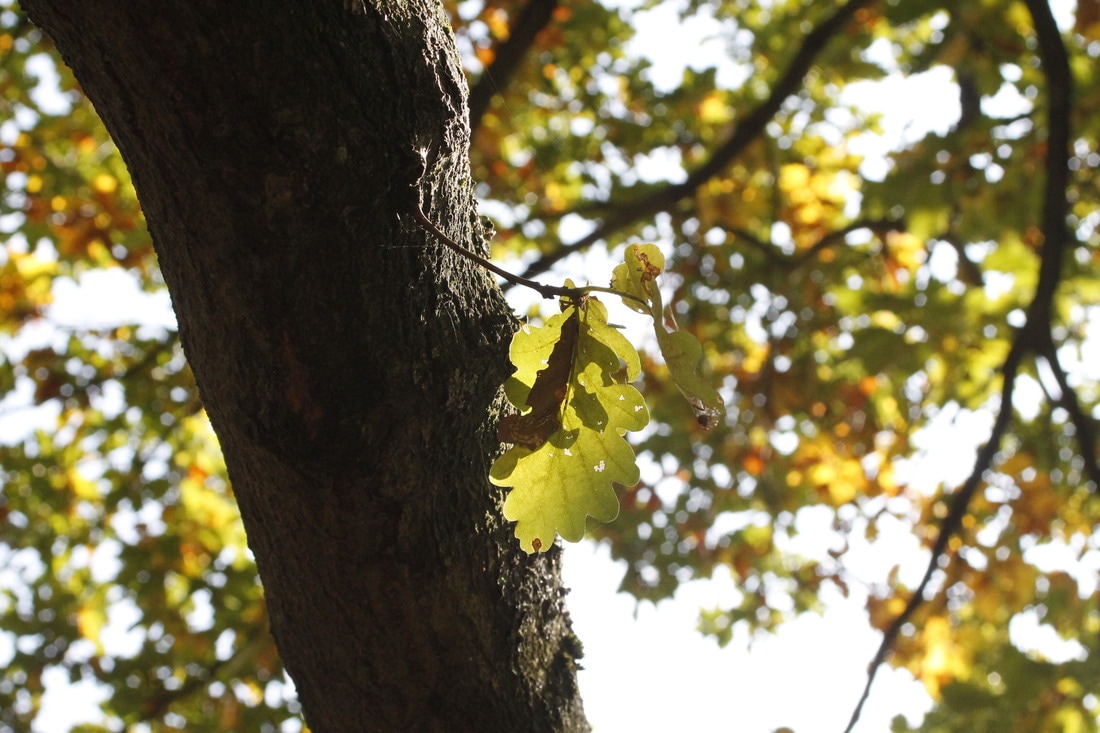
My 'Good' images are pictures that have no bad effect on the environment.
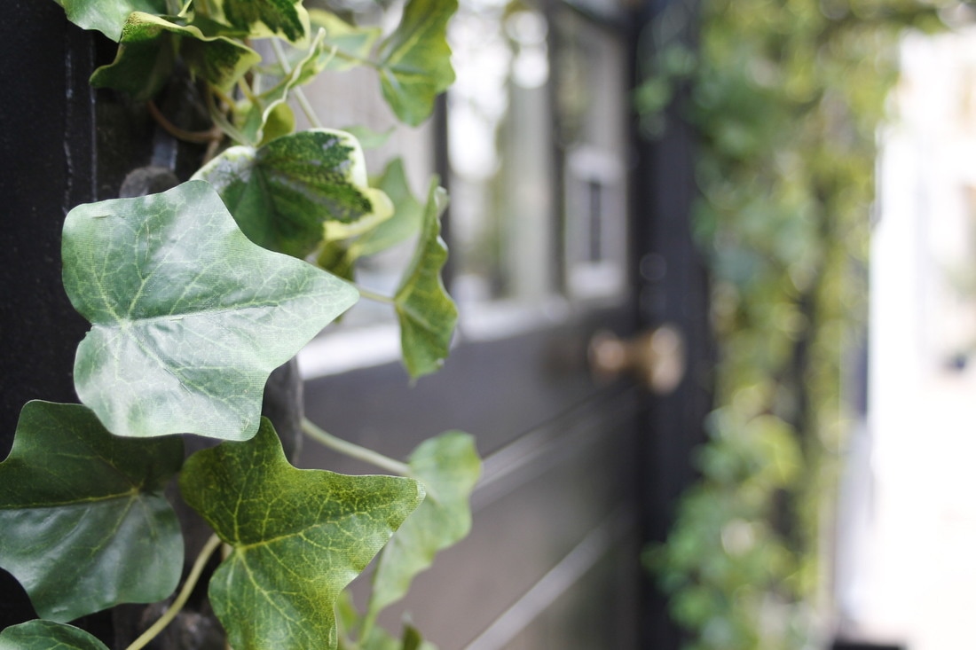
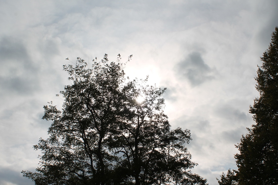
I successfully captured good images. I really like how in my first and fourth images I used depth of field to focus closely on a specific object whilst the background was blurry.
I could have taken more images to further show me understanding and also maybe take more pictures that aren't plants.
I successfully captured good images. I really like how in my first and fourth images I used depth of field to focus closely on a specific object whilst the background was blurry.
I could have taken more images to further show me understanding and also maybe take more pictures that aren't plants.
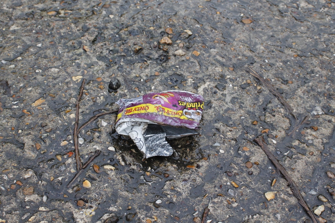
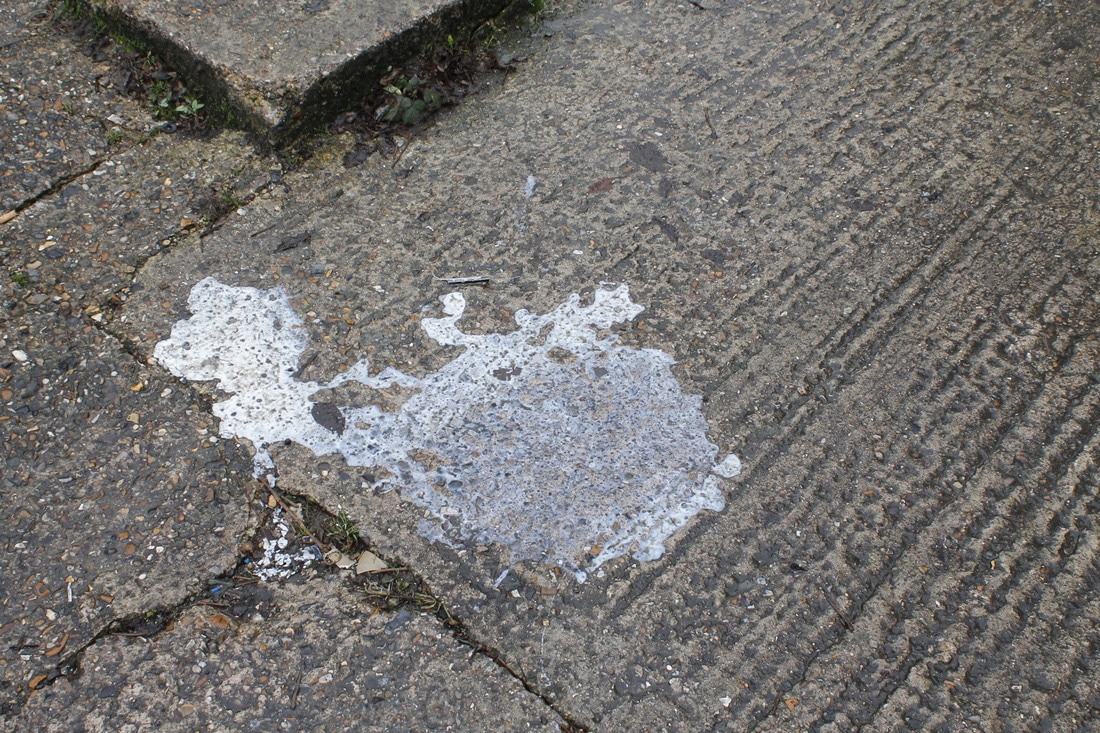
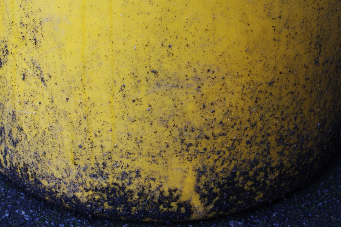
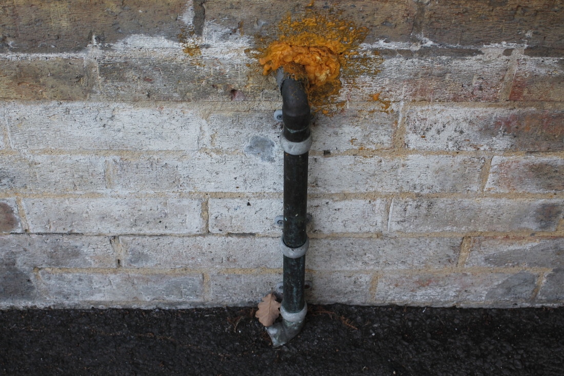
The Bad
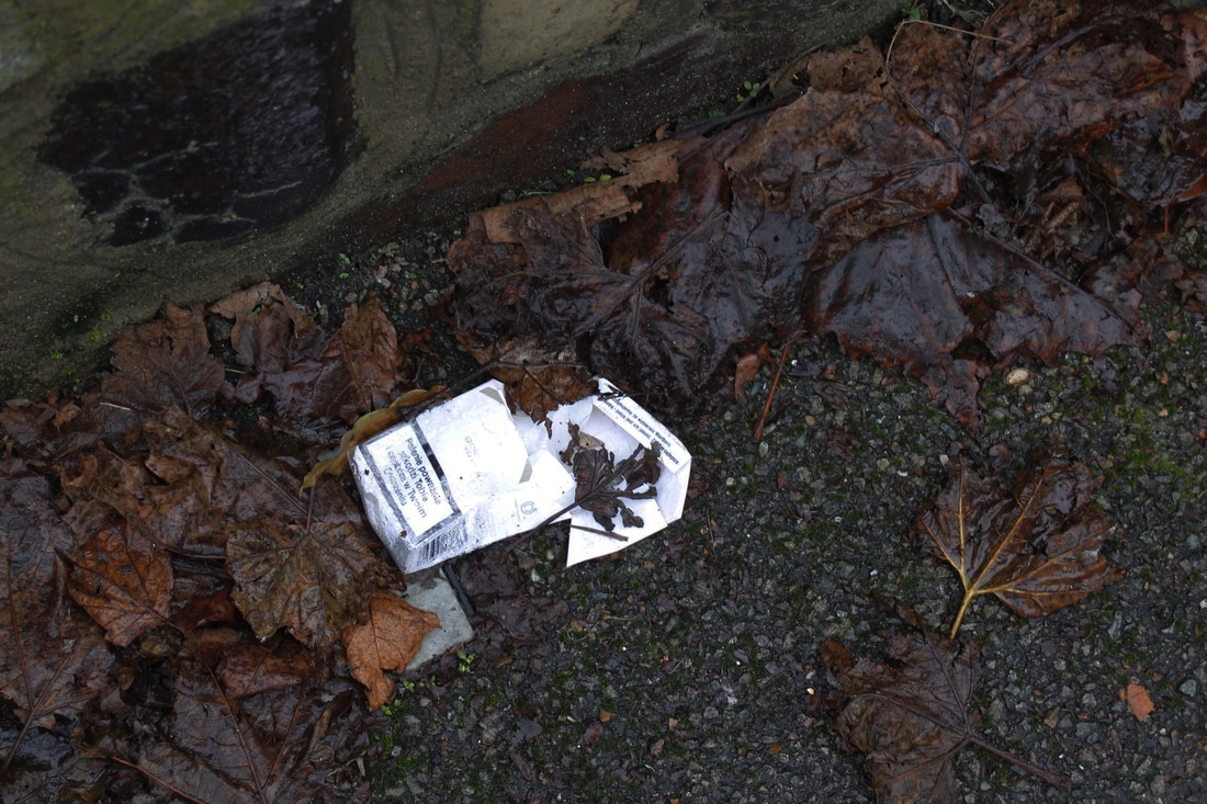
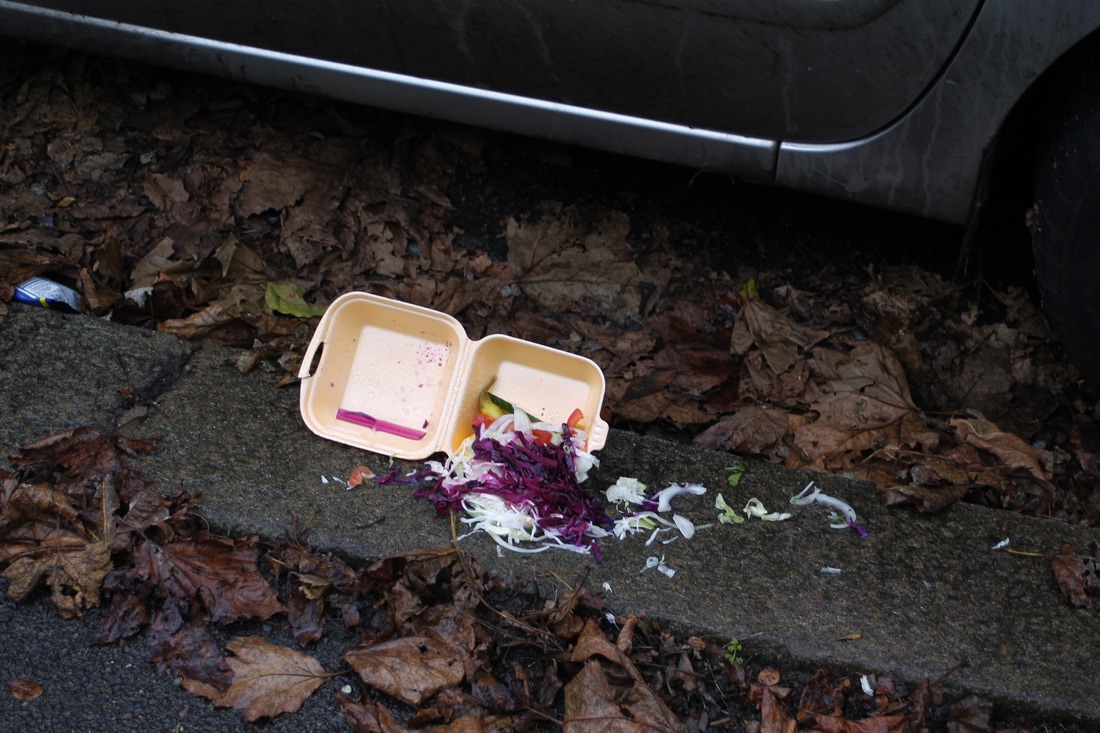
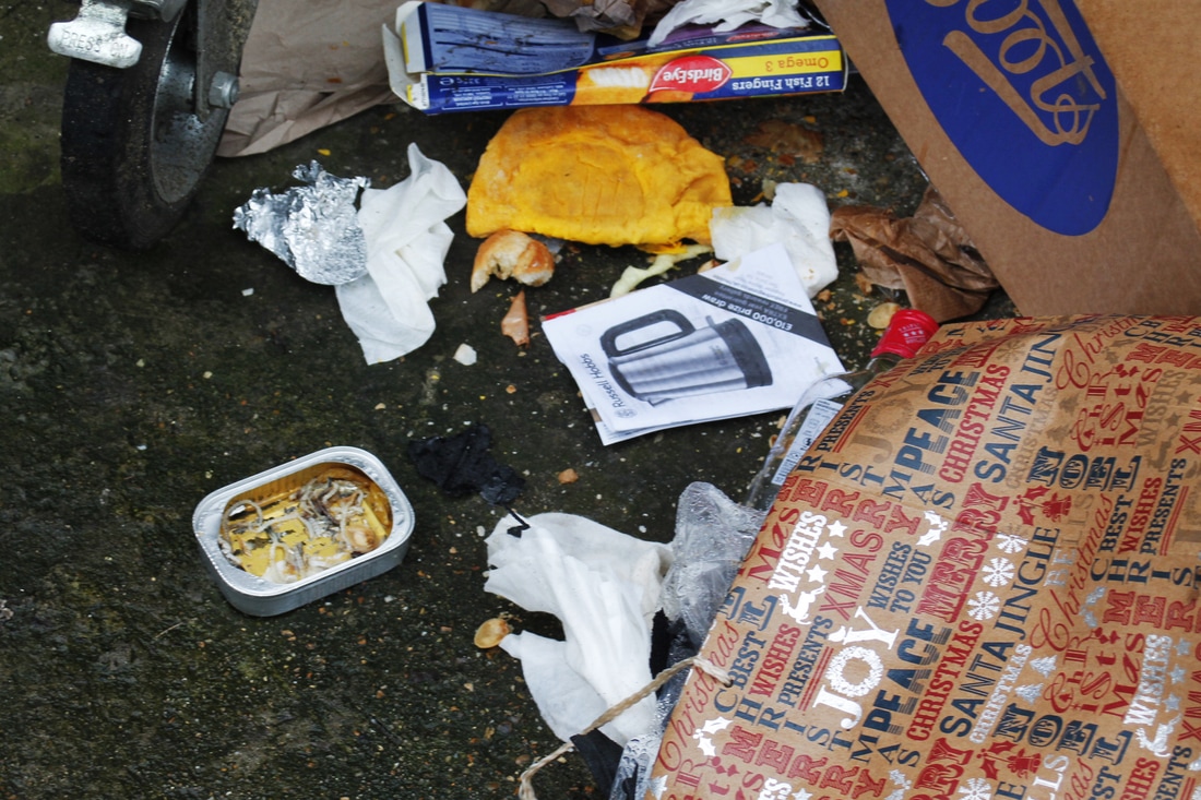
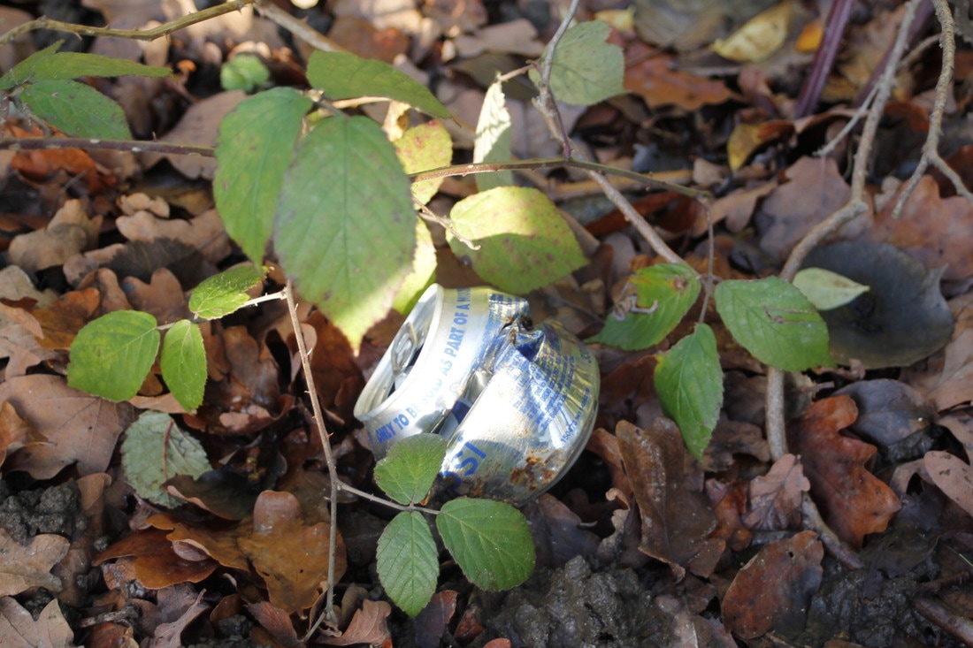
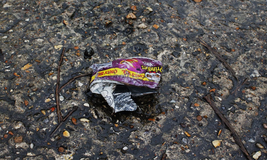
My 'Bad' images are objects in the environment that have been left on the streets e.g. rubbish.
I like how I focused on small details that we don't usually look at while we are out.
I could have taken more images showing a variation of 'bad' images, in my images I mostly took images of abandoned food or rubbish.
I like how I focused on small details that we don't usually look at while we are out.
I could have taken more images showing a variation of 'bad' images, in my images I mostly took images of abandoned food or rubbish.
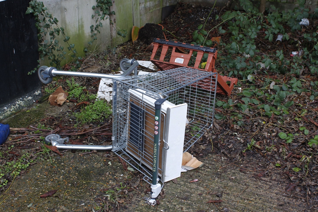
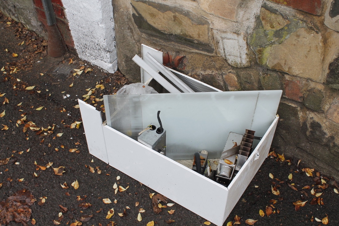
The Ugly
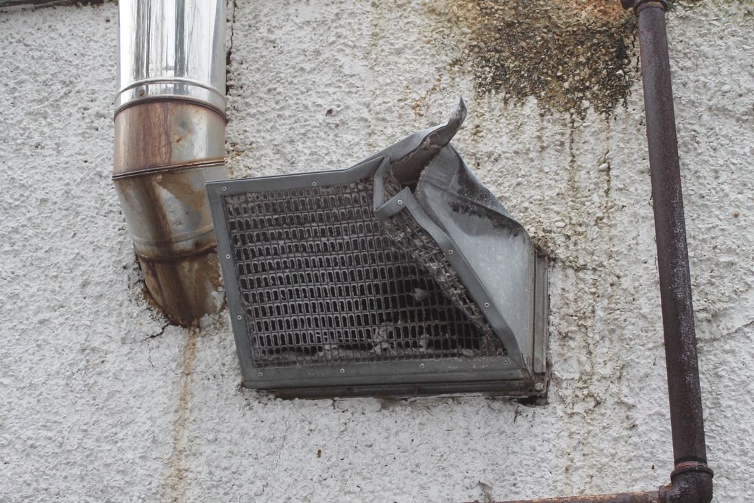
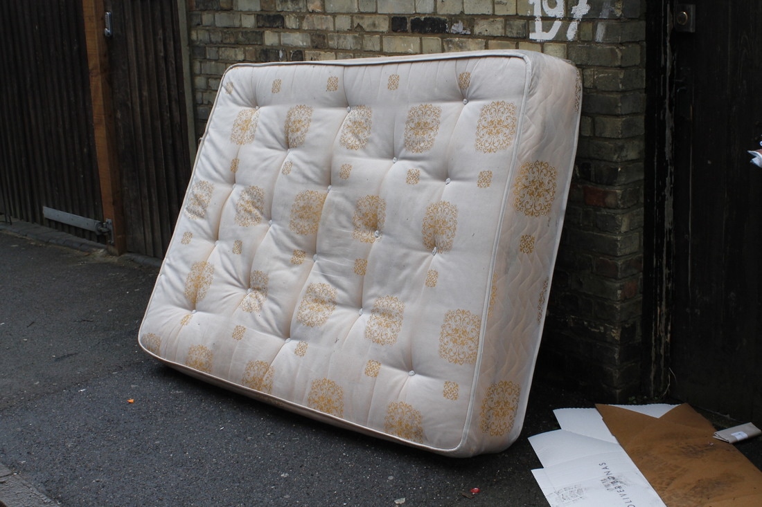

My 'Ugly' images are things that make the environment look unpleasant. For example, broken things or random objects that shouldn't be outside (for example, the matress).
I managed to photograph 'ugly' things in the environment and I looked closely to small details.
My 'bad' and 'ugly' images are quite similar so I could have made the difference between bad and ugly more clearer.
I managed to photograph 'ugly' things in the environment and I looked closely to small details.
My 'bad' and 'ugly' images are quite similar so I could have made the difference between bad and ugly more clearer.
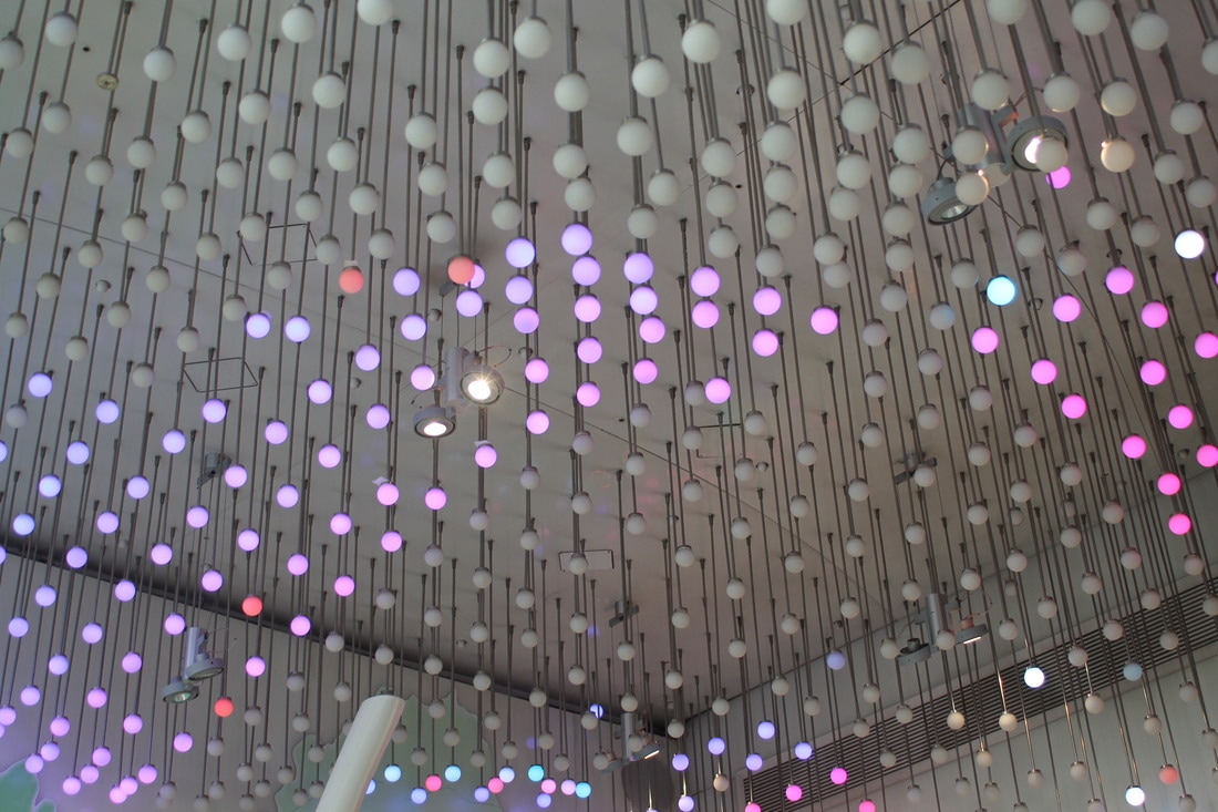
My Best 9 Images

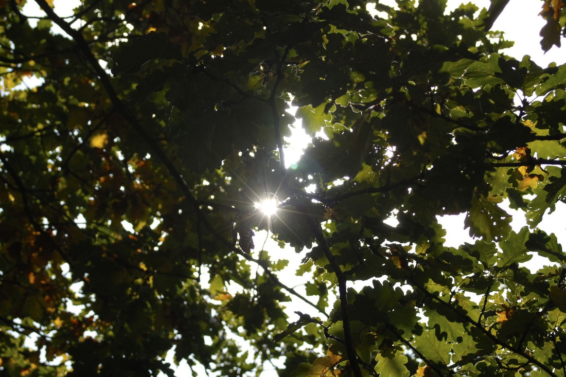


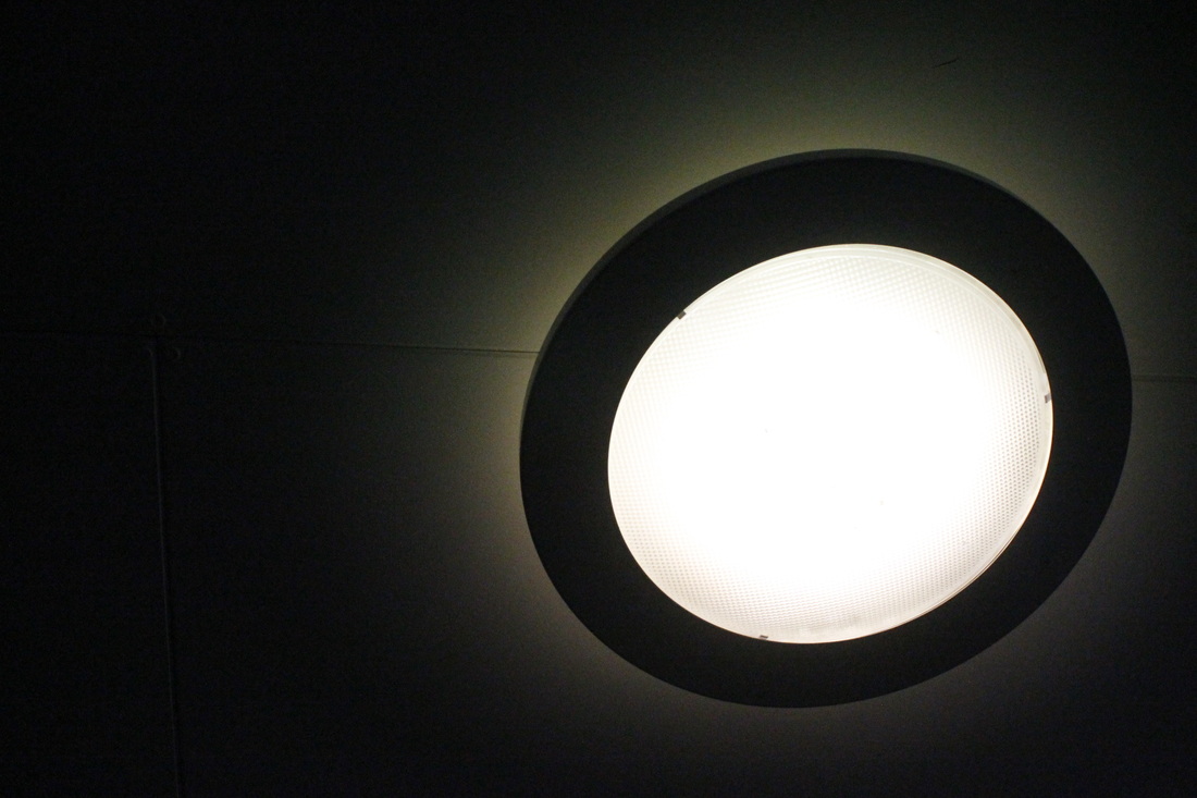
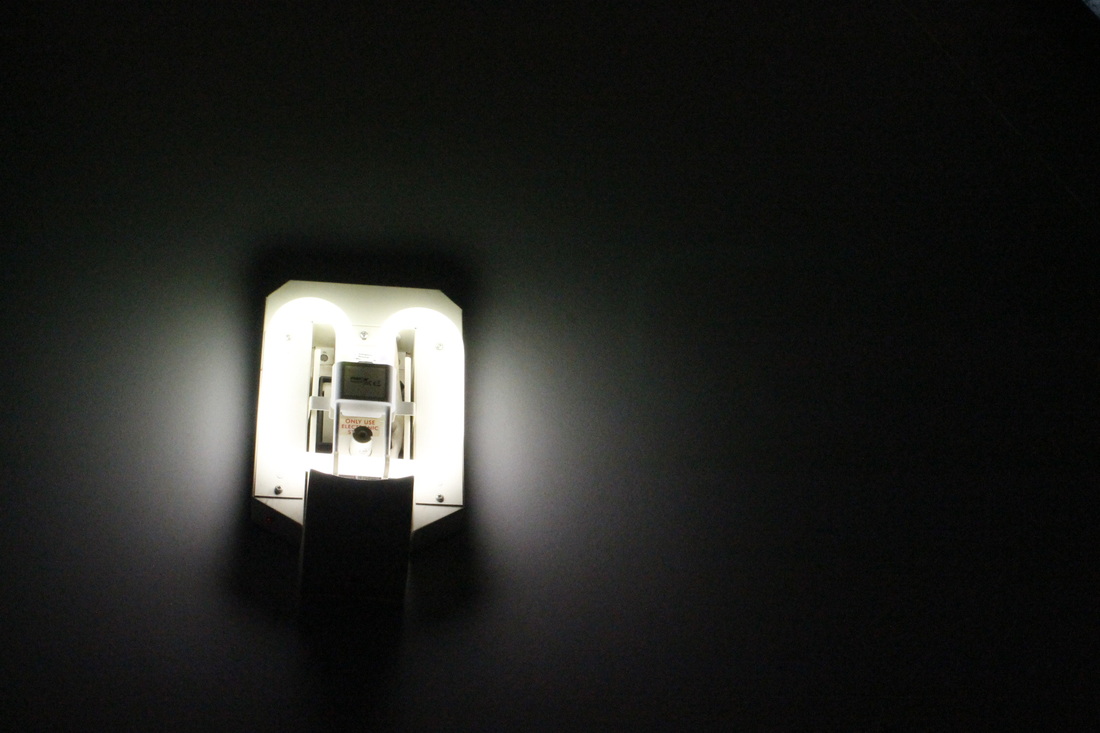
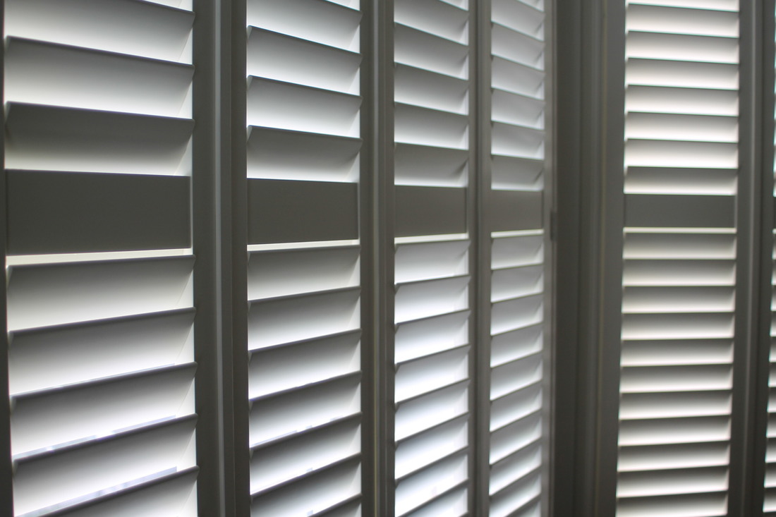
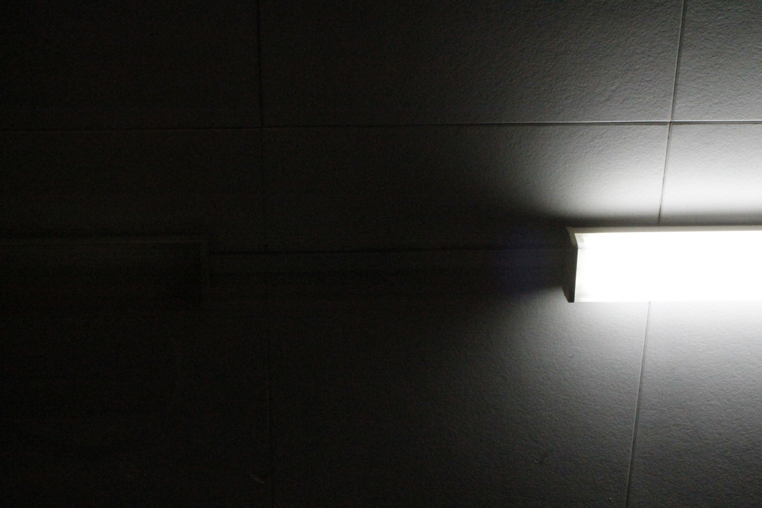
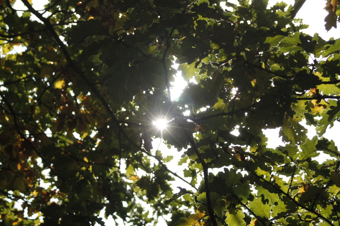
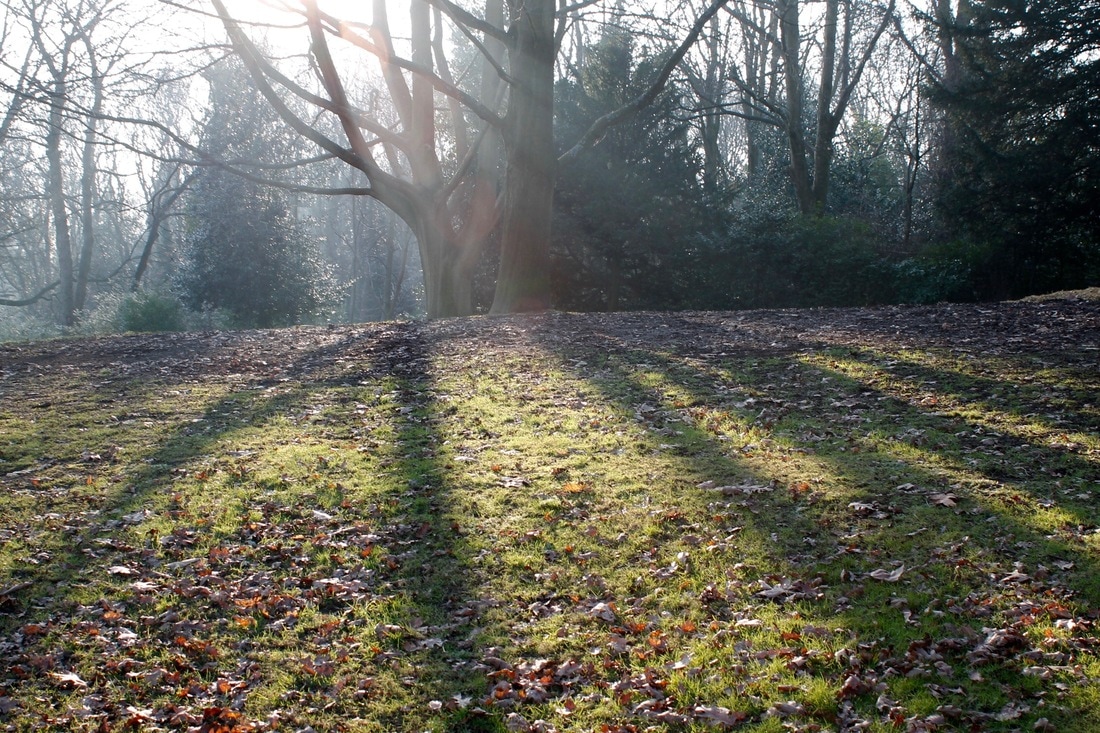
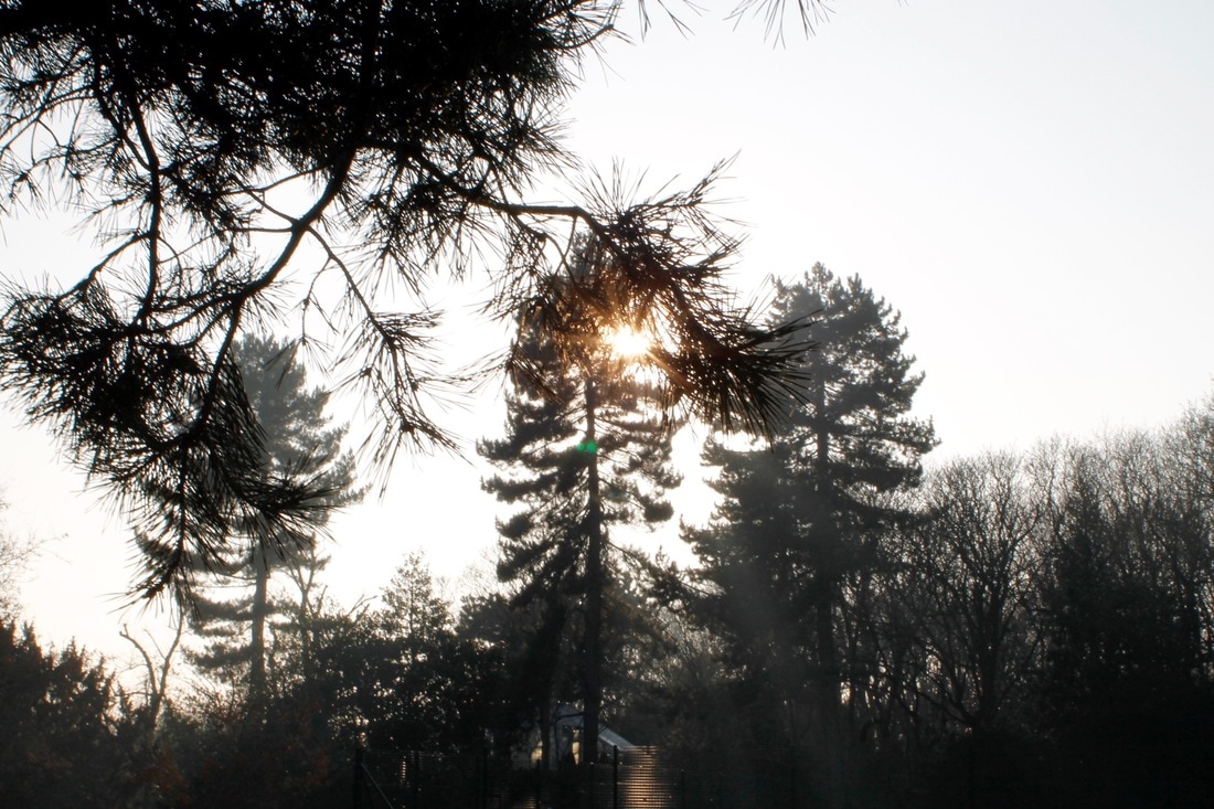
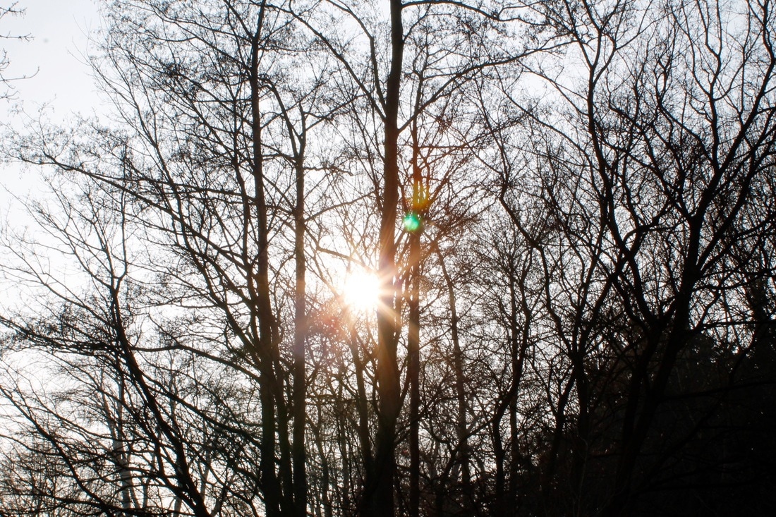
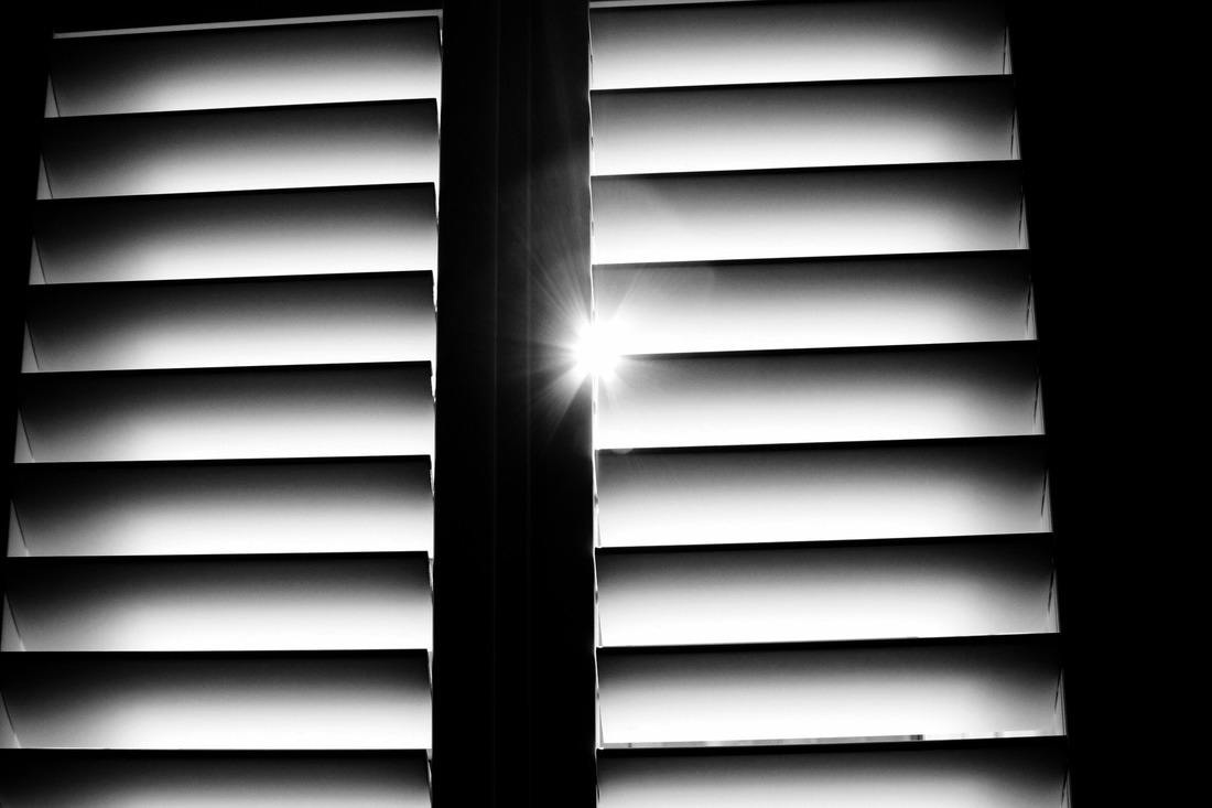
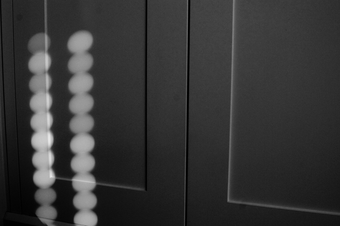
Light
Light
lʌɪt/
noun
The natural agent that stimulates sight and makes things more visible
"the light of the sun"
synonyms: illumination, brightness, luminescence, luminosity, shining, gleaming, gleam, brilliance, radiance, lustre, glowing, glow, blaze, glare
lʌɪt/
noun
The natural agent that stimulates sight and makes things more visible
"the light of the sun"
synonyms: illumination, brightness, luminescence, luminosity, shining, gleaming, gleam, brilliance, radiance, lustre, glowing, glow, blaze, glare
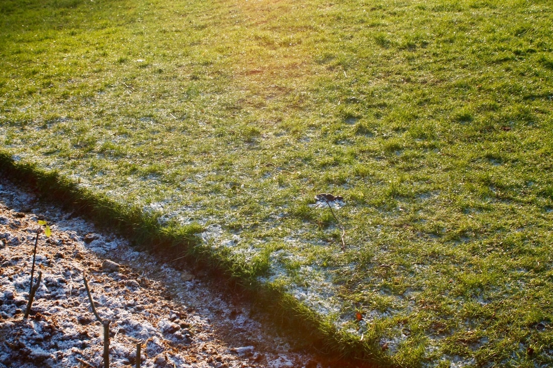
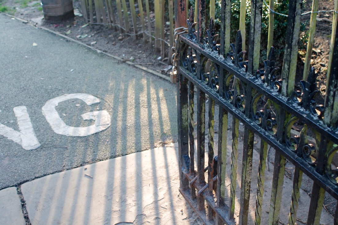
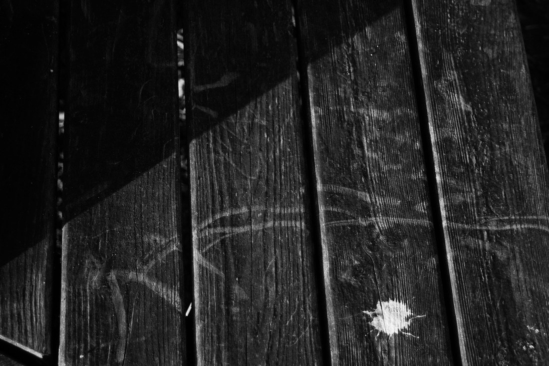
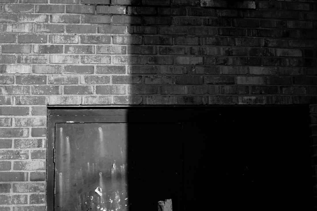
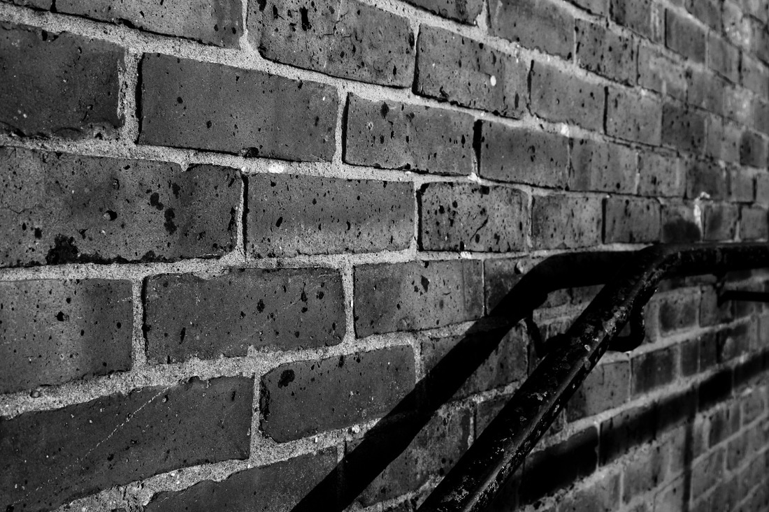
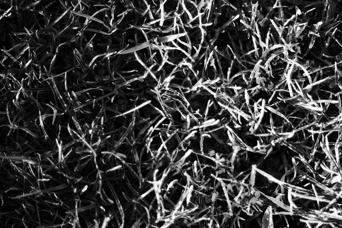
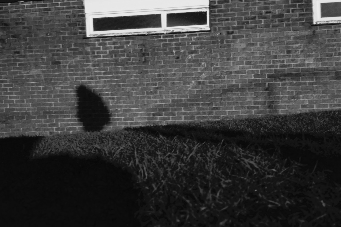
Contrast
Contrast
noun
ˈkɒntrɑːst
The state of being strikingly different from something else in juxtaposition or close association.
"the day began cold and blustery, in contrast to almost two weeks of uninterrupted sunshine"
synonyms: difference, dissimilarity, disparity, dissimilitude, distinction, contradistinction, divergence, variation, differentiation;
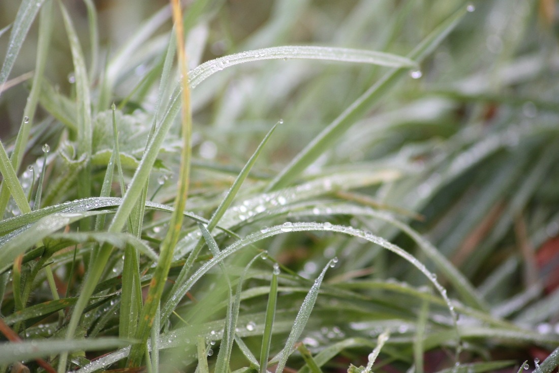
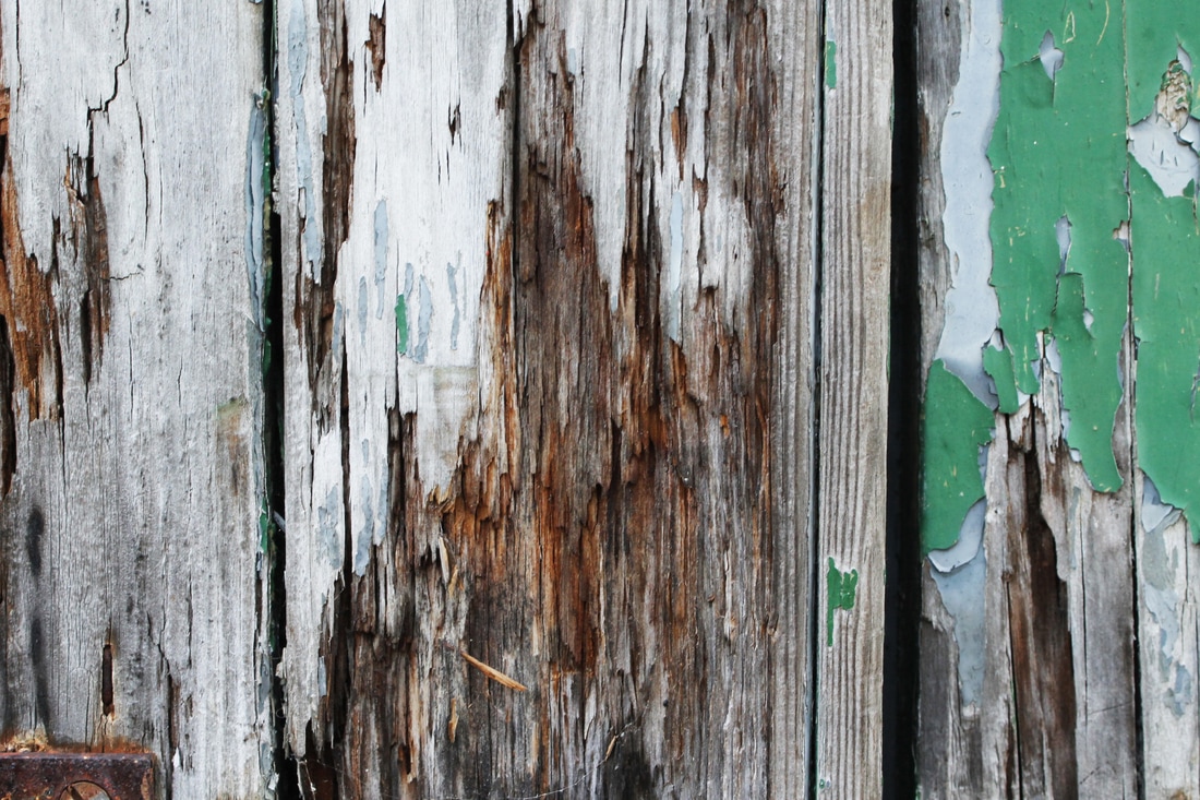
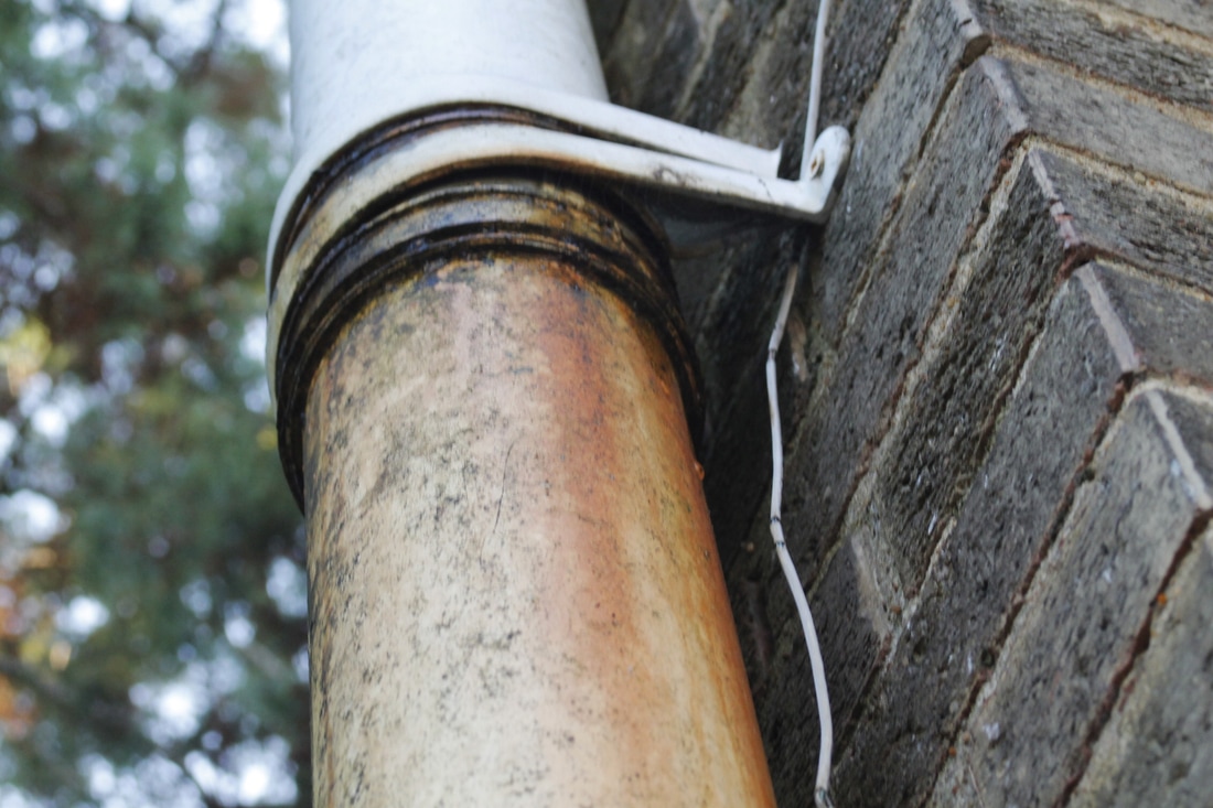
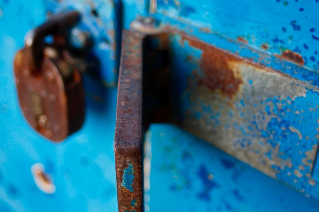
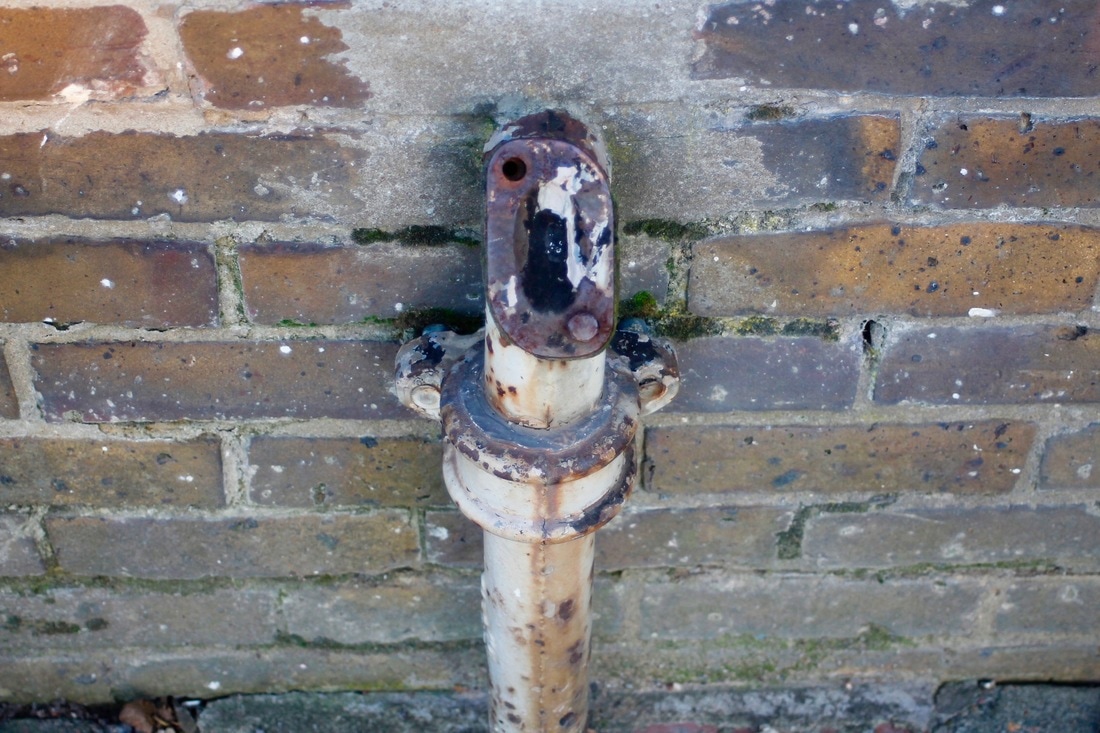
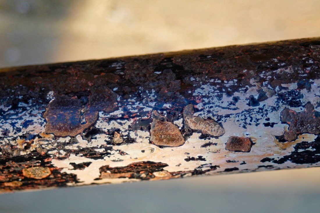
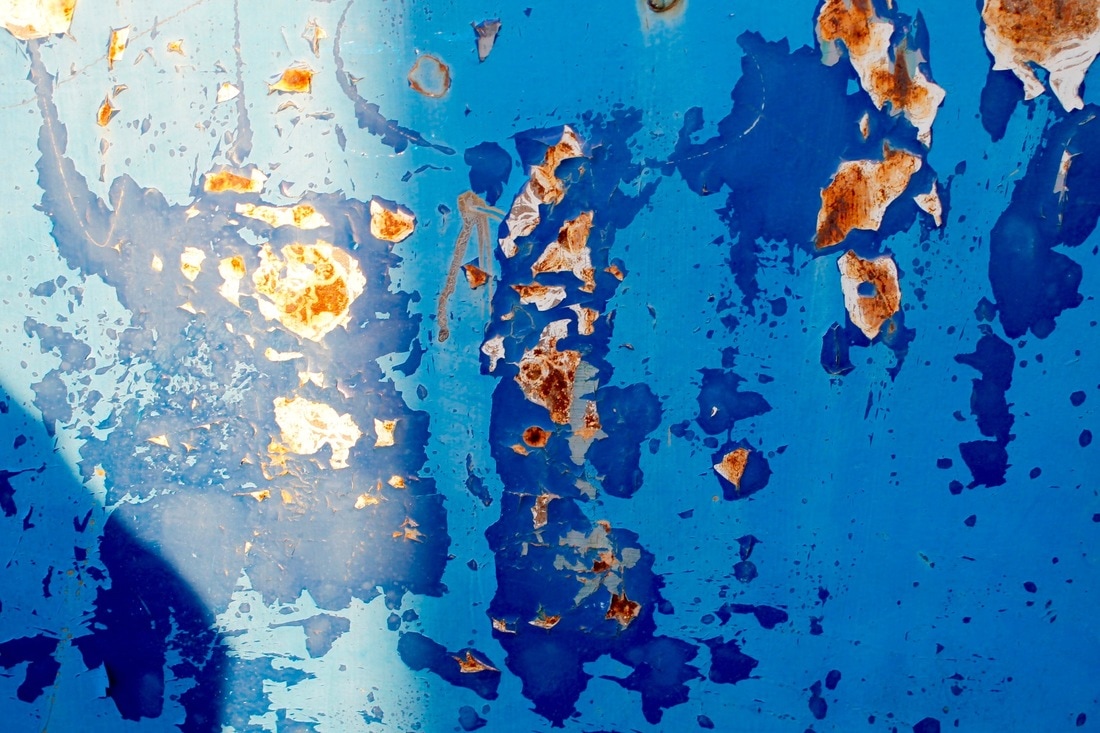
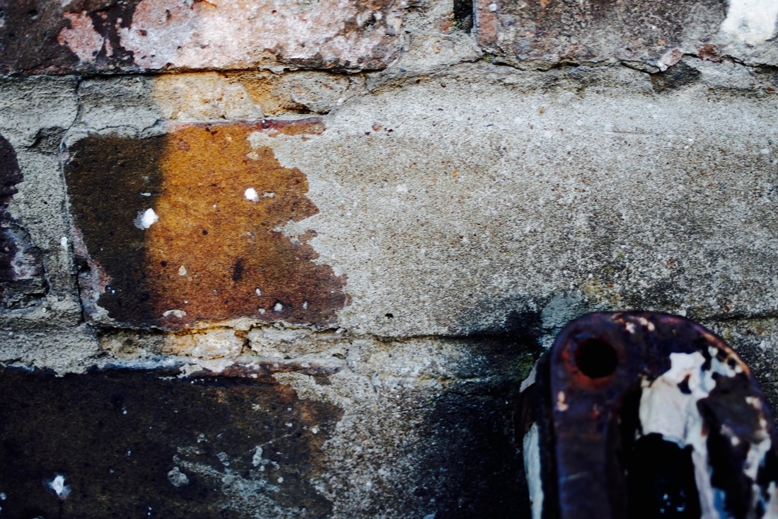
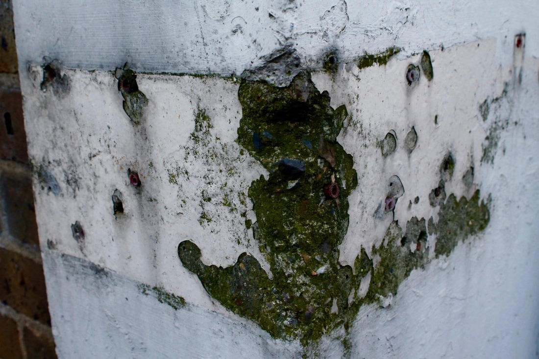
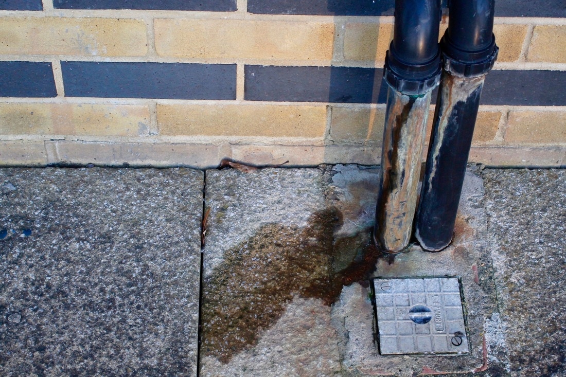
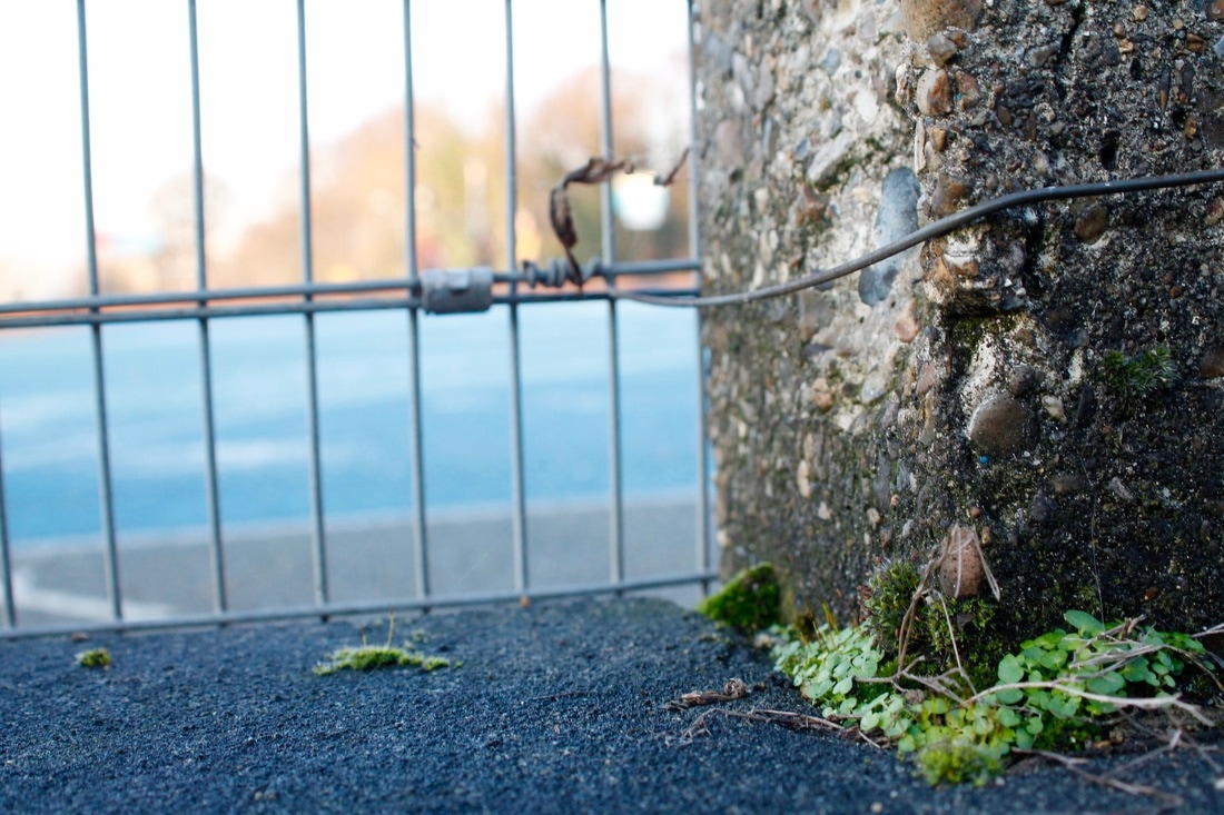
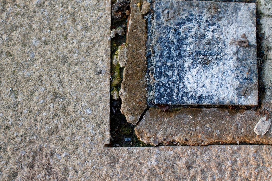
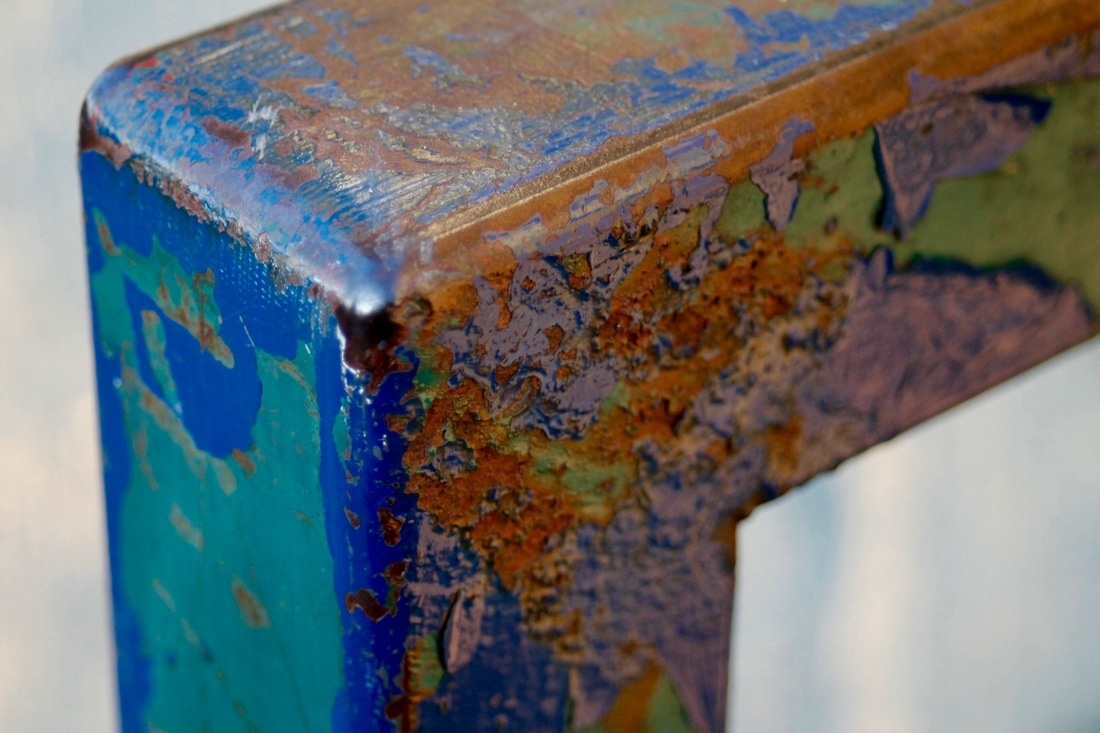
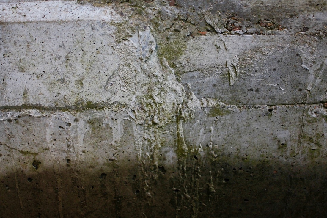
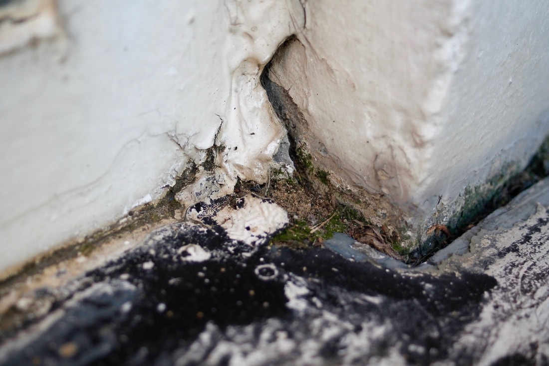
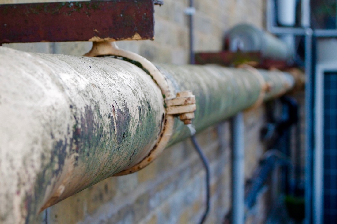
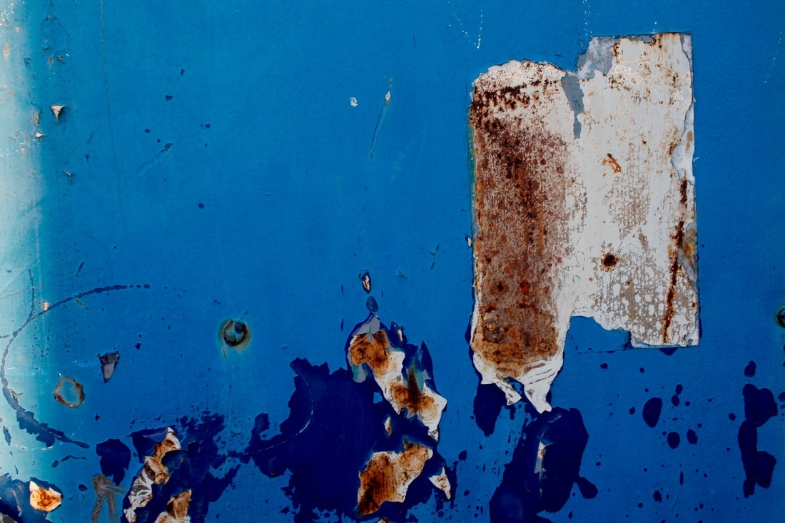
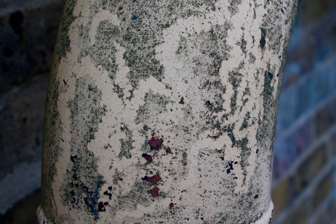
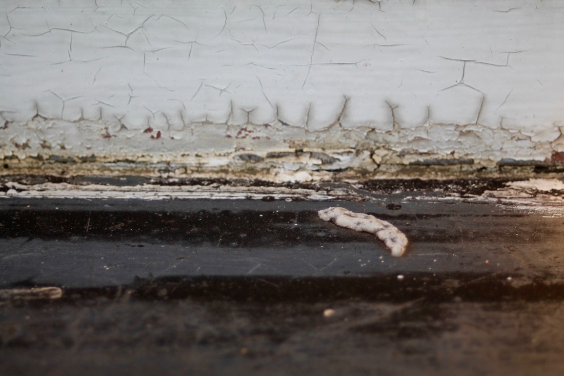
Decay
Decay
dɪˈkeɪ/
verb
(of organic matter) rot or decompose through the action of bacteria and fungi.
"the body had begun to decay"
synonyms: decompose, rot, putrefy, go bad, go off, spoil, fester, perish, deteriorate
dɪˈkeɪ/
verb
(of organic matter) rot or decompose through the action of bacteria and fungi.
"the body had begun to decay"
synonyms: decompose, rot, putrefy, go bad, go off, spoil, fester, perish, deteriorate
Peer-Assessment
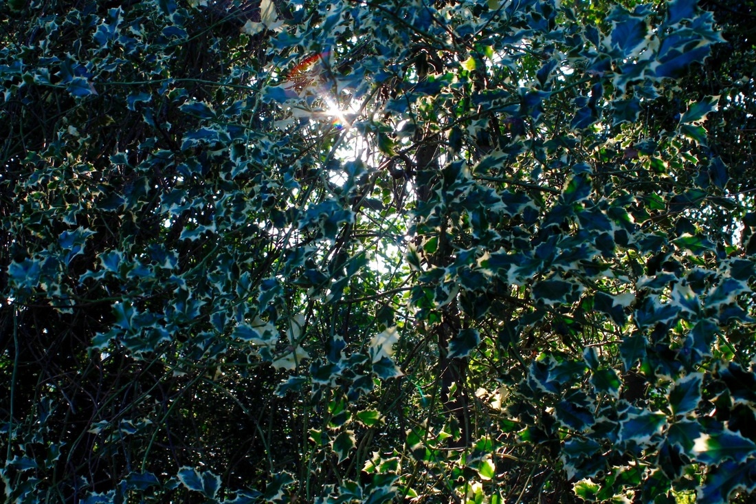
Light
WWW:
- Shows a good use of 'the rule of thirds' to compose the images correctly.
- Uses 'line' to separate different parts of the image to make it easier to the eye.
EBI:
- Some images are a little over exposed
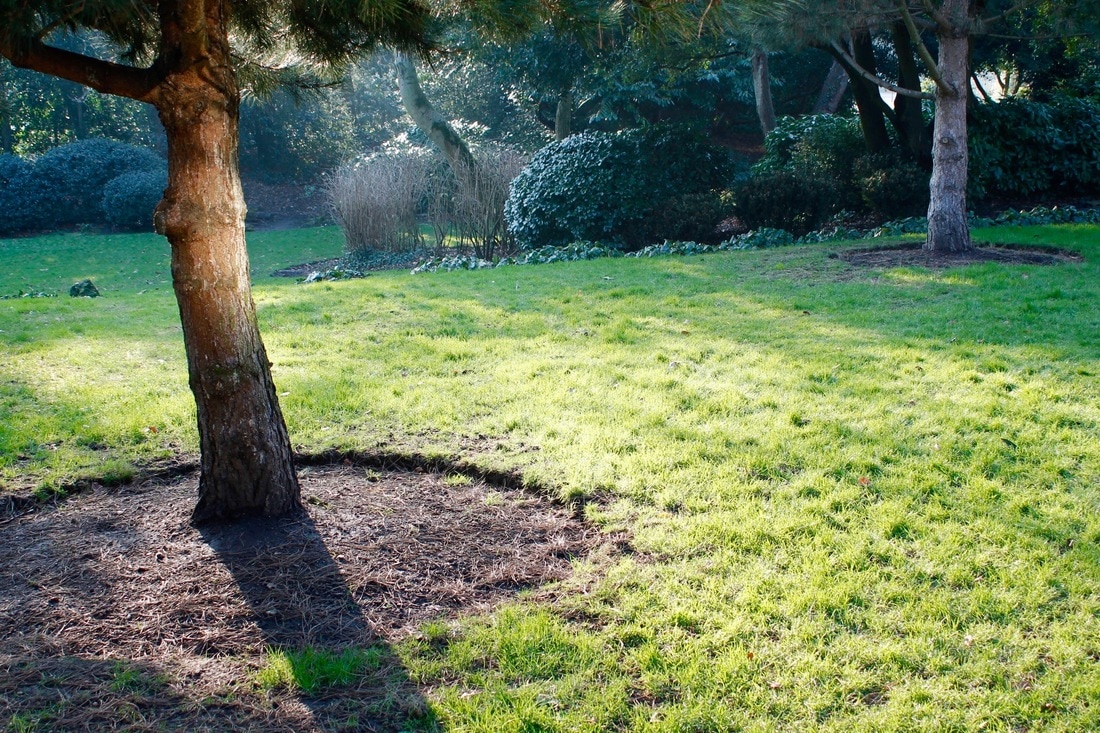
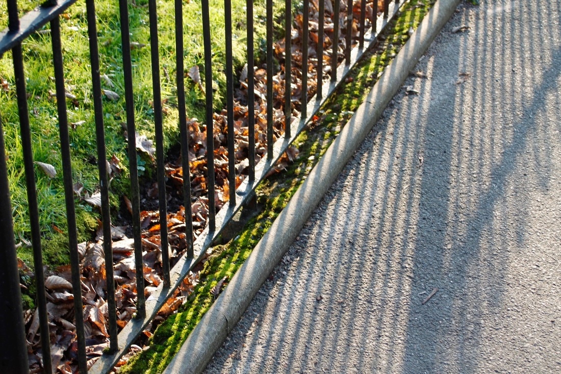
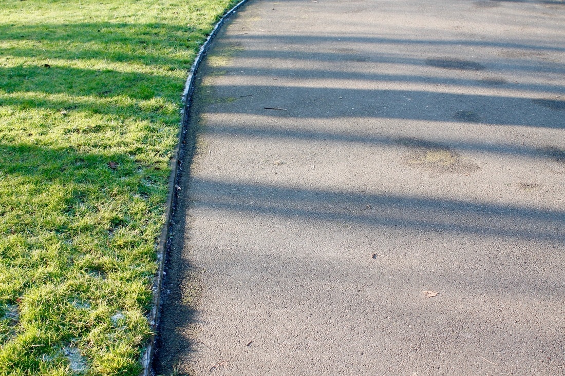
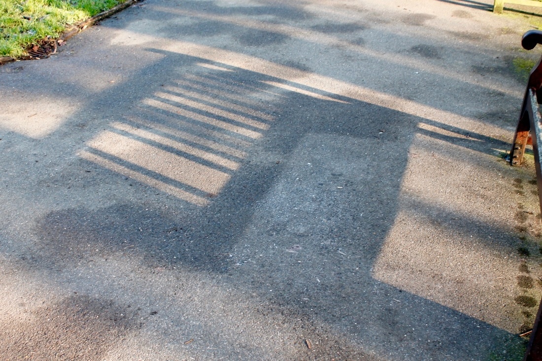
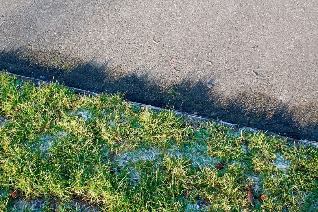
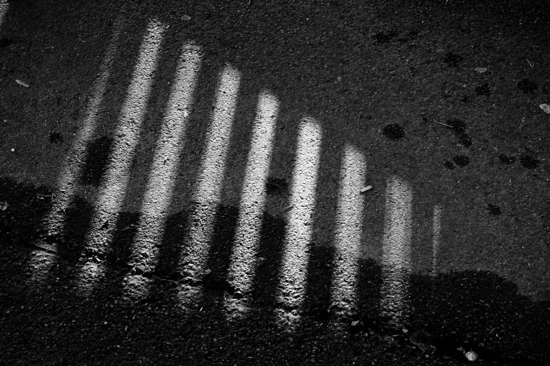
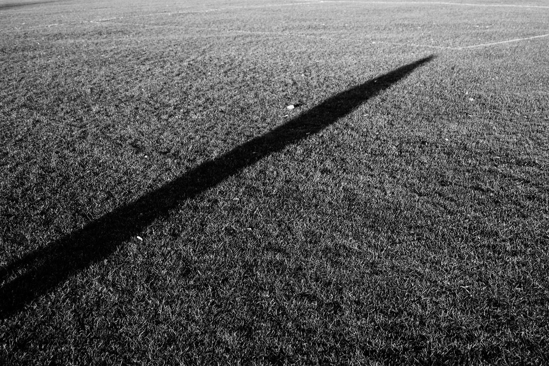
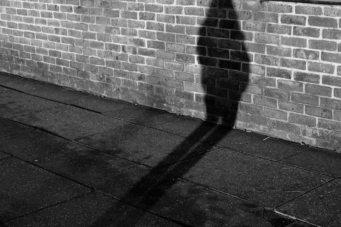
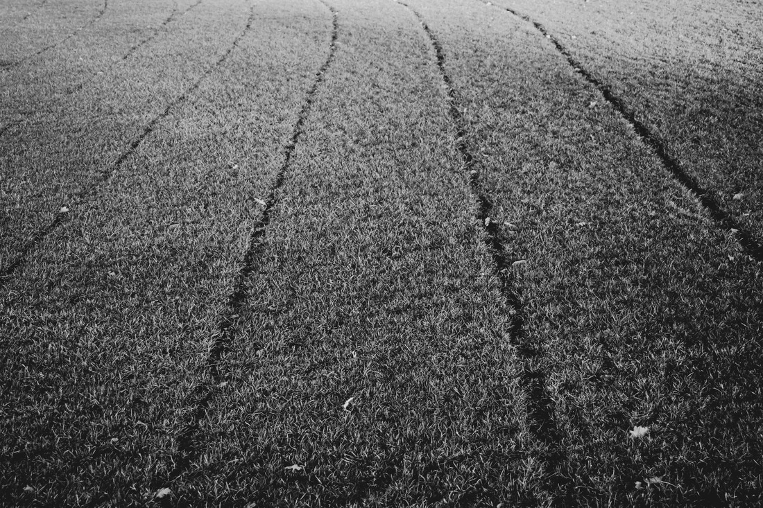
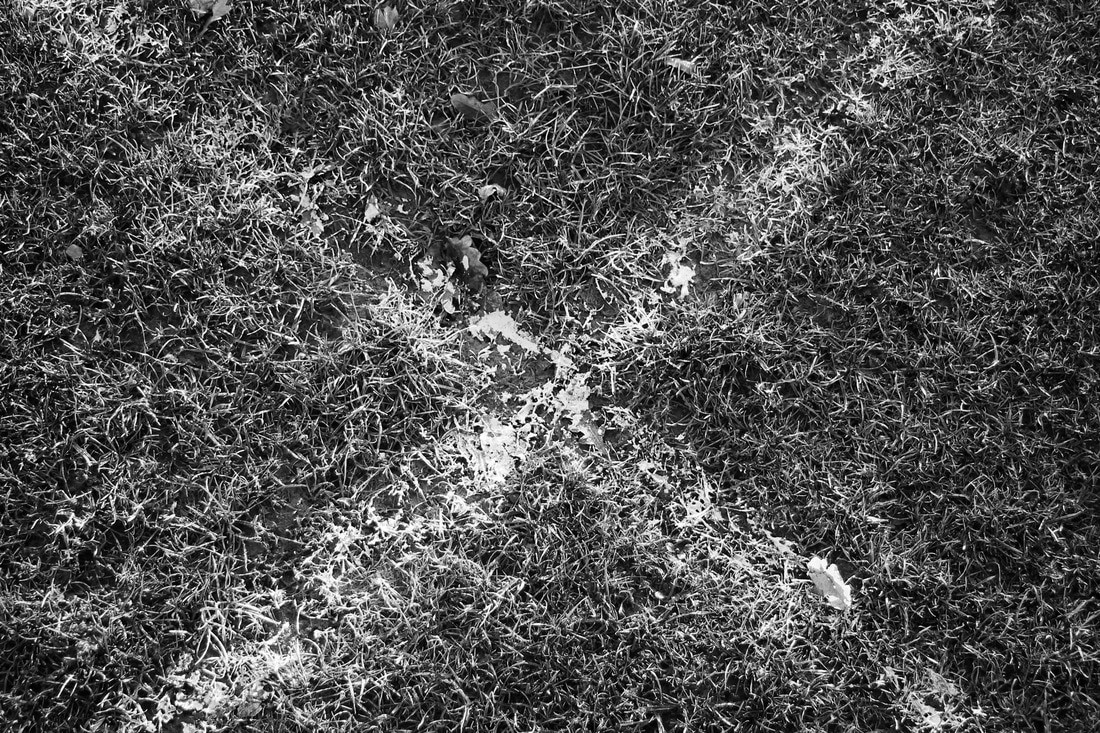
Contrast
WWW:
- Uses black and white to show the contrasting colours better.
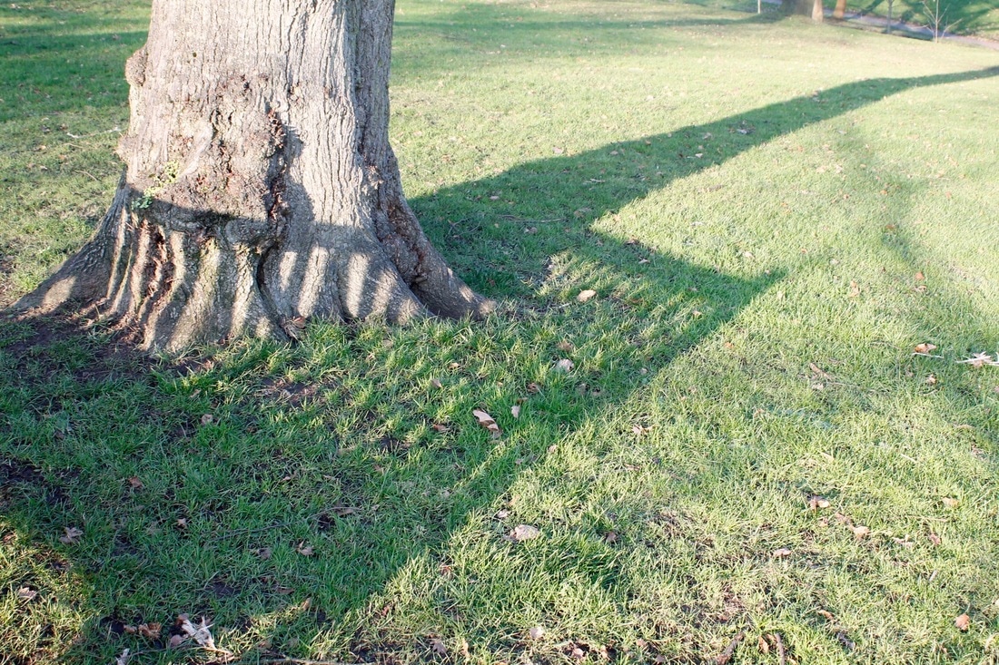
- Chooses to take pictures of objects that cast stronger shadows to show contrast.(e.g the grass casting small but frequent shadows)
- Good choice of objects that cast complex and more exciting shadows.
EBI:
- Some pictures are taken at angles or are not straight enough which makes it a bit harder to look at.(e.g 3rd picture to the right could have been straightened slightly in photoshop or when you took the picture.
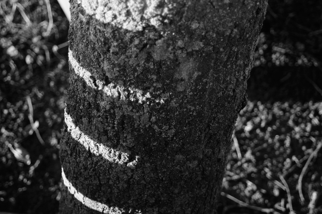
Decay
WWW:
- Good at using very close up pictures to show tiny details which represent decay very well.
- Some of the pictures are composed very well in the frame making it a much more pleasant picture.
- Good use of contrasting colours (e.g blue with rustic brown/orange)
EBI:
- Again some of the images need straightening in photoshop or while picture is being taken.
WWW:
- Shows a good use of 'the rule of thirds' to compose the images correctly.
- Uses 'line' to separate different parts of the image to make it easier to the eye.
EBI:
- Some images are a little over exposed
Contrast
WWW:
- Uses black and white to show the contrasting colours better.
- Chooses to take pictures of objects that cast stronger shadows to show contrast.(e.g the grass casting small but frequent shadows)
- Good choice of objects that cast complex and more exciting shadows.
EBI:
- Some pictures are taken at angles or are not straight enough which makes it a bit harder to look at.(e.g 3rd picture to the right could have been straightened slightly in photoshop or when you took the picture.
Decay
WWW:
- Good at using very close up pictures to show tiny details which represent decay very well.
- Some of the pictures are composed very well in the frame making it a much more pleasant picture.
- Good use of contrasting colours (e.g blue with rustic brown/orange)
EBI:
- Again some of the images need straightening in photoshop or while picture is being taken.
Close up + Far away