Double Exposure
Christoffer Relander
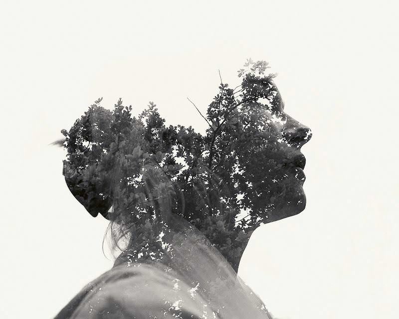
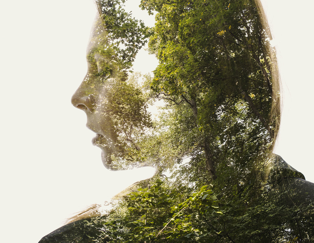
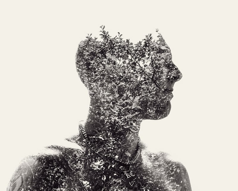
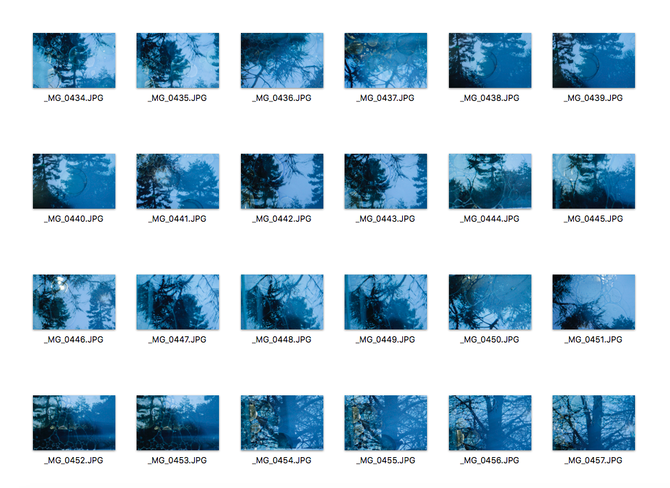
Christoffer Relander uses a technique inspired by multiple exposure to create ‘We Are Nature’: a series of dreamy, surreal images based on the relationship between man and nature. For his “We Are Nature” series, Relander began experimenting with this technique back in 2010 while shooting spontaneous portraits. The series is not about any specific individual; it is about man and nature itself. By keeping the identities of the models anonymous, it leaves space for the viewer’s own perception. At the initial stage, Relander scouted for overexposed settings to shoot in to mask his subjects, which he placed in darker areas, from their background. The portraiture images, as well as the texture images, needed to be shot against bright backgrounds. He didn’t like too many peripheral objects distracting his focus and he preferred hills with adjacent trees as the backdrop. Then, once he located the scene, he creates the portrait image by visualising how the shapes will overlay and blend with the nature.
My Response
|
|
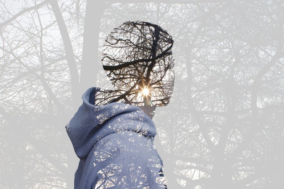
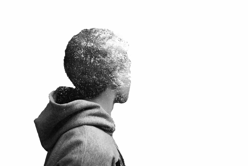
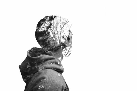
I am very pleased with my double exposure images. I managed to successfully create it on photoshop using the steps I explained in the slideshow. I like how in my final attempt of double exposure, you can only see a silhouette of the model and the background looks very faded but is still visible. I also like how the sun is right in the middle of the model. Next time I do double exposure, I would like to edit more photos with different backgrounds - for example the city - to show my understanding of it. Whilst I was photographing my model, I purposely took side profiles of him because if they were just normal portraits, you wouldn't be able to see the outline of his face.
Tim Tadder
Waterwigs
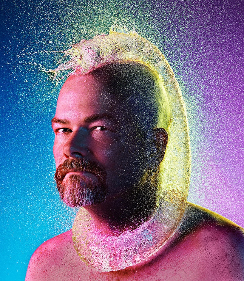
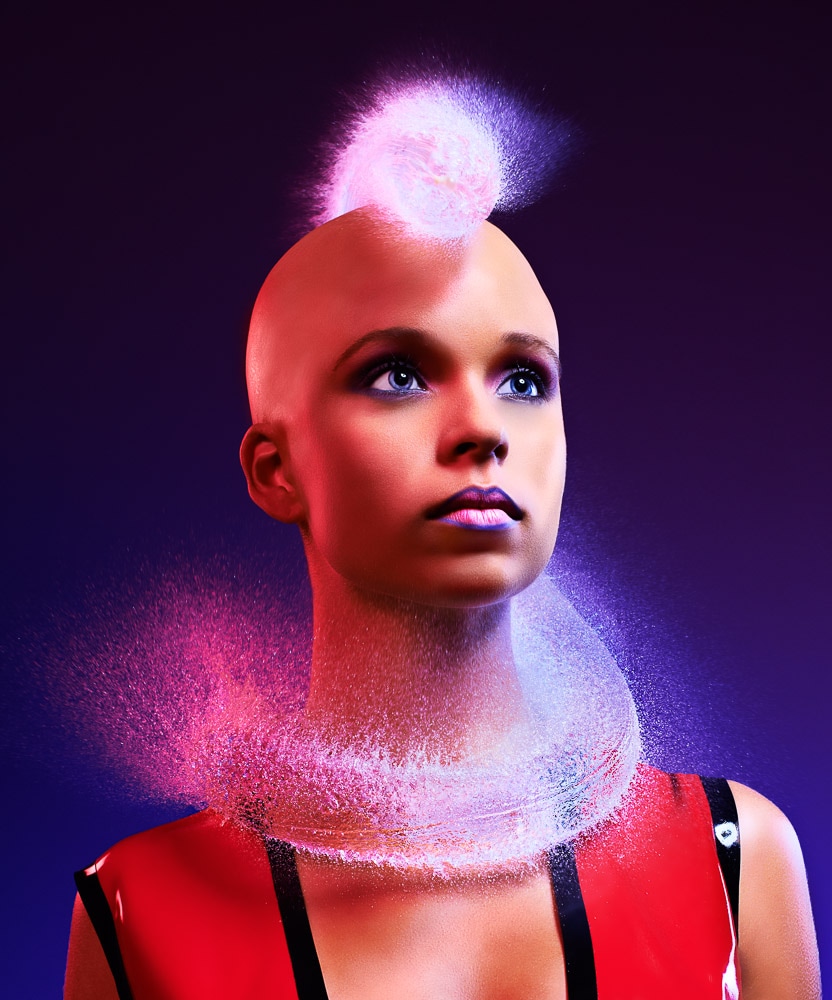
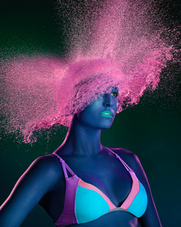
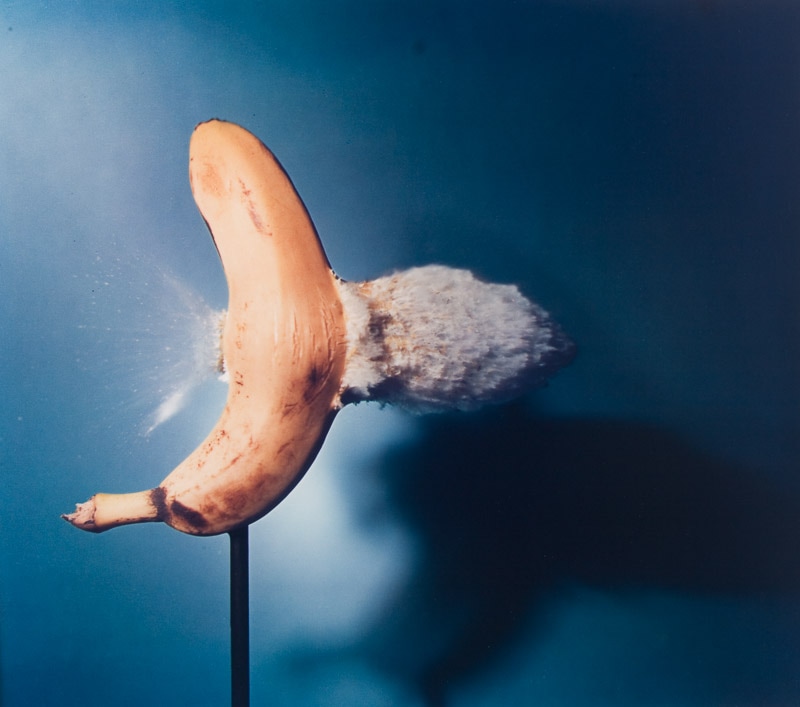
Tim Tadder is an internationally acclaimed photographic artist. In 2015 Epson, the world leader in photographic printing technology recognized Tadder as one of the top influential photographers, producing a TV commercial and worldwide ad campaign featuring Tadder and his work. Most recognized for his highly inventive conceptual advertising photography Tadder has been ranked in the top 200 photographers worldwide by the prestigious Luezer Archive Magazine 8 years running. These images are shot in complete dark, using powerful strobes to capture the action so sharply. Originally, he triggered the strobes and camera using a laser trigger with a slight delay, so that as the balloon dropped, it would cut the path of the laser beam, and hopefully trigger when burst. But when that proved too unreliable, he switched to an audio trigger, snapping the photos with the sound of the balloon popping. For some of the photos, water balloons are simply dropped on the head of the model, but for others long balloons are draped over the subject, and then popped when needed. Tadder has previously said that he wants to use these images to work with cancer foundations, but advertisers have expressed interest, too.
Martin Klimas
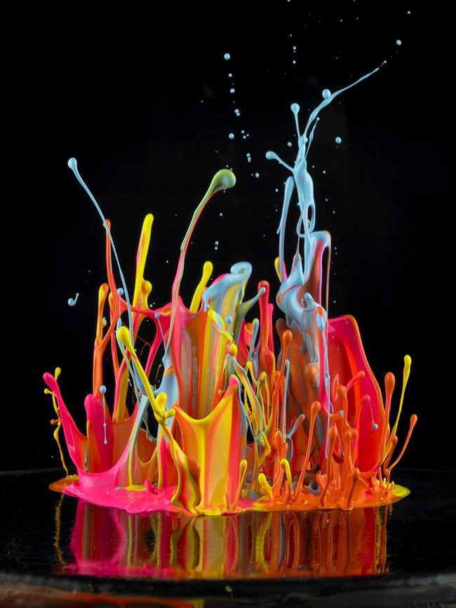
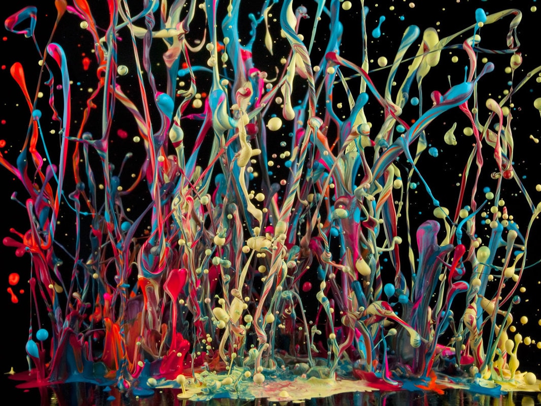
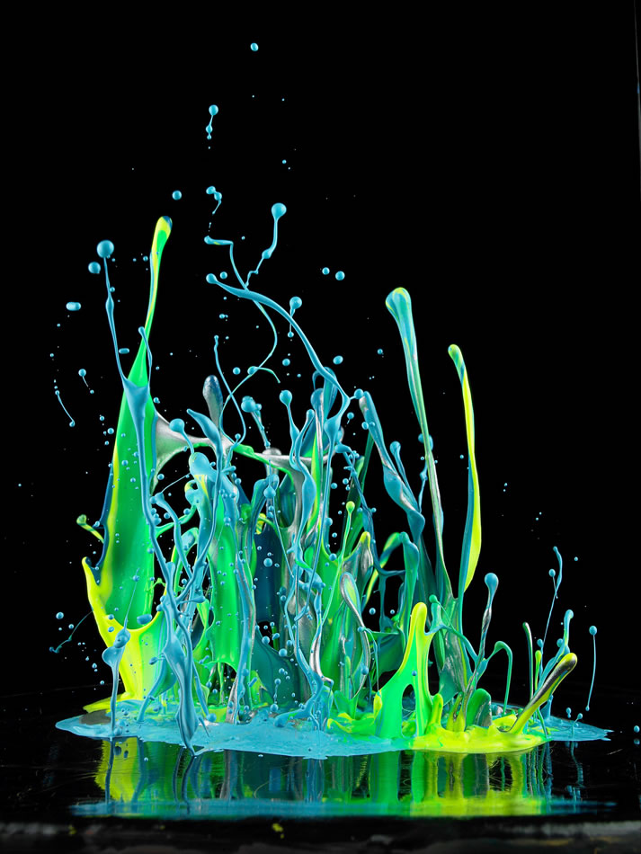
German photographer Martin Klimas is known for his work surrounding high speed photography to capture moments otherwise invisible to the human eye. His project, Sonic Sculptures, enables the viewer to visualize the impact of sound as streams of colorful paint are thrown upward by sound waves from a speaker. After splashing paint on stretched canvases suspended over a speaker, Klimas turns the music up to full volume. As the vibrations from the speaker to throw the paint upwards, the resulting intricate patterns are captured in his high-speed photographs. While each individual photograph is quite interesting, the project becomes truly fascinating when the photographs are compared and the differences in pattern between songs are revealed.
Harold Edgerton
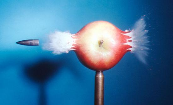
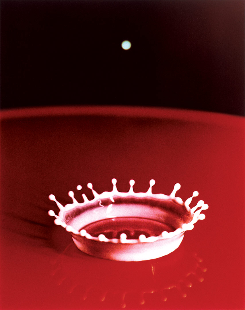
Before Harold Edgerton rigged a milk dropper next to a timer and a camera of his own invention, it was virtually impossible to take a good photo in the dark without bulky equipment. It was similarly futile to try to photograph a fleeting moment. But in the 1950s at his lab at MIT, Edgerton started tinkering with a process that would change the future of photography. There the electrical-engineering professor combined high-tech strobe lights with camera shutter motors to capture moments imperceptible to the naked eye. Milk Drop Coronet, his revolutionary stop-motion photograph, freezes the impact of a drop of milk on a table, a crown of liquid discernible to the camera for only a millisecond. The picture proved that photography could advance human understanding of the physical world, and the technology Edgerton used to take it laid the foundation for the modern electronic flash.
Edgerton worked for years to perfect his milk-drop photographs, many of which were black and white; one version was featured in the first photography exhibition at New York City’s Museum of Modern Art, in 1937. And while the man known as Doc captured other blink-and-you-missed-it moments, like balloons bursting and a bullet piercing an apple, his milk drop remains a quintessential example of photography’s ability to make art out of evidence.
Edgerton worked for years to perfect his milk-drop photographs, many of which were black and white; one version was featured in the first photography exhibition at New York City’s Museum of Modern Art, in 1937. And while the man known as Doc captured other blink-and-you-missed-it moments, like balloons bursting and a bullet piercing an apple, his milk drop remains a quintessential example of photography’s ability to make art out of evidence.
Force Pinterest Board
Force Homework
FORCE
noun
noun
- 1.
strength or energy as an attribute of physical action or movement.
"he was thrown backwards by the force of the explosion"
synonyms: strength, power, energy, might, potency, vigour, muscle, stamina, effort, exertion, impact, pressure, weight
"Eddie delivered a blow with all his force" - 2.
coercion or compulsion, especially with the use or threat of violence.
"they ruled by law and not by force"
synonyms:coercion, compulsion, constraint, duress, oppression, enforcement, harassment, intimidation, threats, pressure, influence
- 1.
make a way through or into by physical strength; break open by force.
"the back door of the bank was forced"
synonyms:break open, force open, burst open, prise open, kick in, knock down,
"the doors had to be forced" - 2.
make (someone) do something against their will.
"she was forced into early retirement"
synonyms:compel, coerce, make, constrain, oblige, impel, drive, necessitate, pressurize, pressure, press, push
|
|
|
Favourite images edited
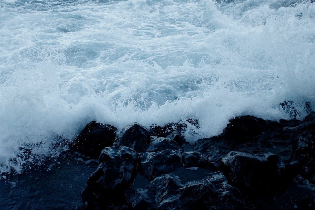
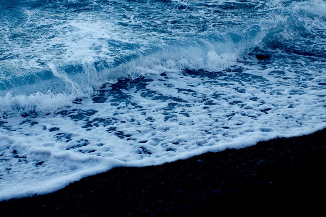
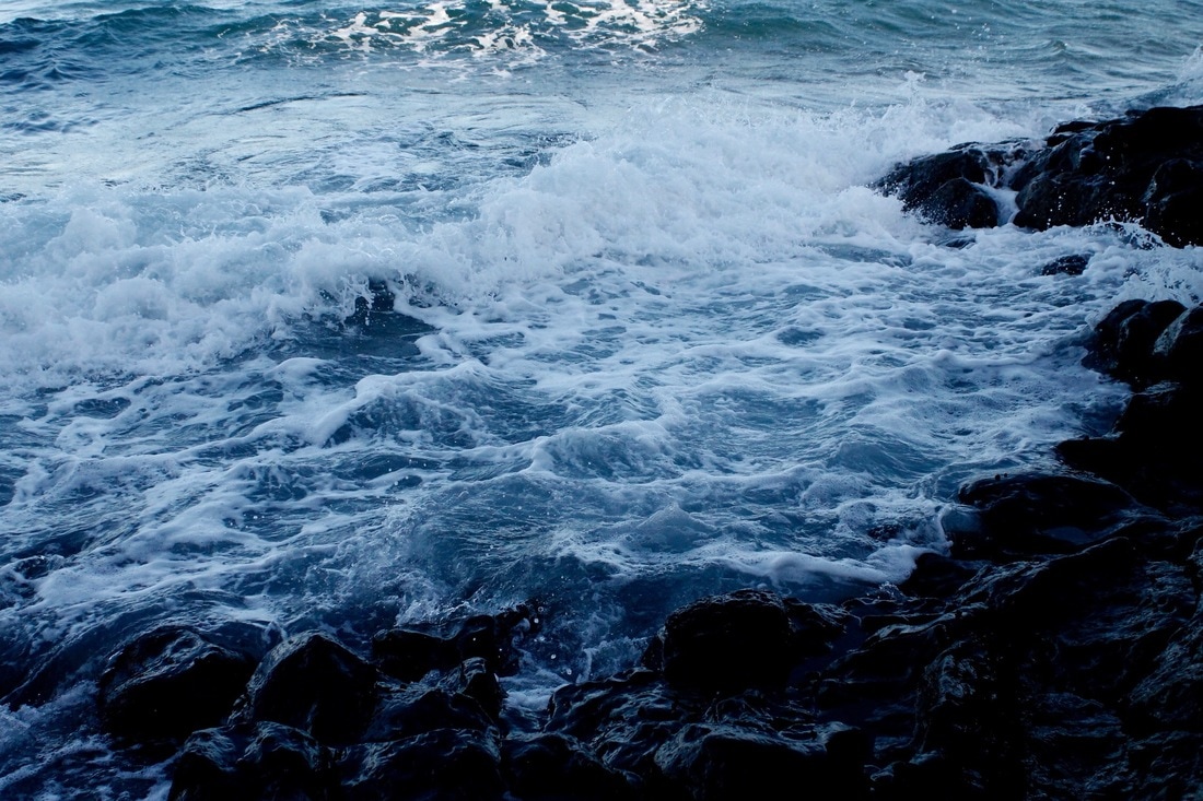
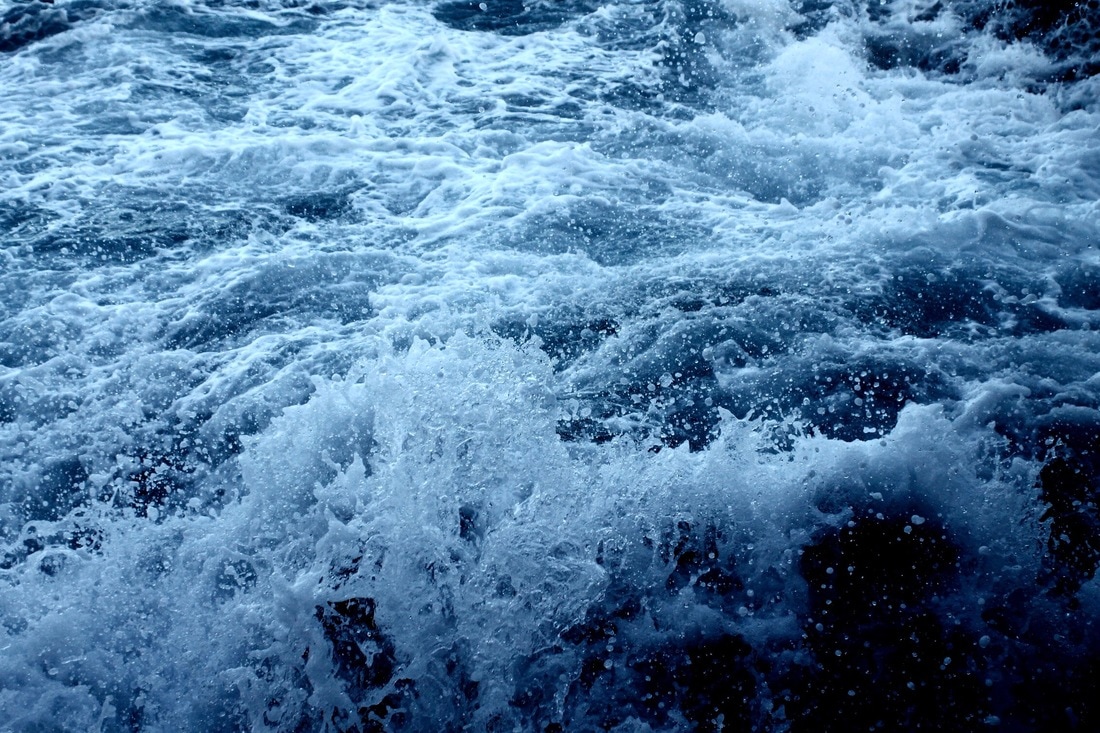
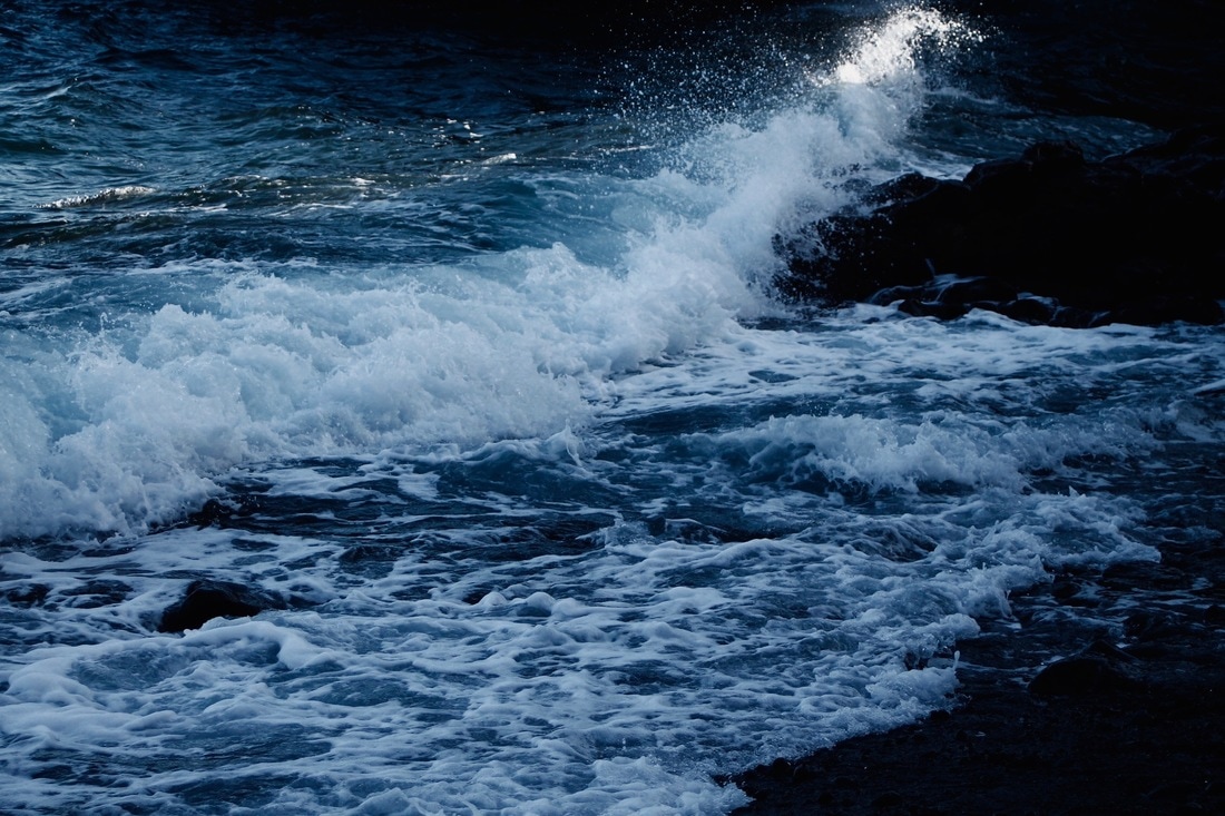
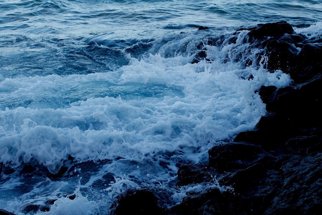
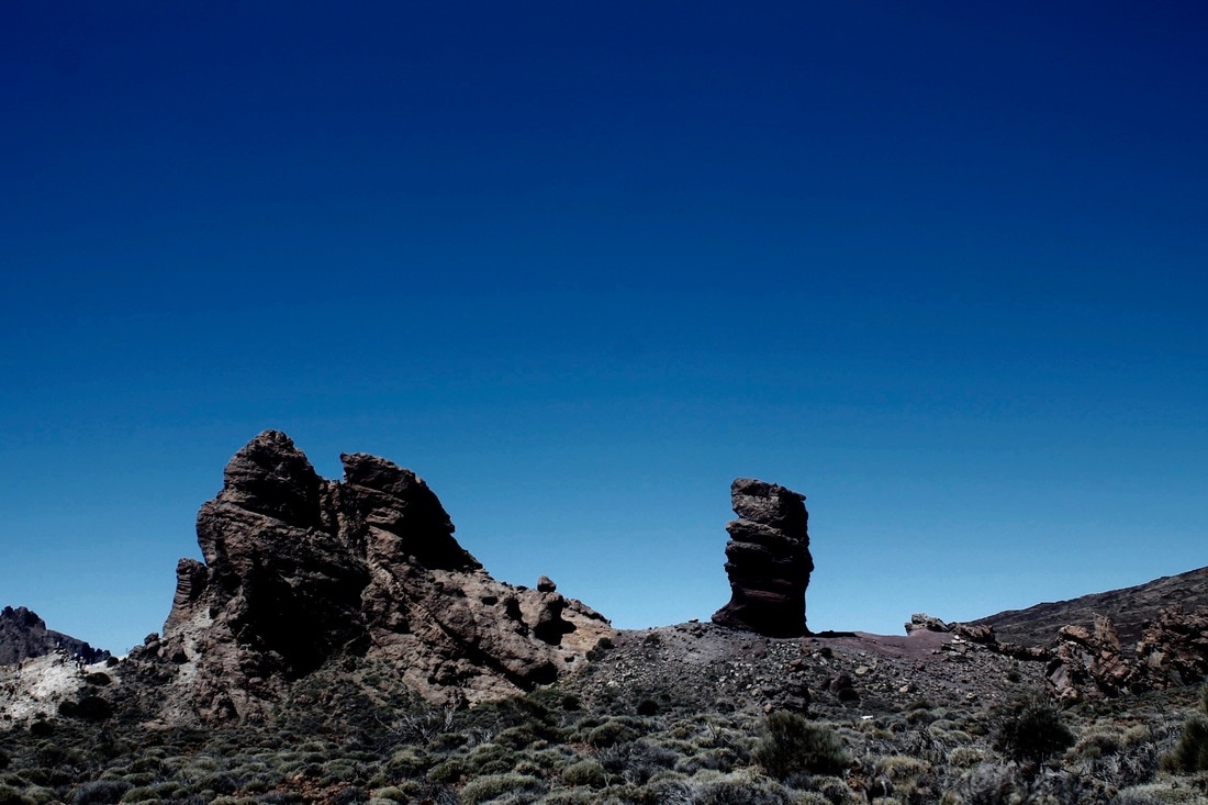
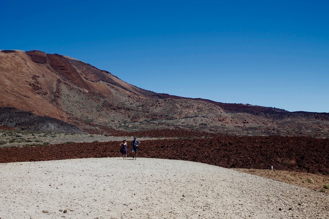
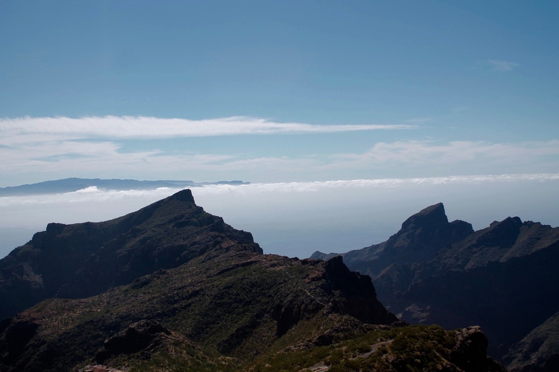
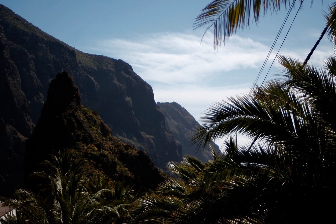
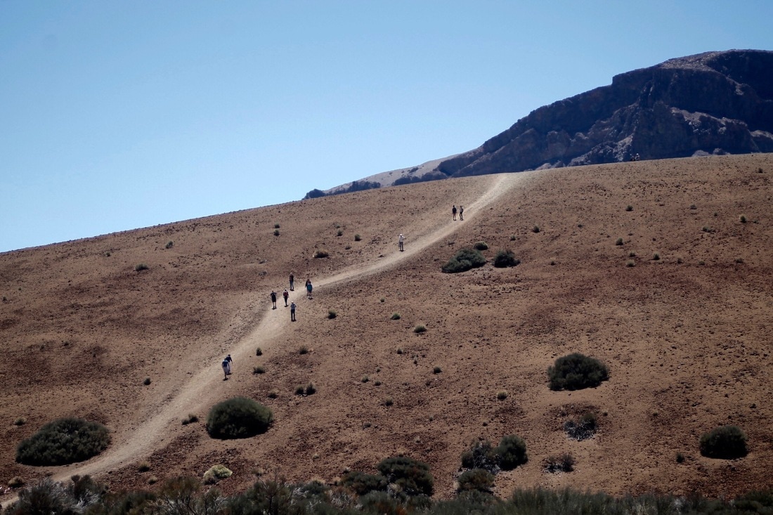
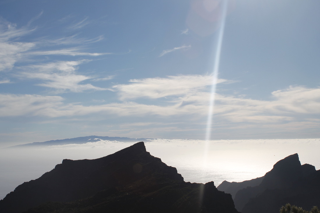
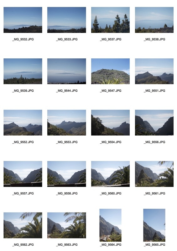
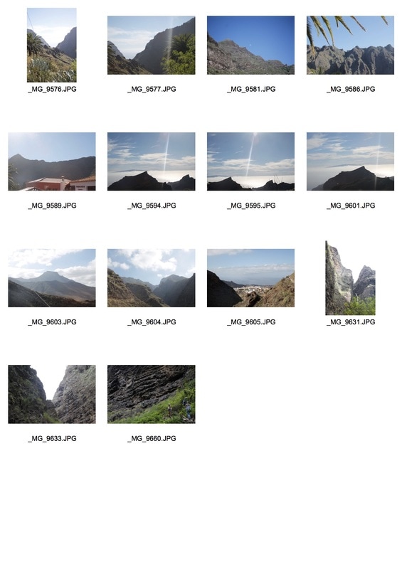
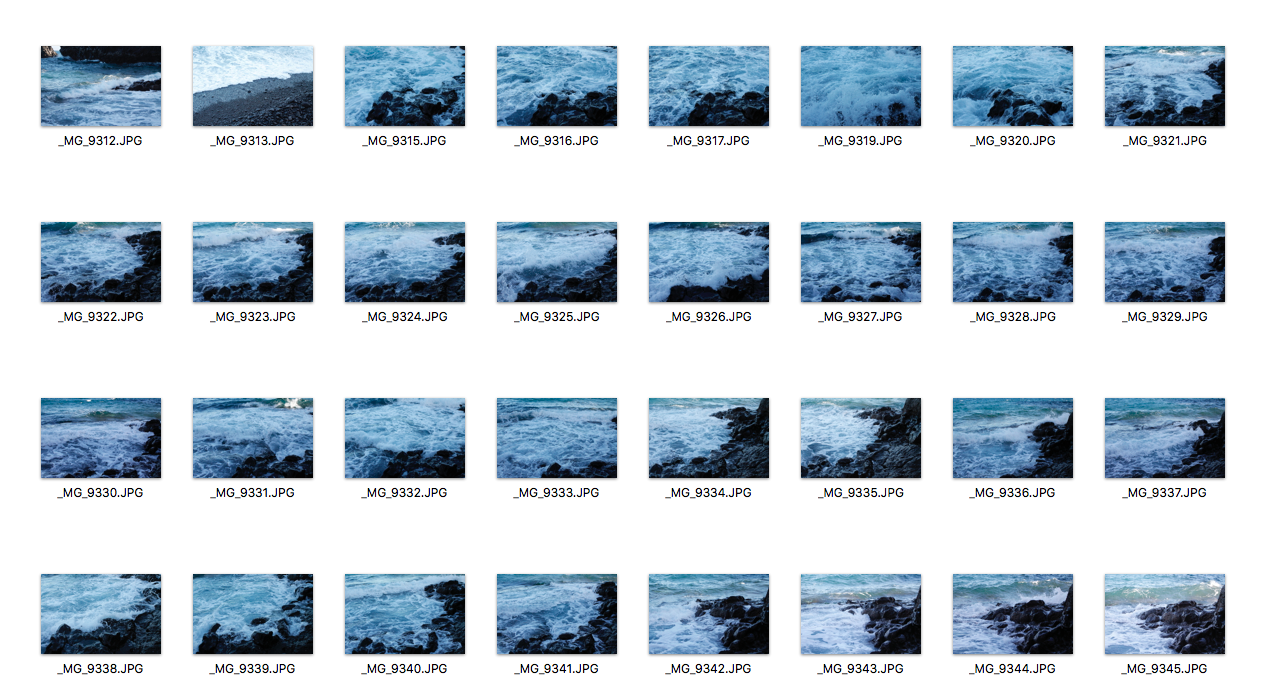
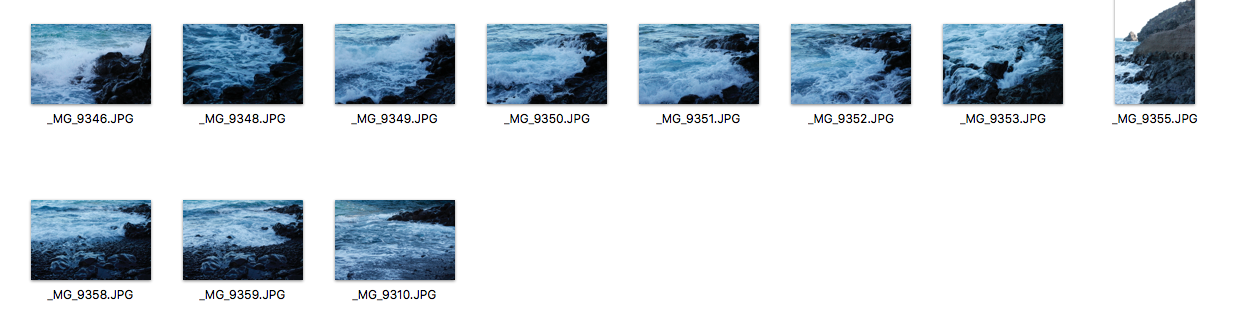
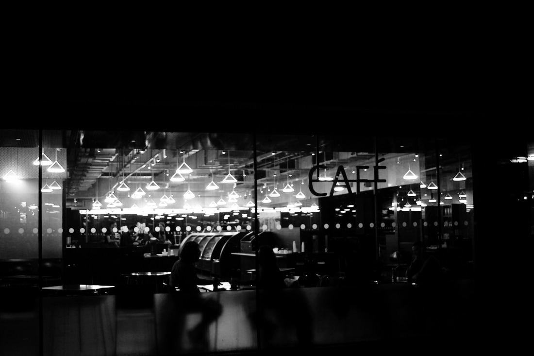
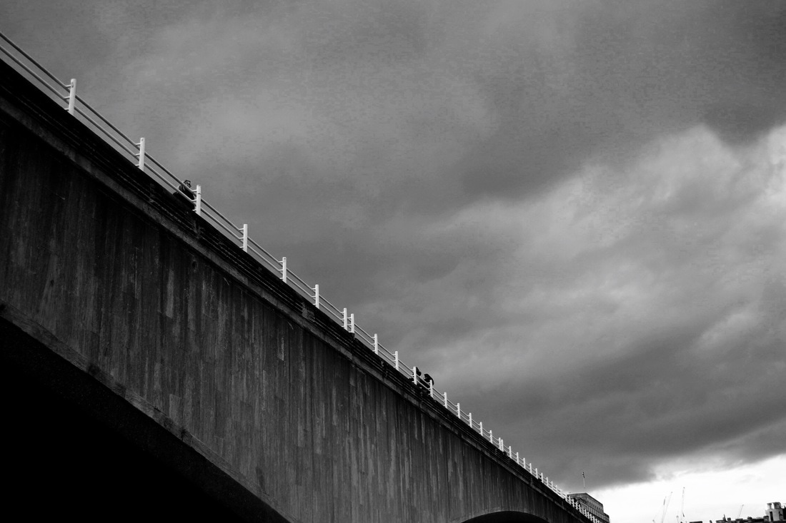
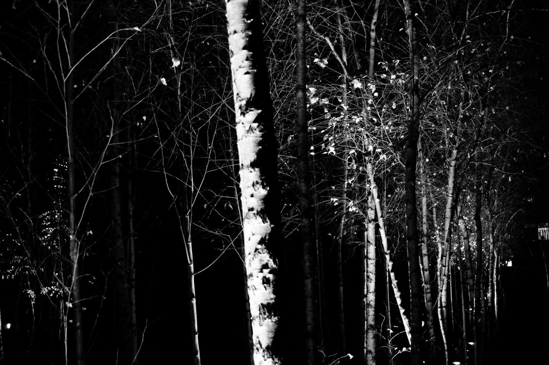
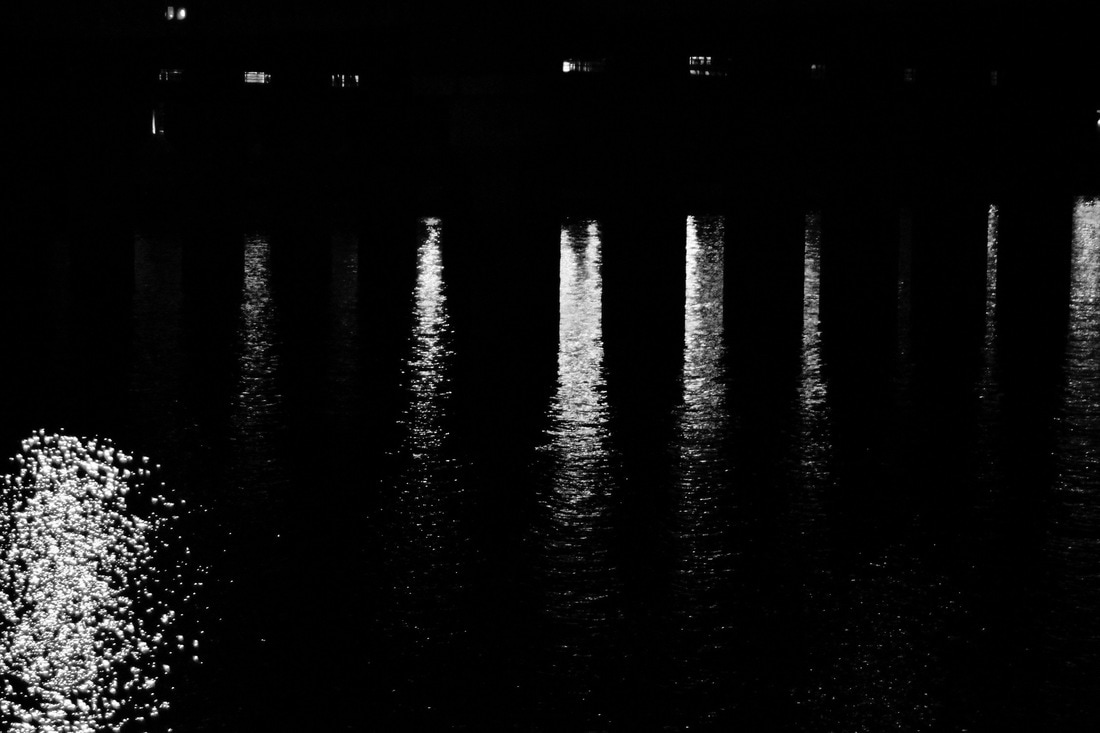
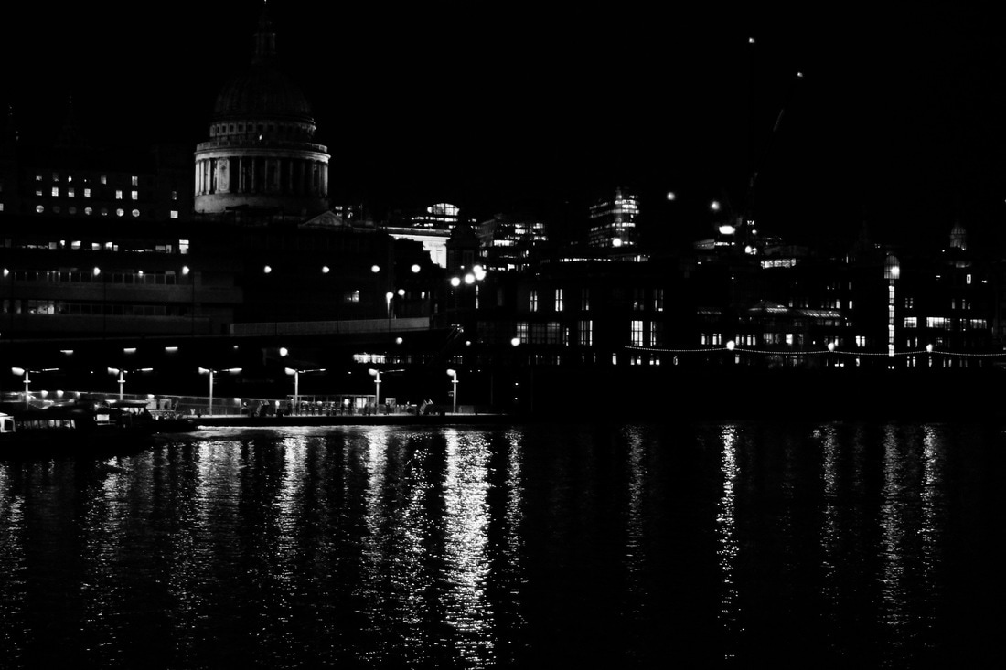
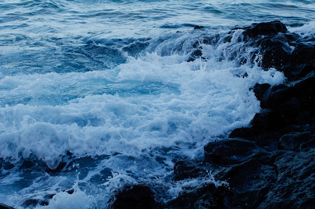
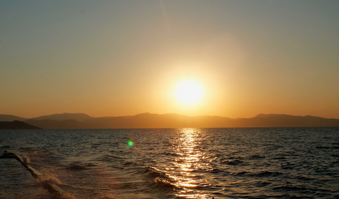
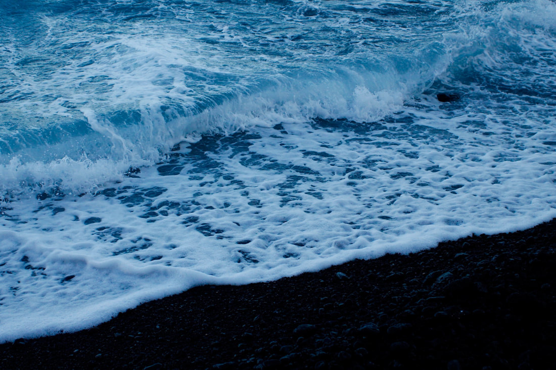
In this task, we had to photograph 'force'. The word force could lead you to anything in photography as there is such a wide variety of different forces. I went on holiday to Tenerife over the holidays and I chose to capture the force of nature as I went on many adventures and discovered how powerful the force of nature is. Firstly, I photographed the force of waves as there were many beaches there which gave me an opportunity to experiment photographing them. I managed my exposure and shutter speed very well as the waves look very clear and still, however I think I should have not just photographed the same waves and I could have gone to various different beaches and photographed different types of waves. I also went on a hike which was another opportunity to capture the force of nature which really emphasised how unchallengeable force is and how unstoppable it is. My images really accentuate the vastness and significance nature is to humans. Some of my images are a little over exposed but I think I managed my shutter speed very well as the images are very clear and crisp. Furthermore, I like how in a few of my images you can see people in the distance walking which again emphasises the immenseness of nature.
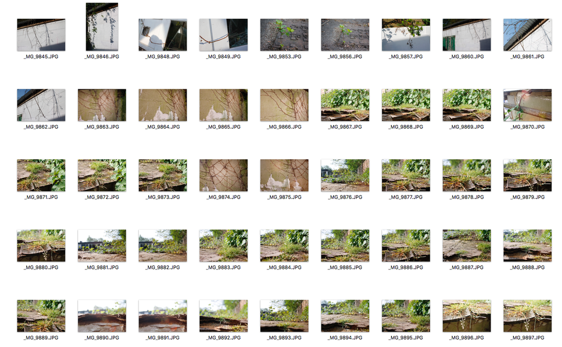
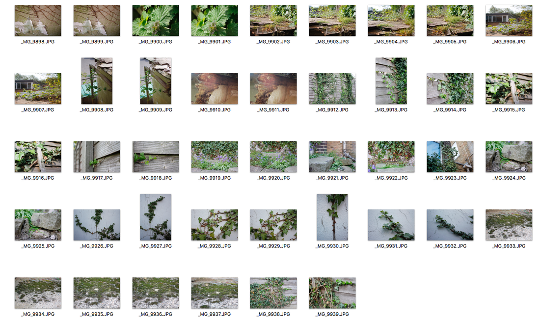
Force Of Nature around school
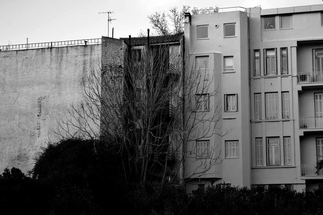
In this task we were asked to photograph places that show the true force of nature around school and the battle that it faces to reclaim its natural territory. This links to the theme as it portrays the relentless battle between man and the natural environment that he inhabit's which is one that holds endless visual possibilities. The buildings and structures that man builds as symbols of prosperity and status are at their basic level simply a means of protection from the harsh environment that surrounds him.
|
|
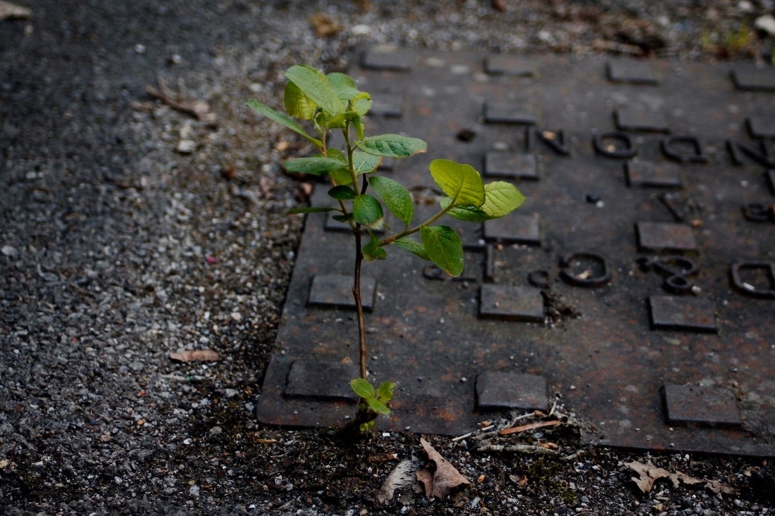
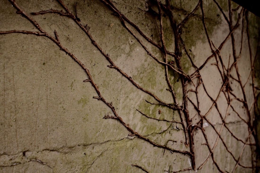
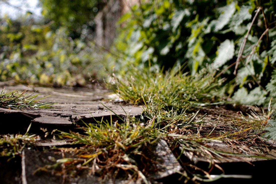
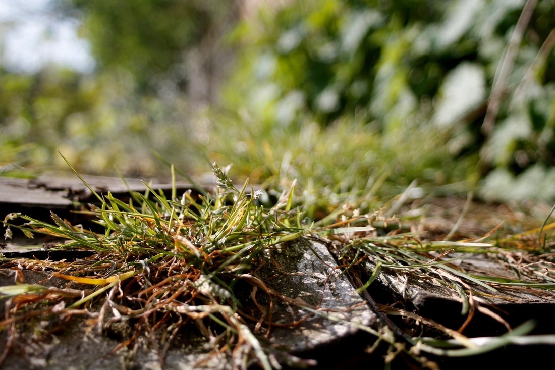
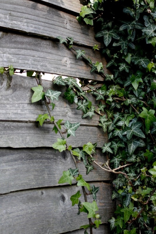
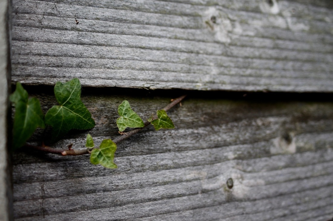
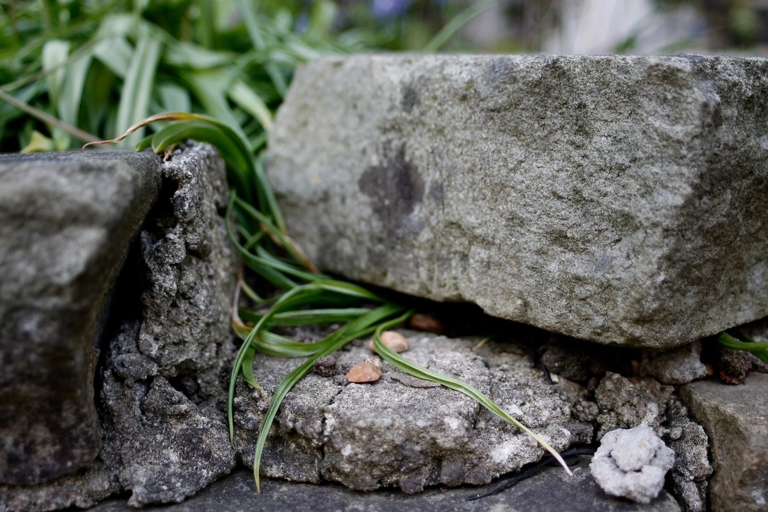
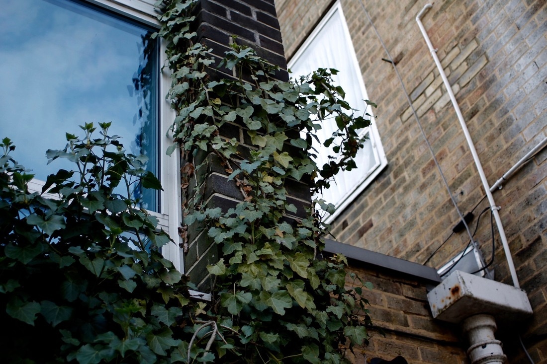
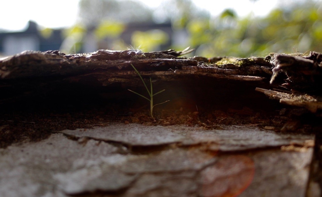
I really like the composition of my images and how I focused on very small details of how nature reclaims man-made objects. I used depth of field successfully to really focus on intricate details. Previously I photographed the force of nature but I did it in a much larger scale whereas this task was focusing more on small details and I managed to convey this in my images. Next time I should photograph out of school so that it really shows my understanding of 'Force Of Nature.'
Francois Delfosse
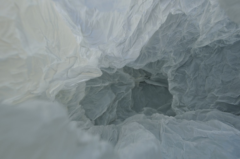
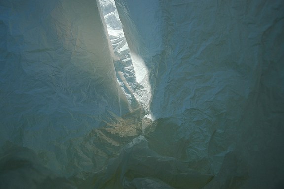
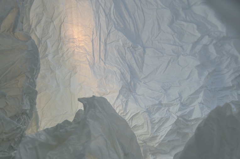
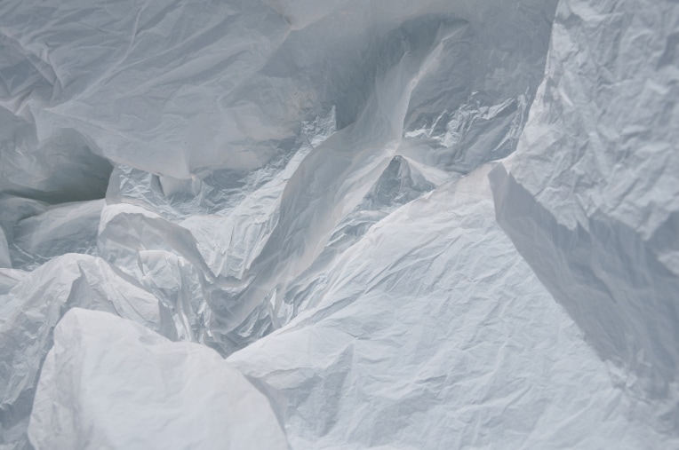
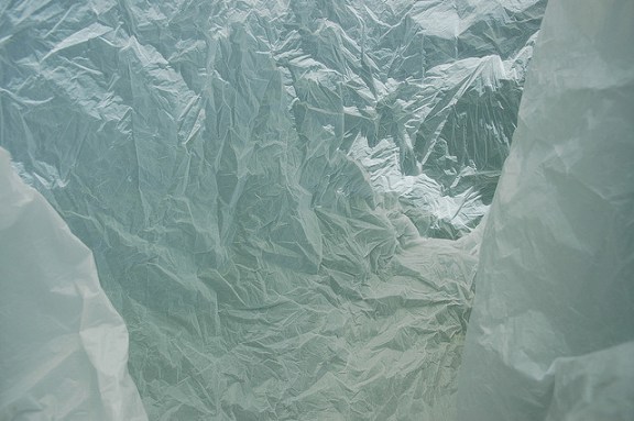
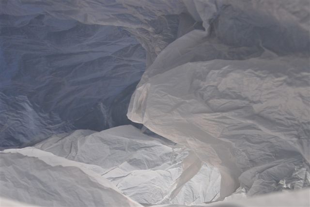
Francis Delfosse has photographed what at first seems like an icy landscape but after closer inspection we start to see that he is actually photographing a white plastic bag. He says that they were taken in a "glacier cave just North of the South Pole", before adding that they are "viewed from the inside of a plastic bag". By focusing on form, texture, lighting and colour he has managed to reinvent an object and photograph it in a way that completely throws the viewer off, without actually changing the form of the plastic bag. Instead of focusing on a passageway this image concentrates on mounds of snow. The texture of the bag makes it look as if the snow is settled and is being sculpted by the wind. The lighting casts shadows that give form to the front facing walls of the plastic bag. They start to look like steep cliff faces, which then give a sense of scale to the image. It starts to resemble some of Ansel Adams photographs of the National Park.
Applied Force
|
|
|
Best Images
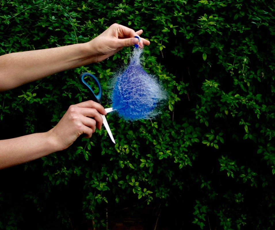
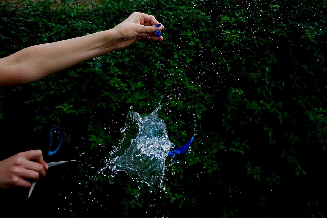
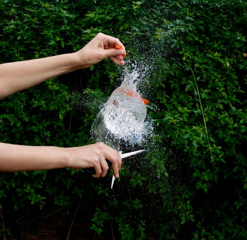
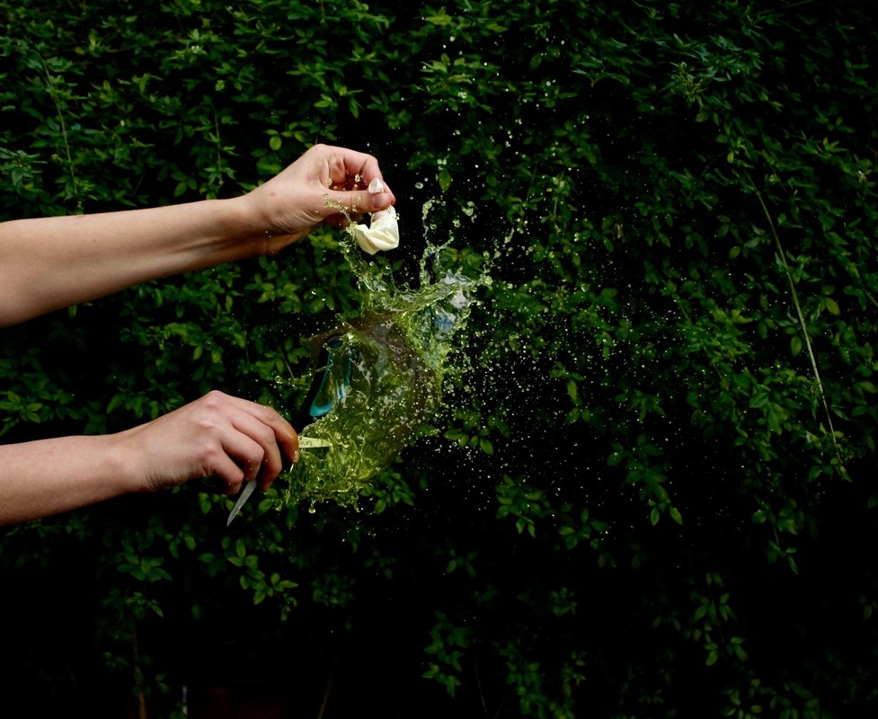
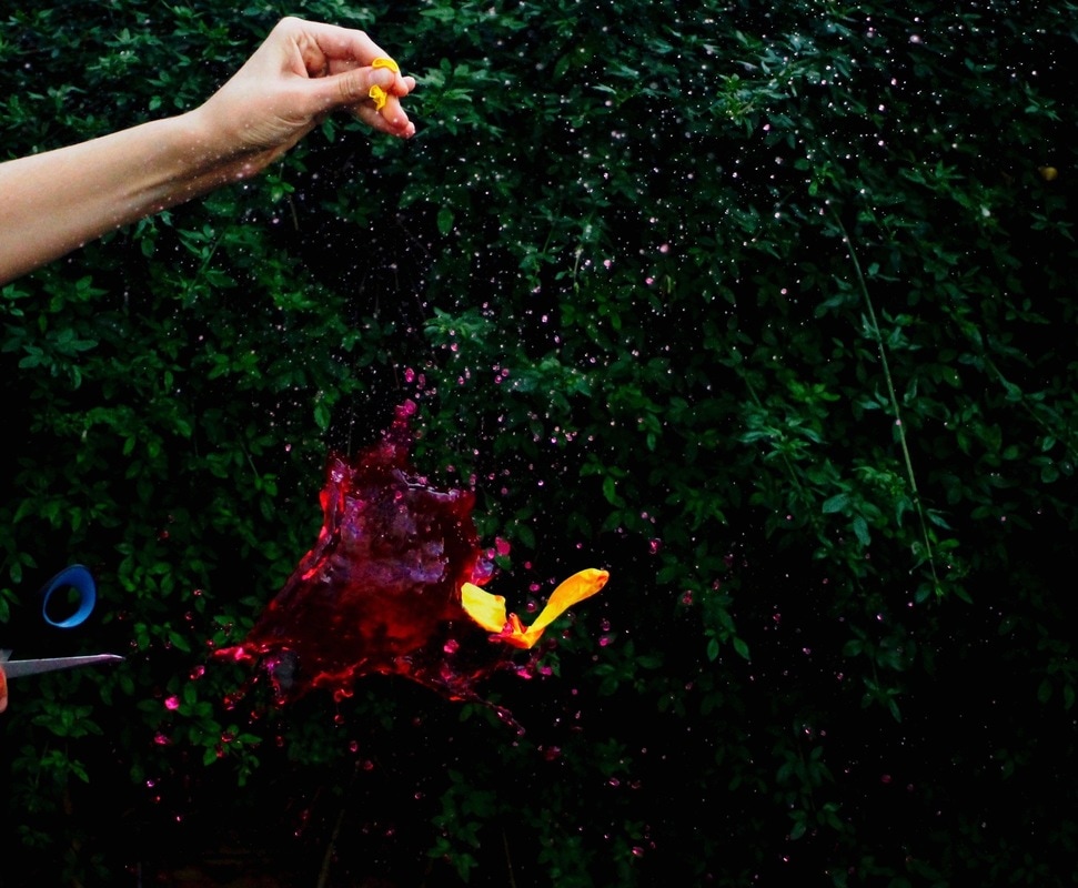
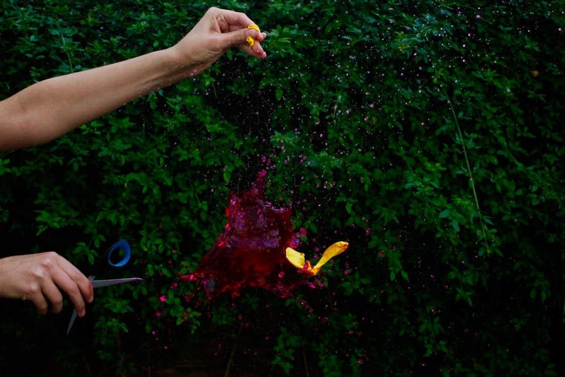
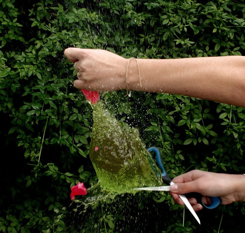
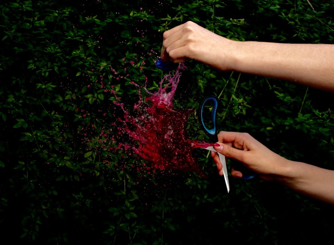
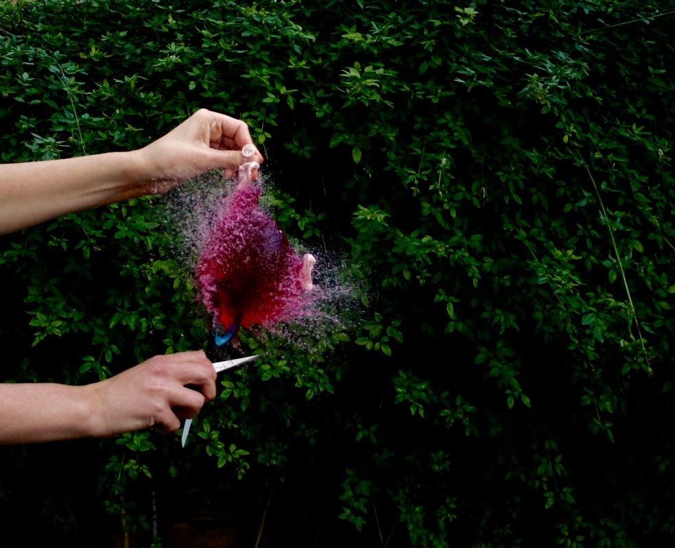
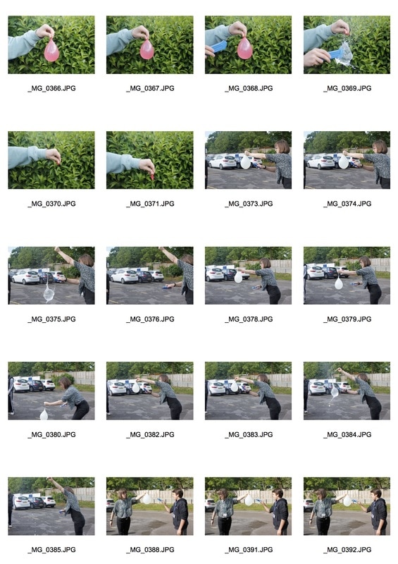
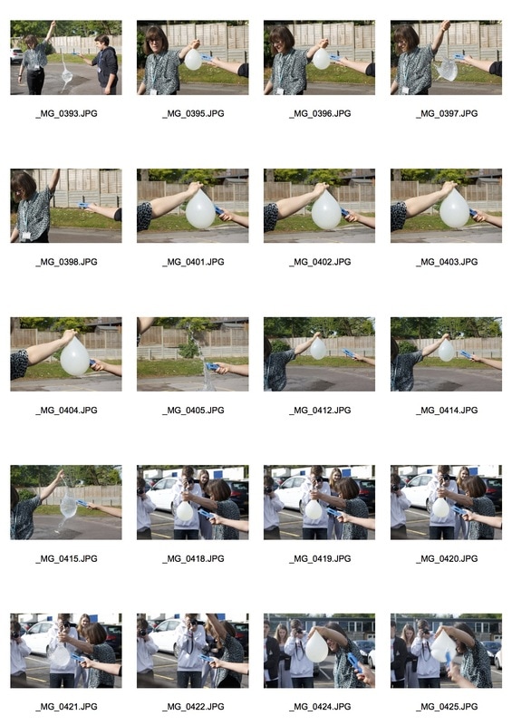
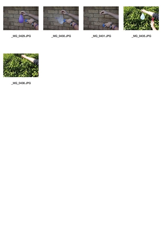
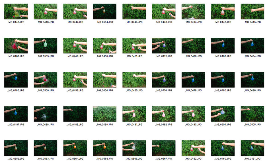
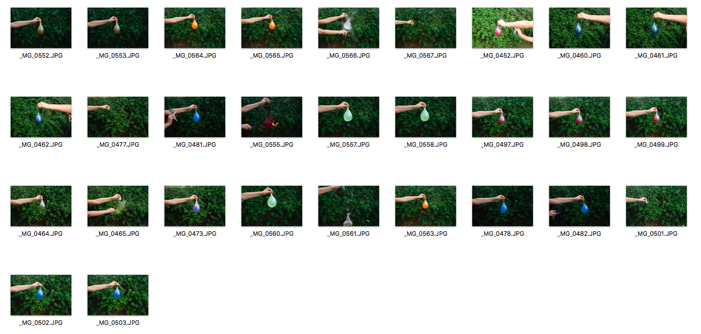
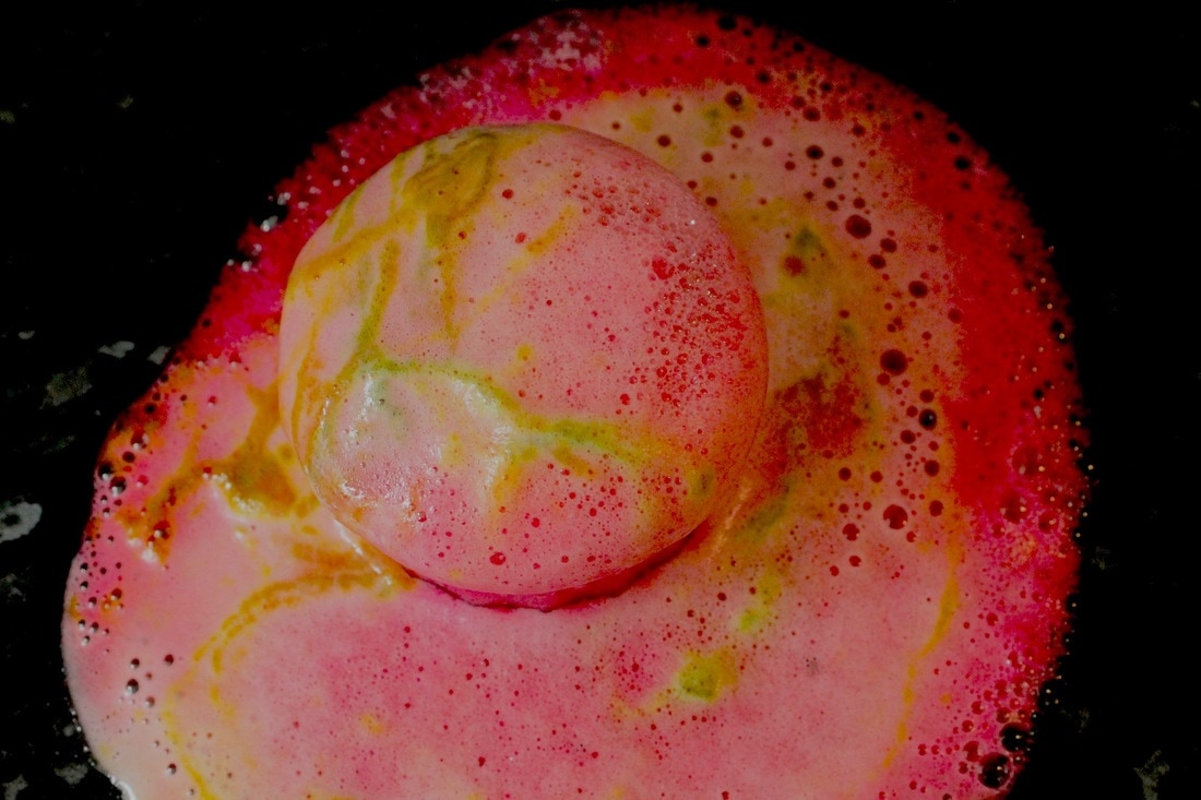
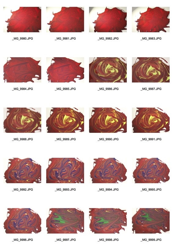
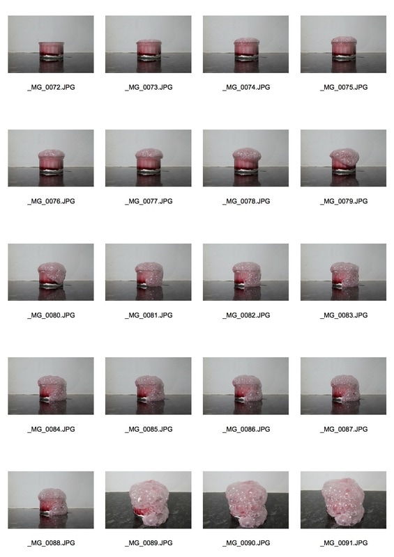
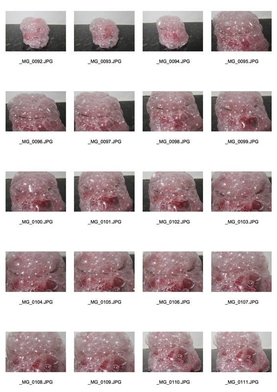
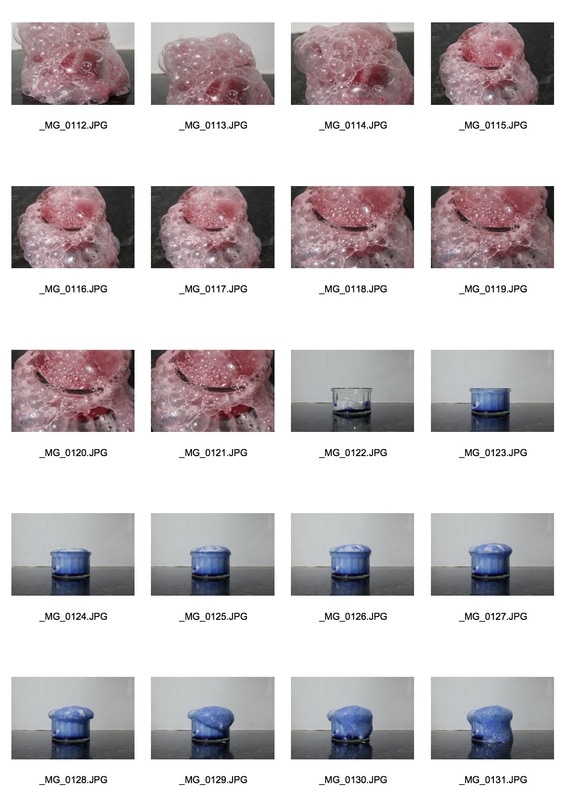
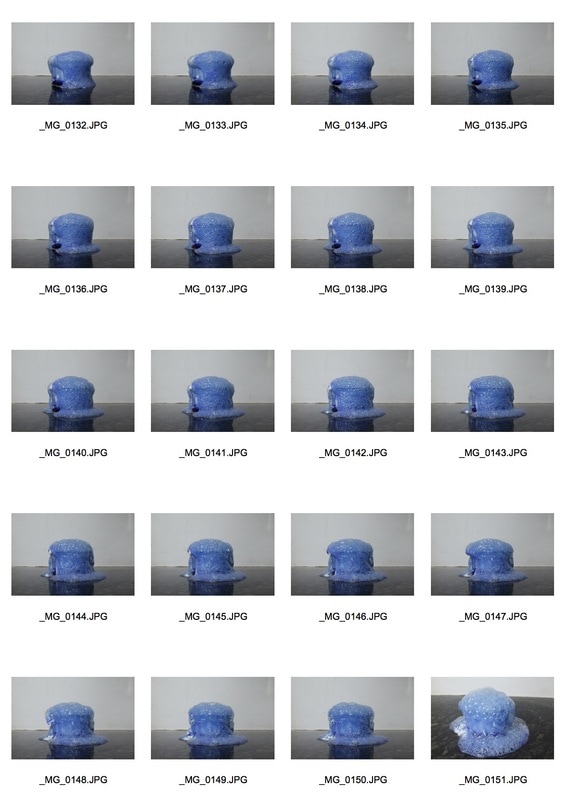
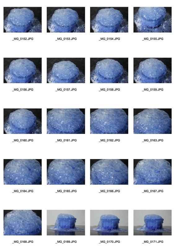
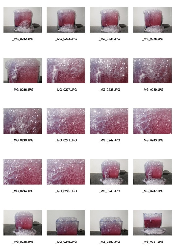
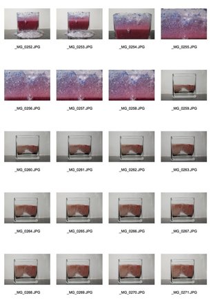
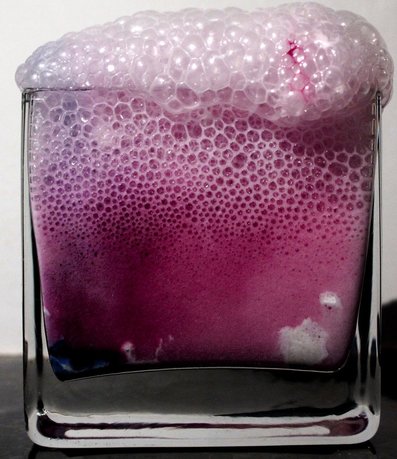
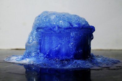
In this task I had to capture force being applied to something so I decided to fill up a balloon with water and photograph someone popping it with a needle. The first time I tried it at school I found it quite challenging to capture the exact moment it popped but I had to prioritise my shutter speed so that the image looked like a frozen moment. I tried this task again at home and I thought it could be quite interesting to add colour in the water as the water would be more visible and it also made it look quite exciting. I decided to photograph the images with a very plain background so there weren't many distractions in the background. I learnt this from trying it at school as I photographed them in the school car park and there were many objects in the background which made the balloon not the main focus. Some of my images look a bit dark which meant my ISO was too low, however some are brighter which shows that I turned my ISO to a higher setting so that the brightness changed. Furthermore, I don't really like how the arms show in all my images so I could have actually photoshopped them out.
3 Strands
Srand 1: Chemical reactions
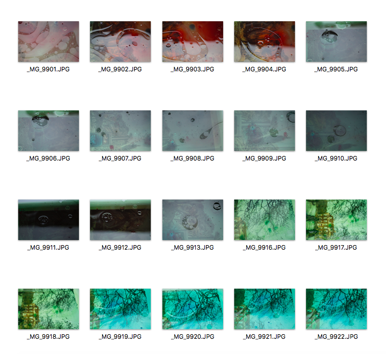
Alberto Severso
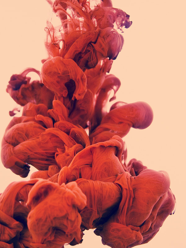
Alberto was born in Milan, Italy in 1976, but has spent most of his life on the island of Sardinia where he became interested in computer graphics and photography. In the early 2000s, the artist moved to Rome to start his career as a illustrator and graphic designer. Alberto has not attended art school and is a self-taught artist. The images were made by taking high-speed photographs of ink mixing with water, but unlike the previous times, the artist mixed two colors and titled his new series ‘a due Colori’. By using specific ink consistency and a dedicated pouring process Alberto creates these images. While often the end result is careful planned, a lot of the process was discovered by a chain of creative mistakes. It is pretty cool to see how Alberto celebrates those mistakes
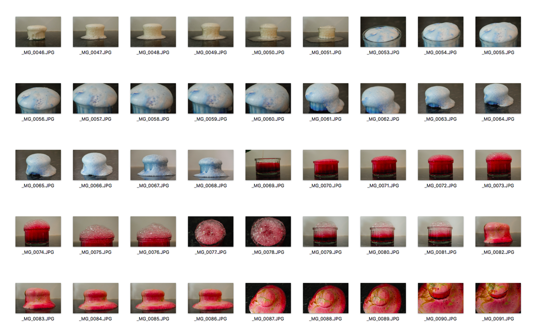
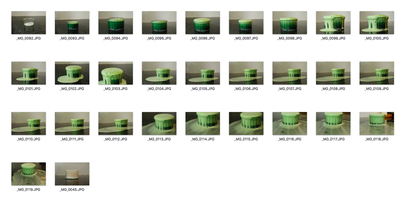
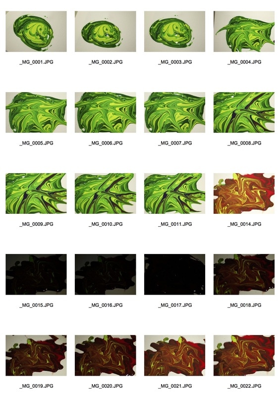
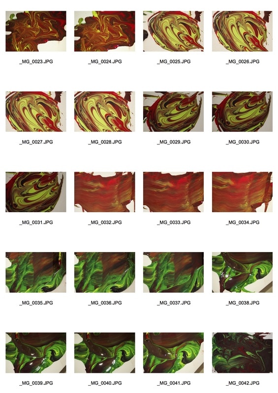
For this task, I didn't use the same technique as Alberto Seveso as I wanted to experiment and not do exactly the same thing as him. His photography inspired me to photograph chemical reactions happening. I decided to use baking powder, food colouring and vinegar. I set up my tripod and made sure that I was photographing with a plain background. I filled the small container with baking powder and added food colouring and then added vinegar which started to make it fizz. I took many photos during the process of the reaction. liked how I used ink to make the images more interesting and I also liked how I edited my best images to emphasise the different colours. However, most of my images were not in focus, so if I choose this strand I would probably focus on keeping my tripod very still. I've also decided that I am going to develop this strand by photographing close ups of the colours that are made during a chemical reaction.
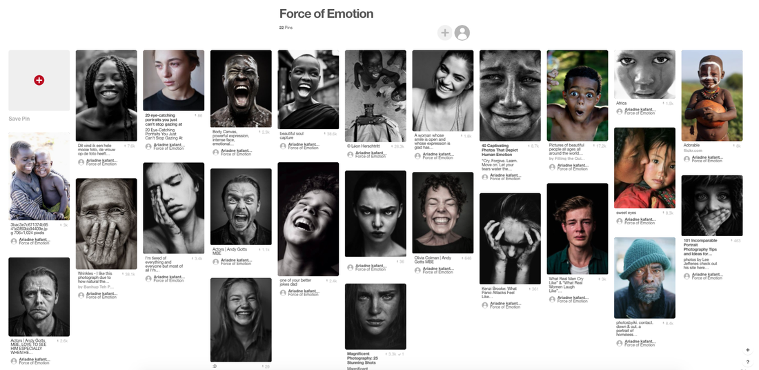
Strand 2: Force Of Emotion
Ideas
Steve McCurry
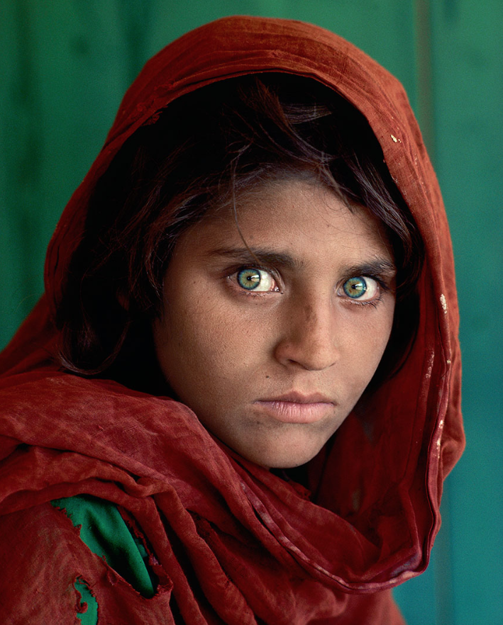
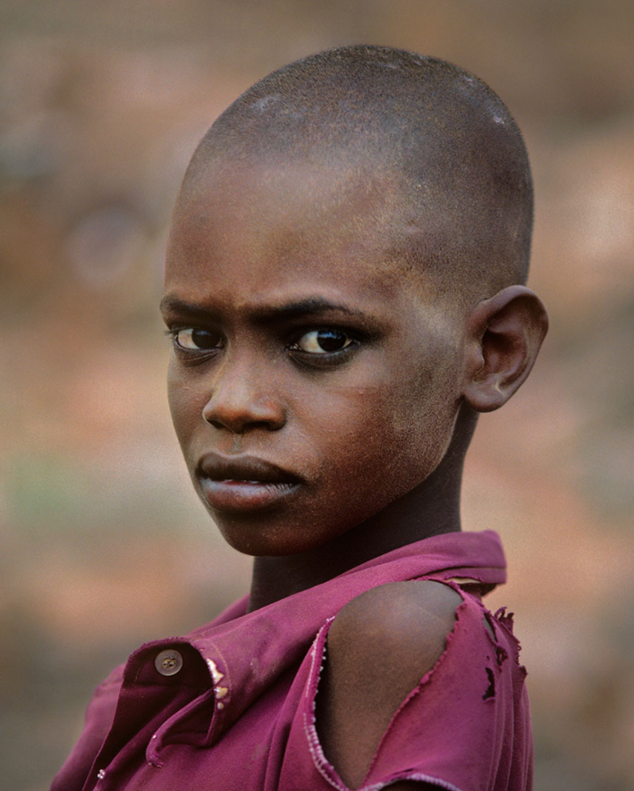
Steve McCurry has been one of the most iconic voices in contemporary photography for more than thirty years, with scores of magazine and book covers, over a dozen books, and countless exhibitions around the world to his name. McCurry, recognized universally as one of today's finest image-makers, is best known for his evocative color photography. In the finest documentary tradition, McCurry captures the essence of human struggle and joy.
"What is important to my work is the individual picture. I photograph stories on assignment, and of course they have to be put together coherently. But what matters most is that each picture stands on its own, with it's own place and feeling." - Steve McCurry
"What is important to my work is the individual picture. I photograph stories on assignment, and of course they have to be put together coherently. But what matters most is that each picture stands on its own, with it's own place and feeling." - Steve McCurry
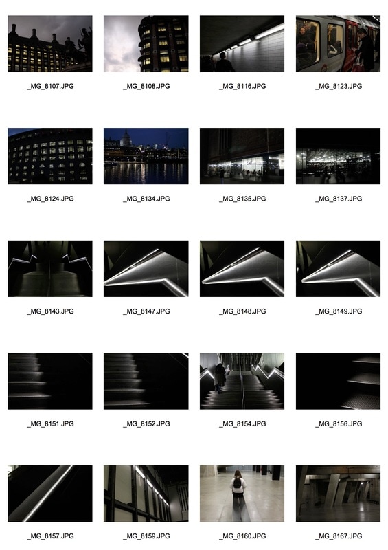
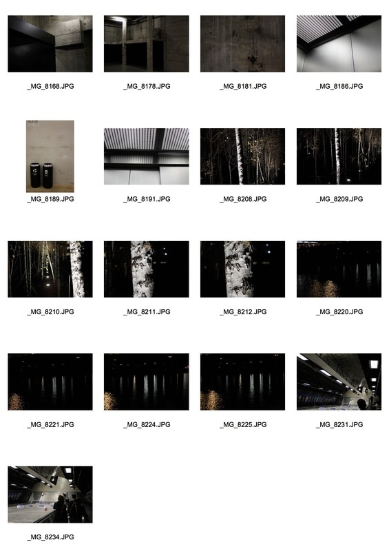
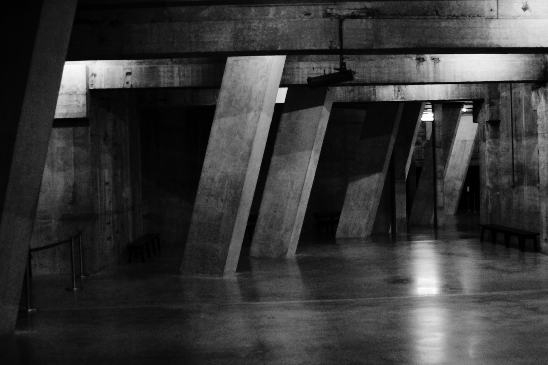
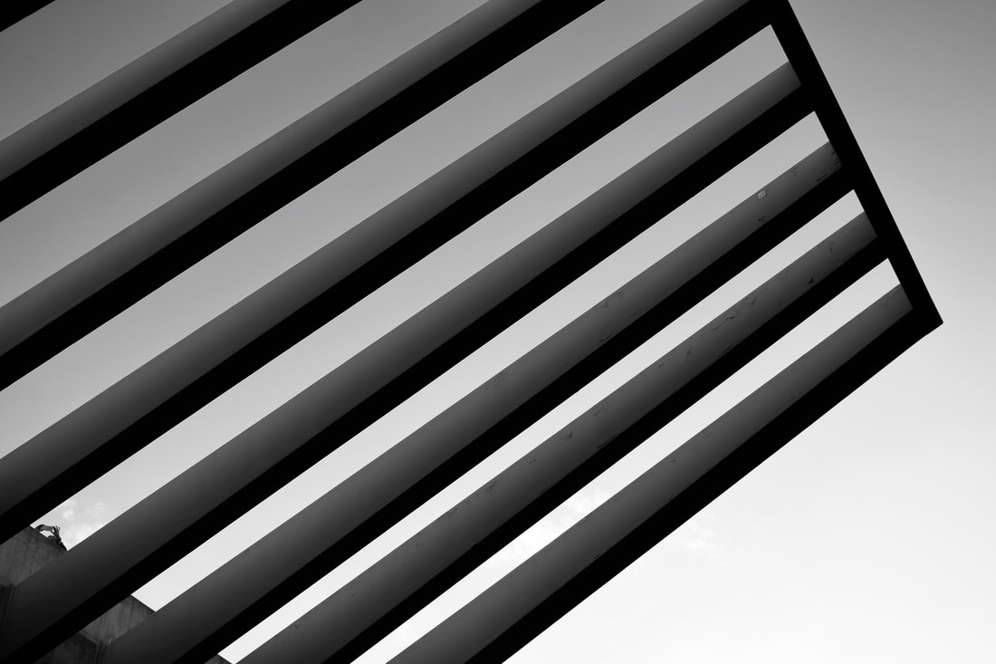
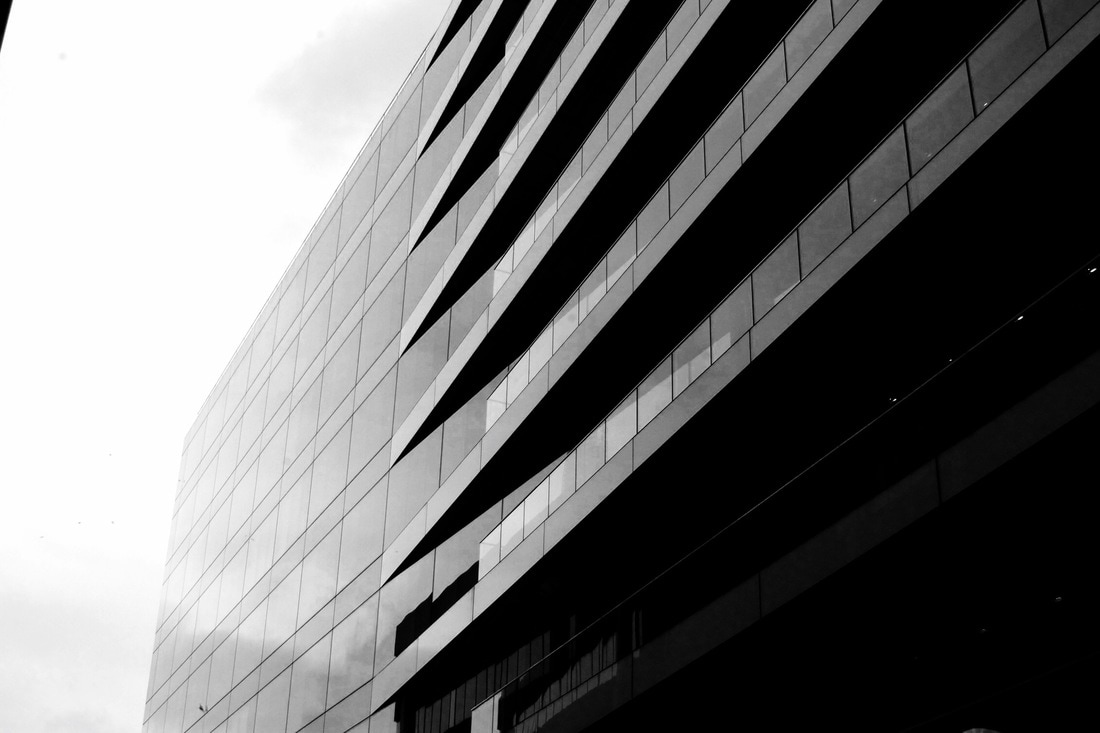
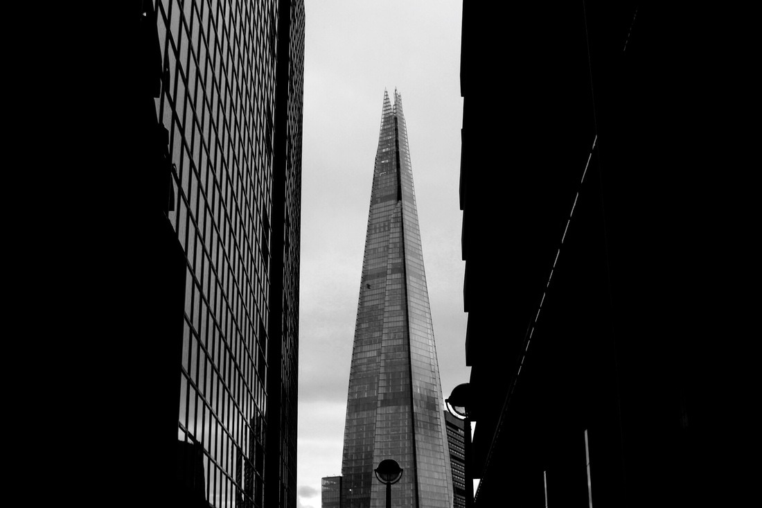
Strand 3: Force of Architecture
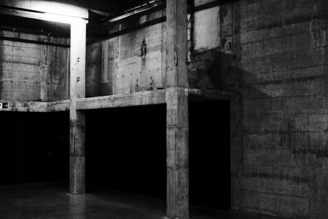
Simon Phipps
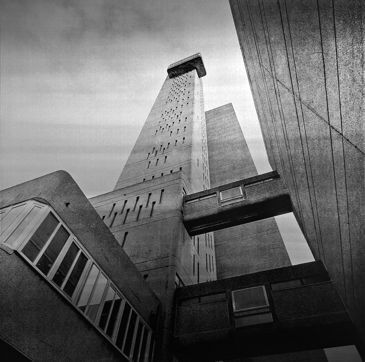
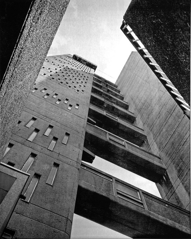
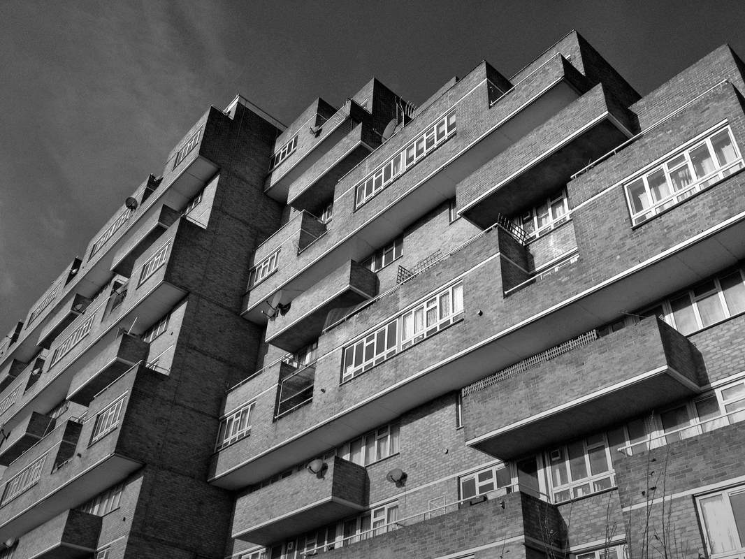
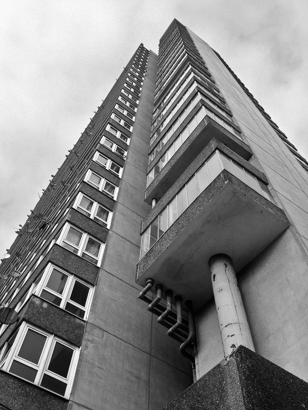
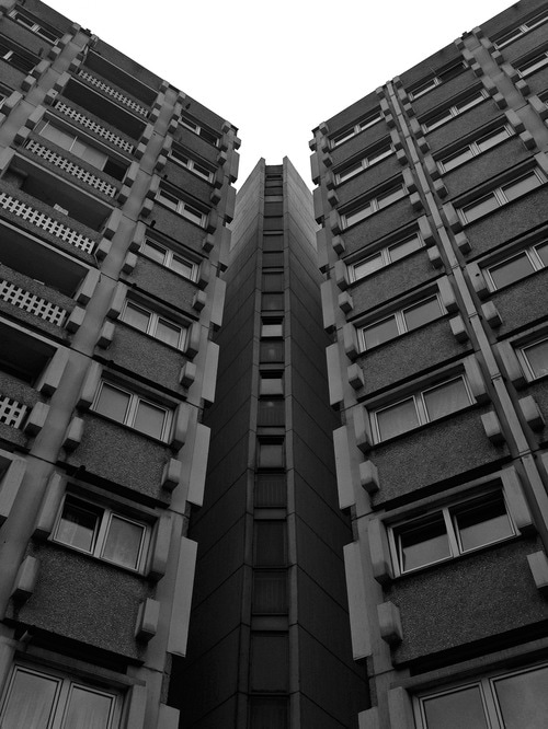
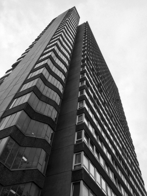
Simon Phipps is a fine art photographer operating in the UK and has captured a wide variety of subjects. Phipps has spent the last 15 years photographing and documenting Brutalist and buildings in the UK, creating a survey of photographic images that demonstrate the breadth of this contentious architectural style. Mr. Phipps also made clear that his concerns are to to document and present post 1945 modernist British architecture that (loosely) fits into the idea of the social contract, that the state would provide housing and municipal buildings for the people. This is one part of what makes Brutalism so unique. Its creation had many goals, but arguably the most important one was municipality and the idea that these were functional, government buildings that served a very specific purpose and their design was meant to reflect that.
My Response
|
|
|
|
Chosen Strand
For my chosen strand, I will further develop my first strand : Chemical Reactions. I like this idea the most because it is very interesting to photograph the different colours and patterns that chemical reactions can make. I am going to develop it further by photographing very close up different patterns that are produced. I am going to try and mix different paint colours and see what pattern it makes. I will probably photograph outside so that there is natural light.
|
|
|
|
My images express my intentions which were to photograph close ups of the different kinds of patterns made from the paint.
I like the different patterns the paints made and I also like how I photographed them really close up, however, I had a few problems taking pictures because the camera was very close to the paint and it was not focusing. If I zoomed in, the image would be quite blurry so the next time I do it, I will use a tripod. Also, a few of my images are dark which means I wasn't using the correct ISO. In addition, next time I am going to make sure I know exactly where I am photographing because I moved around a lot and used different locations to photograph my images. I am going to try and photograph more images similar to this with a tripod and not mix too many dark colours together because it makes it look quite dull and boring.
I like the different patterns the paints made and I also like how I photographed them really close up, however, I had a few problems taking pictures because the camera was very close to the paint and it was not focusing. If I zoomed in, the image would be quite blurry so the next time I do it, I will use a tripod. Also, a few of my images are dark which means I wasn't using the correct ISO. In addition, next time I am going to make sure I know exactly where I am photographing because I moved around a lot and used different locations to photograph my images. I am going to try and photograph more images similar to this with a tripod and not mix too many dark colours together because it makes it look quite dull and boring.
New set of photographs
|
|
|
|
|
|
|
|
|
I decided not to carry on with the paint photographs because I found it quite hard to photograph the patterns really close up, also, I thought the idea was quite boring and I didn't think I could develop it in an interesting way.
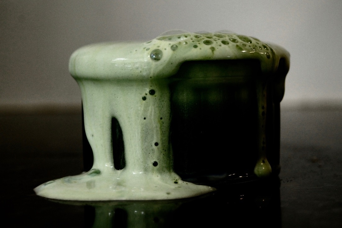
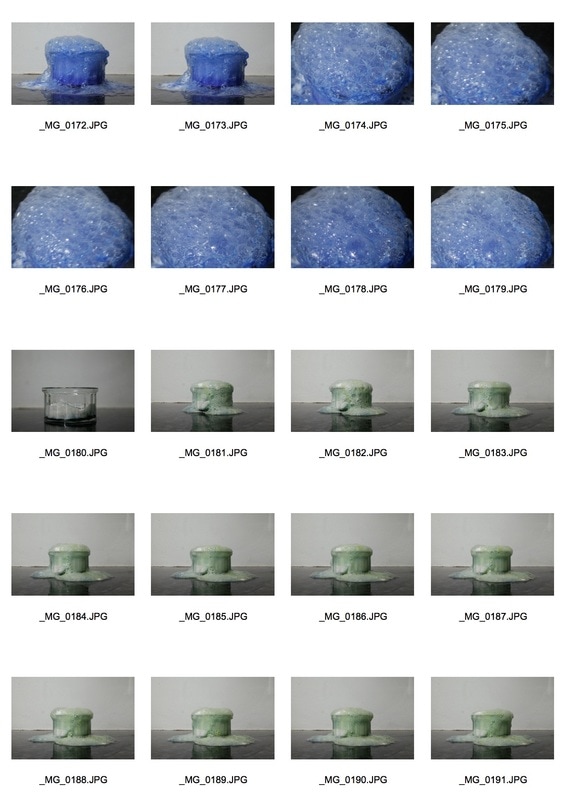
The subject I chose to photograph suited the theme as it shows the force of chemicals reacting together. So, I chose to go back to the chemical reactions and experiment more with it and try new reactions. I used baking powder, vinegar and food colouring which I thought looked really effective. I managed to keep the lighting the same the whole way through. When I first started to take the pictures the background was really yellow but then I decided to place a table lamp above the camera to make the lighting just right. The images I took of the bubbles up close are a bit blurry which meant I could have used a tripod when photographing up close.
The subject I chose to photograph suited the theme as it shows the force of chemicals reacting together. So, I chose to go back to the chemical reactions and experiment more with it and try new reactions. I used baking powder, vinegar and food colouring which I thought looked really effective. I managed to keep the lighting the same the whole way through. When I first started to take the pictures the background was really yellow but then I decided to place a table lamp above the camera to make the lighting just right. The images I took of the bubbles up close are a bit blurry which meant I could have used a tripod when photographing up close.
Favourite images edited
|
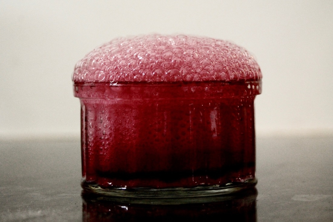
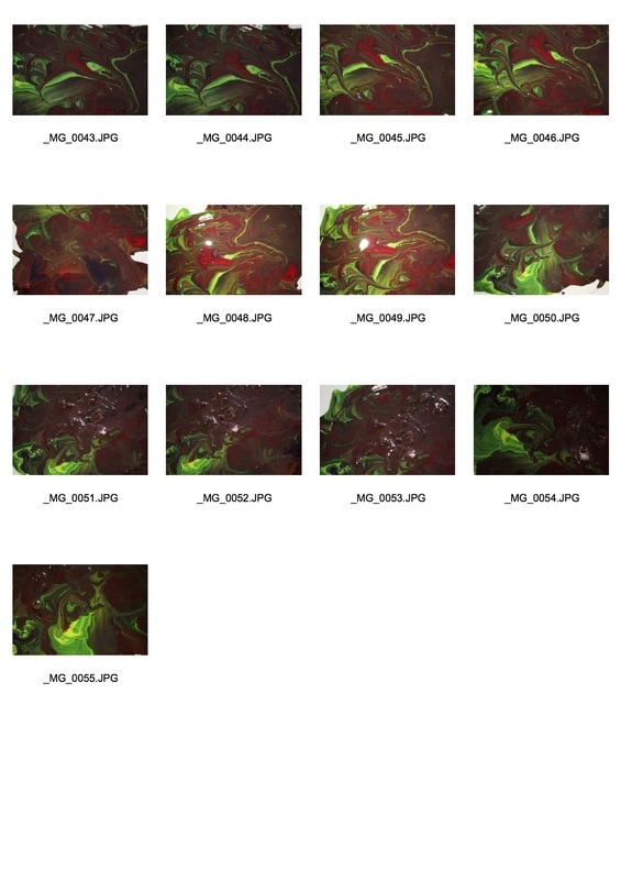
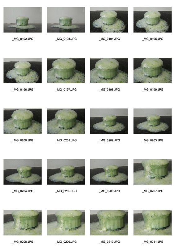
The subject I chose to photograph suited the theme of force as the baking powder causes the bubbling effect in the vinegar. I prioritised aperture to manipulate depth of field and I also used a tripod to avoid camera shake. These were my favourite 5 images which I edited on photoshop and was going to use all of them as part of my final piece but I then realised when the image with the green food colouring was quite unfocused and not the best quality.
I really like my up close images of the bubbles because it emphasises the scale of the effect and focuses on the small details that would usually be glazed over.
|
|
|
|
|
I used the clone tool to edit out the white baking powder that is at the bottom of the glass vase. I didn't think the baking powder was necessary so i decided to edit it out to make the picture look more pure and polished.
GIF
I decided to create a GIF as my final piece because I think a GIF is much more visual and engaging. I had to open each picture on photoshop and edit each image the exact same way eg. the brightness, contrast, levels and exposure. My images look much more clearer and have more colour to them.
Final Piece
Further Development
Exhibition Visit: Roy Colmer
London-born artist Roy Colmer (1935–2014) was a painter, photographer, graphic designer and film artist. Through the use of painting, film, photography and collage, inspired by the introduction of new, electronic media that dominated the artistic landscape of the 1970s, Colmer challenged the disciplinary boundaries in which he worked. His incorporation of time-based technologies with paint and canvas – which other artists at the time found too conventional – mark Colmer as a true innovator in his field. Colmer’s signature approach, characterised by his use of a spray gun, brought about a different language of painting, allowing him to create filmic effects that evoke the sensation of vibration, movement and distortion. He was interested in the immediacy and versatility of the spray gesture and the ability to manipulate space and depth through colour and form. Similar to the early TV sets flickering to life, the paintings on display as part of the exhibition display an optical haze of colour built around horizontal stripes. These works particularly demonstrate Colmer’s ongoing experimentation with technique and style, progressing to include multi-forms and waves created against a background of shifting colours. Lines bend and spiral taking on an almost figurative quality.
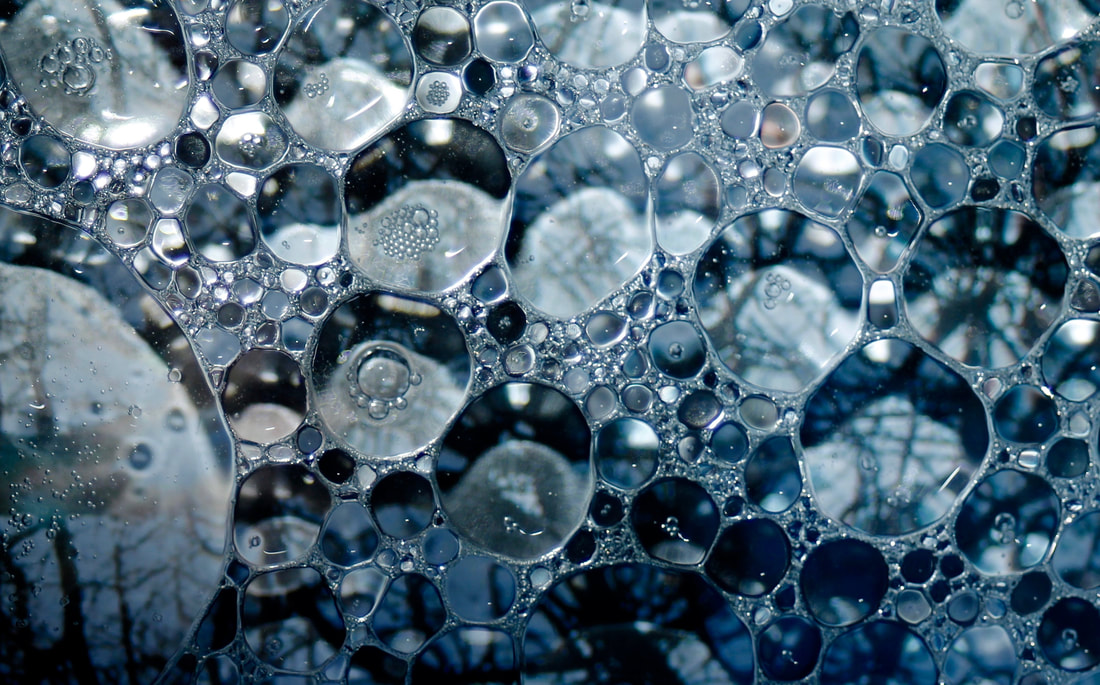
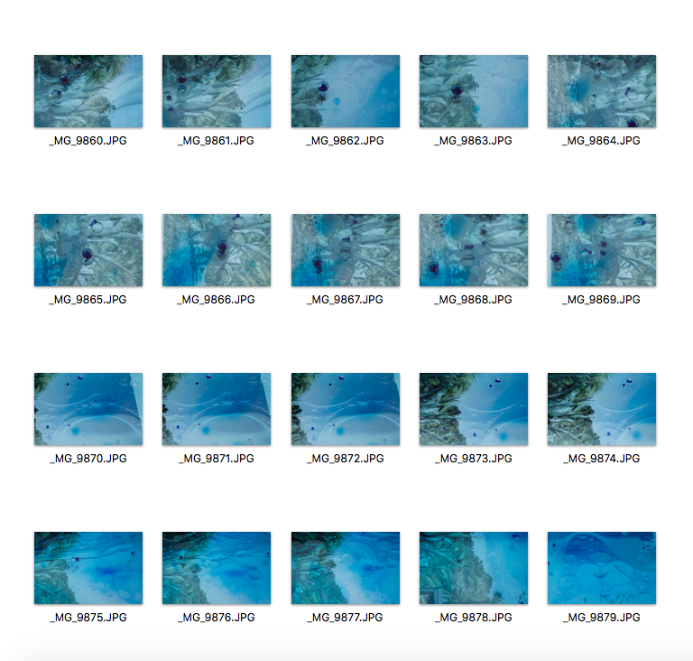
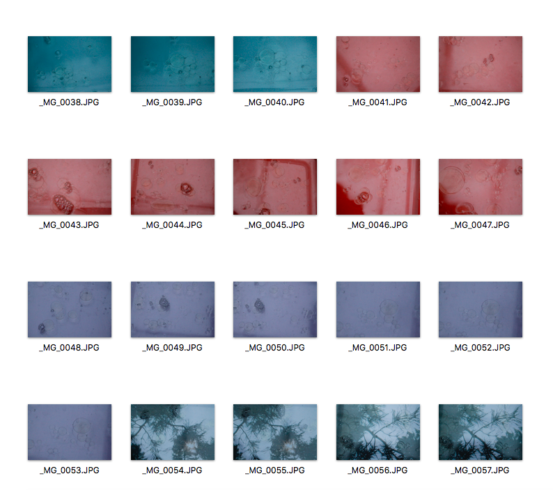
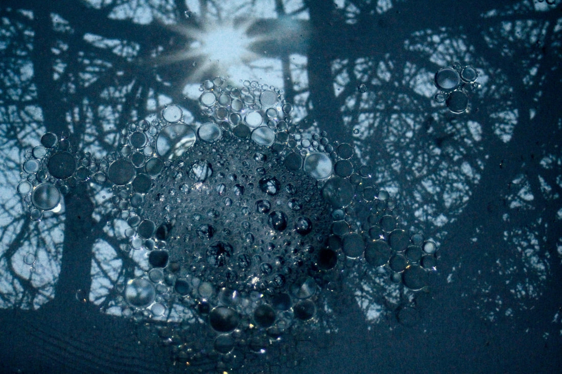
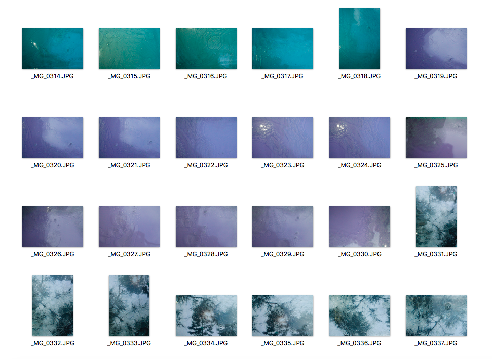
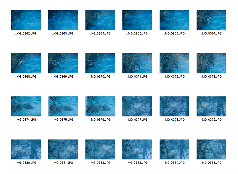
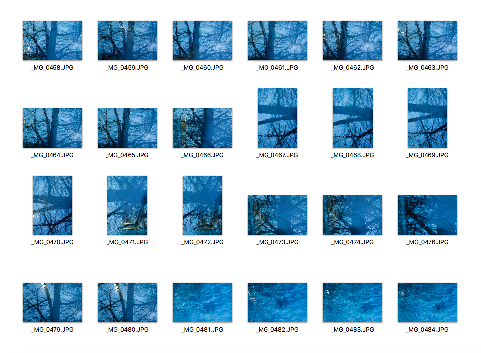
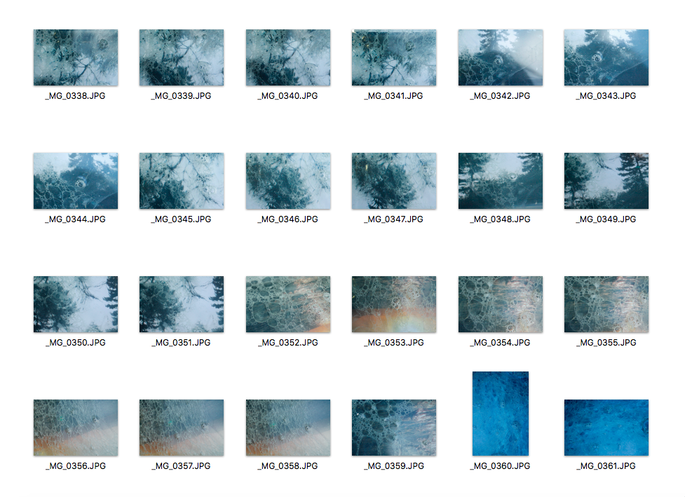
Stephen Gill
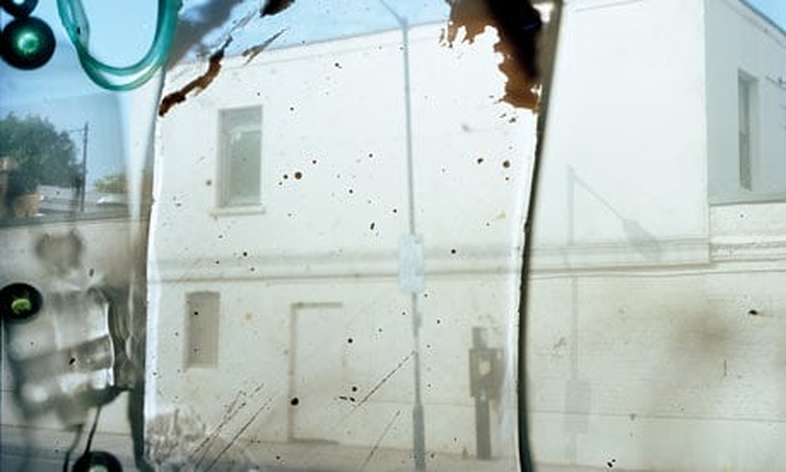
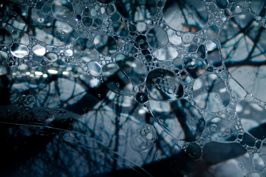
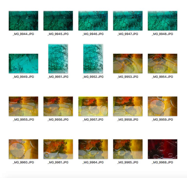
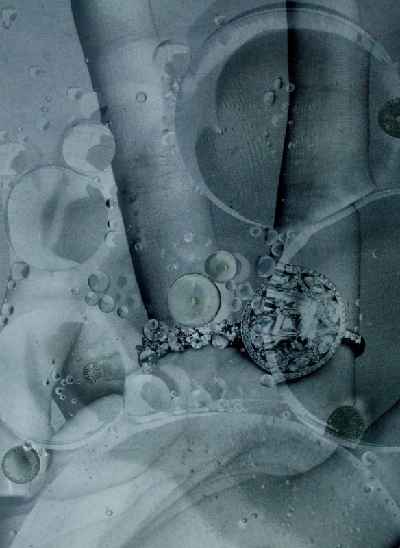
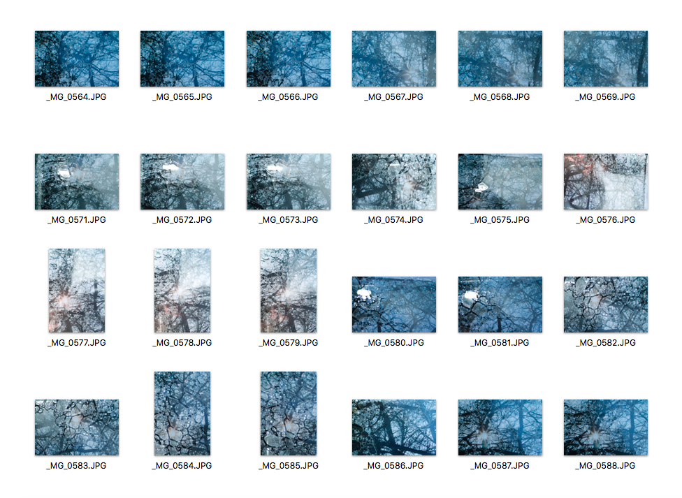
Stephen Gill became interested in photography in his early childhood, thanks to his father and interest in insects and initial obsession with collecting bits of pond life to inspect under his microscope. He started collecting little bits of stuff from actual places, and then putting them inside the camera. Bits of plant life, seeds, or glass: he dropped them in just before loading the film. He even used insects. These objects then sit on the film emulsion when taking the picture. It's a way of encompassing the actual essence of a place in an image, the visual noise and chaos. He thought about photographing these tiny objects directly, but he didn't have a macro lens. He had no idea where the objects would fall. The background picture of this image is a random street in Hackney. The green blobs down the left-hand side are a tiny bit of silica gel he found in the gutter; the cloudy things on the top left are tiny bits of glass. He developed it completely straight, with no computer enhancement. Each frame is from exactly what's sitting on the negative. Gill describes how Hackney is a place that attracts obsessives. It's something to do with its contradictions: you can be in a beautiful spot with canals and meadows, and then the flipside is chaos and dirt. That's what he is trying to grapple with. Photography is good at turning things inside out, and this is the opposite: bringing the outside in. As much as he loves photography, part of him believes that he is rebelling against it.
My Response
|
|
|

|
|

|
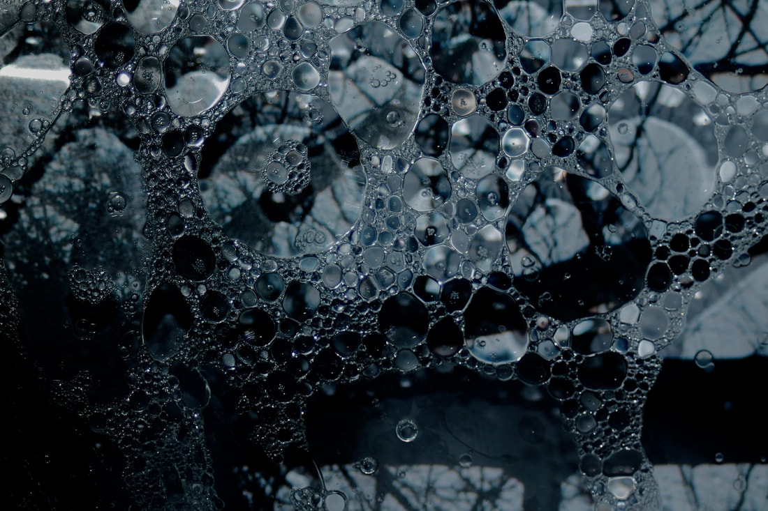
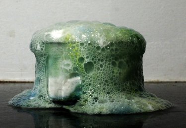
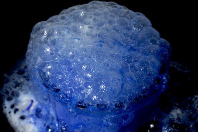
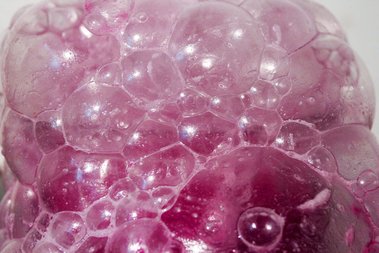
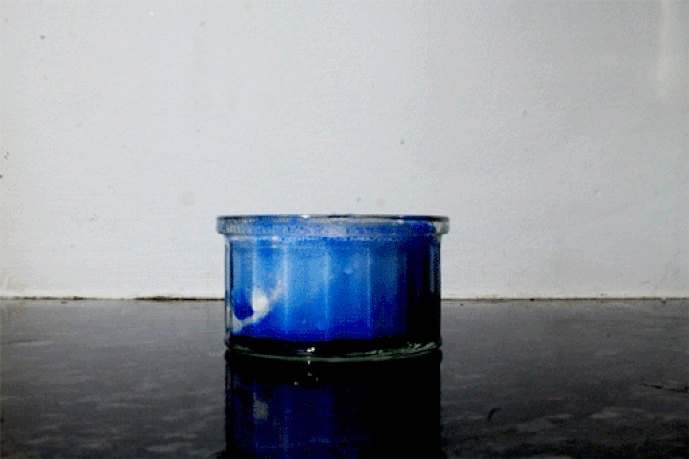
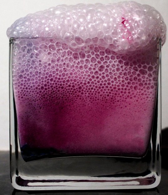
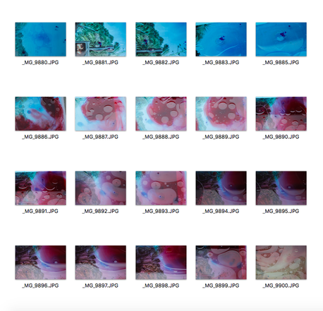
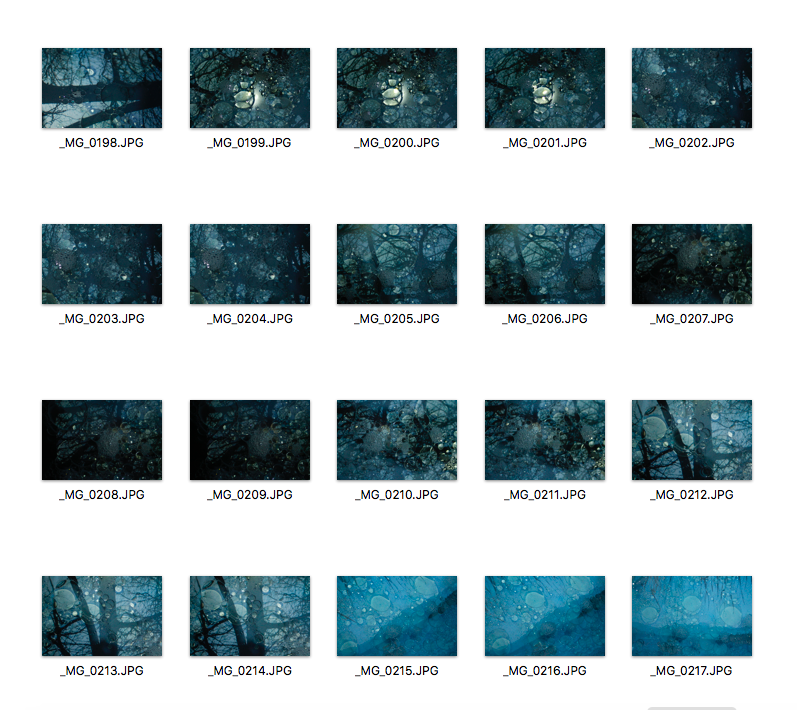
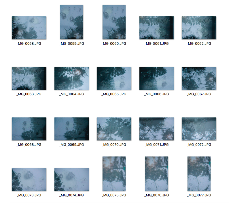
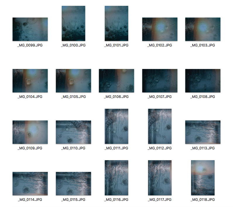
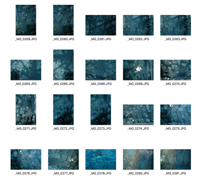
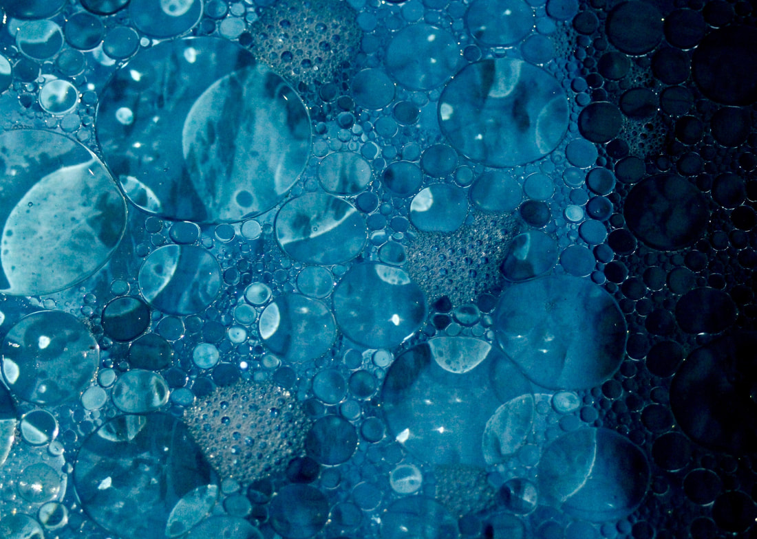
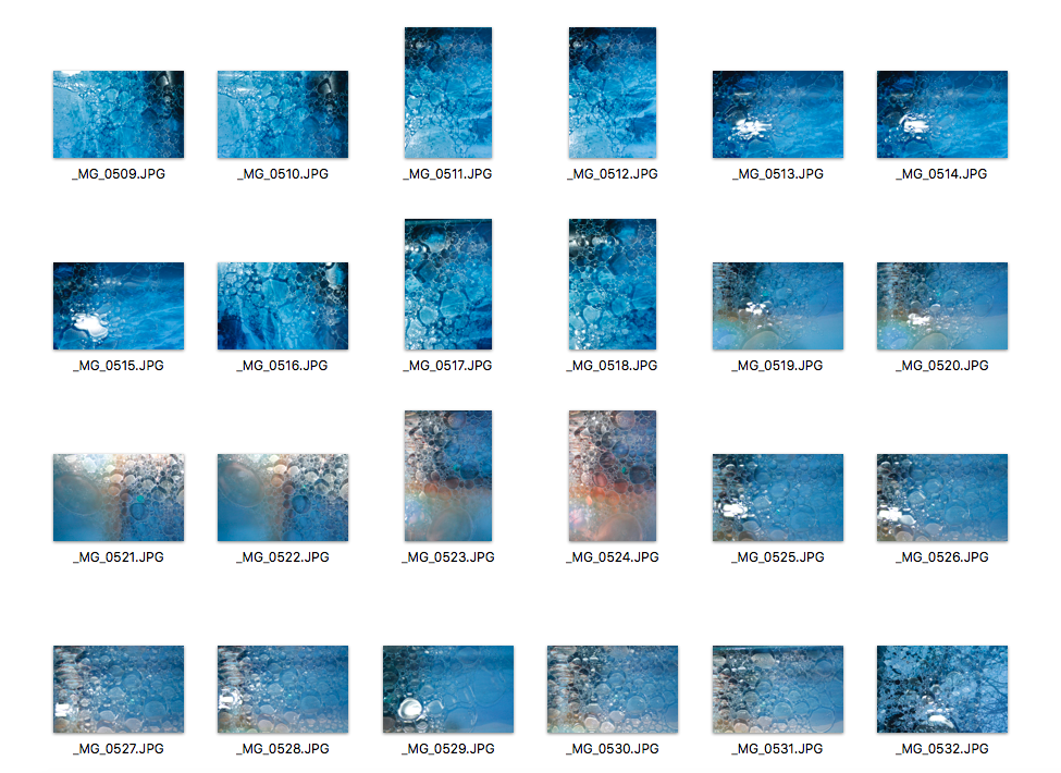
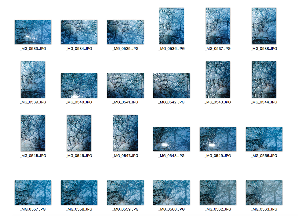
This is my first response to Stephen Gill's photo and I really like how they turned out. Even though I got inspiration from Stephen Gill, I used a different technique to him. I used olive oil, water, food colouring, a clear container and magazines. I first filled the clear container with water. I chose a casserole dish first because it was shallow and then realised it was not the best choice because it had writing stamped into the glass. I had to keep moving my bubbles over to the side because you could see the writing. So I chose to pick a container with no writing instead. I then set the container on a set of books to raise it above the ground. I added pictures from magazines underneath to give a cool background. I didn't use a tripod as I just stood directly above it. I then added oil and let it settle and I had to stir it up to separate the bubbles. I first stirred it really hard, but then noticed that it just made a bunch of tiny bubbles, so I stirred it gently and then bubbles separated and as they collided they formed larger bubbles. I really like how the images turned out as the magazine images look like real places that I went to. Also, the bubbles are in focus so you can really see all the details in the bubbles. My ISO setting was clearly on the right number and so was my shutter speed. To develop this idea even further, I am going to try it again but instead of using images from magazines, I am going to print some of my own images and maybe focus much more on the bubbles rather than the background. Also, I am going to add a little bit of washing up liquid which makes the bubbles look more 3D and makes them much more visible in the images.
Favourite Images Edited
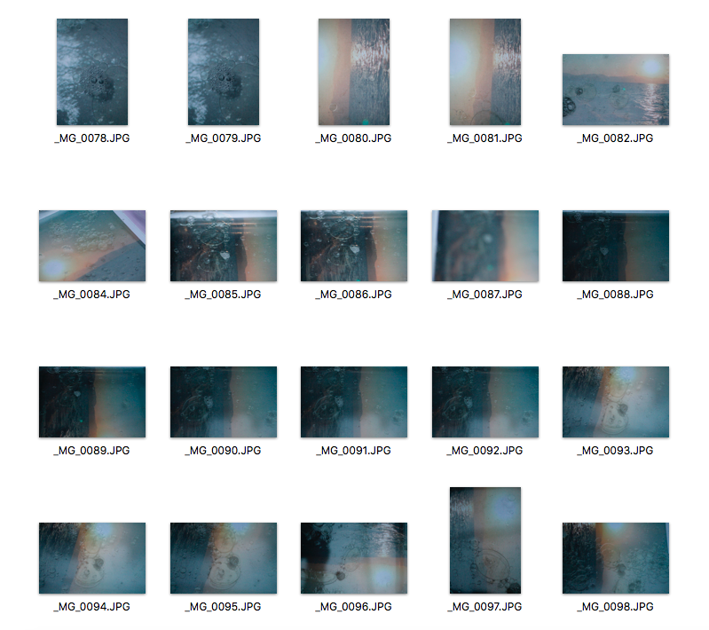
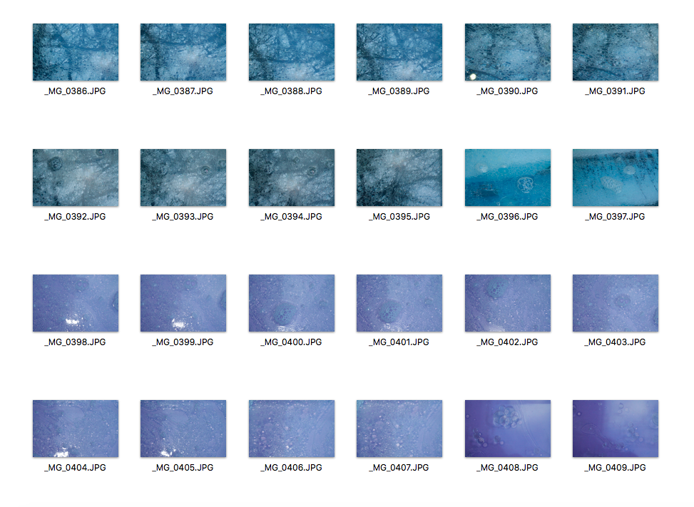
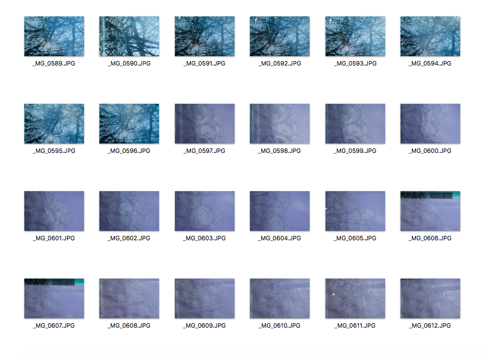
Second Response Using My Own Images
|
|
Favourite Images Edited
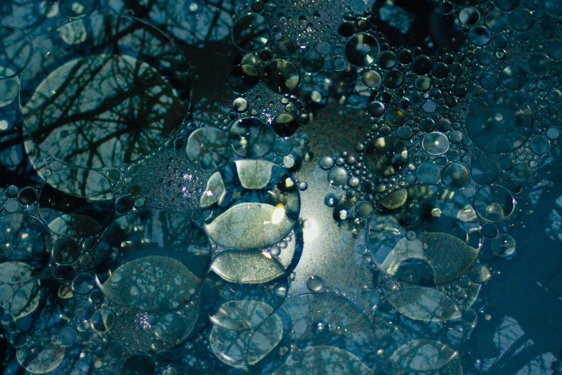
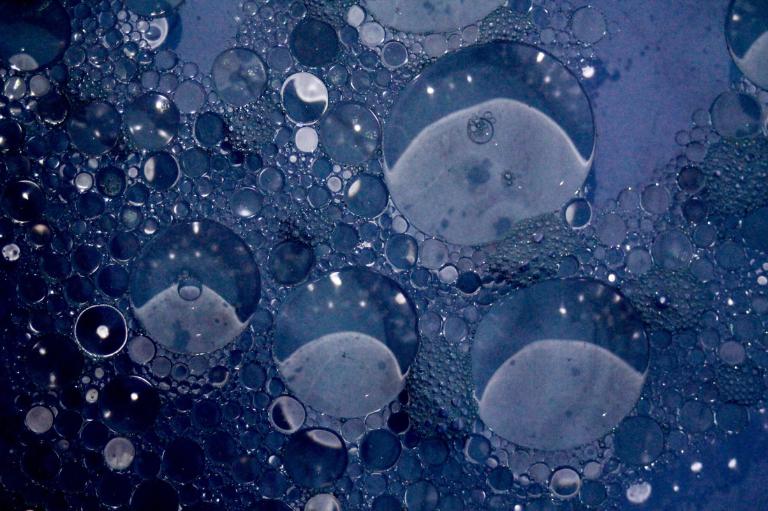
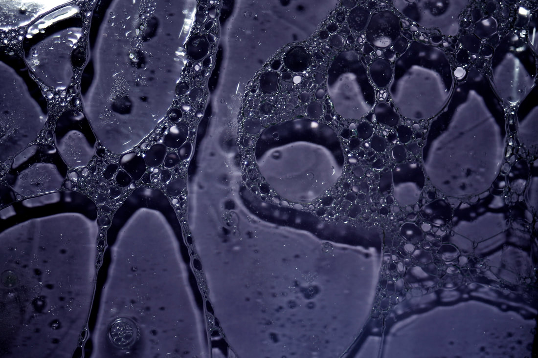
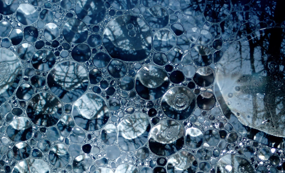
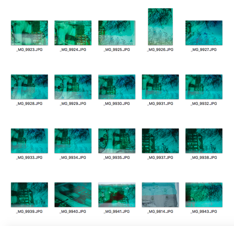
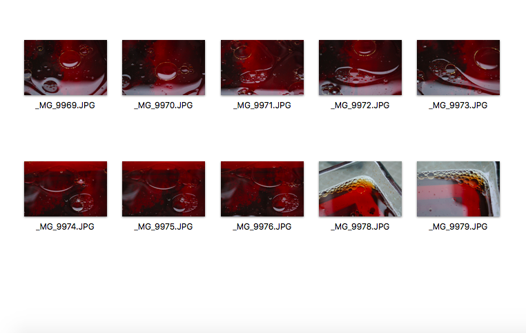
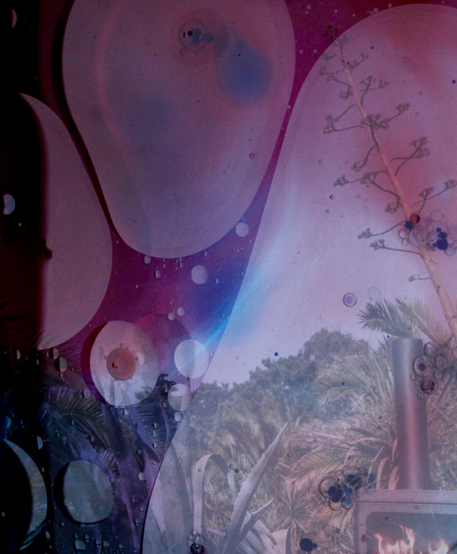
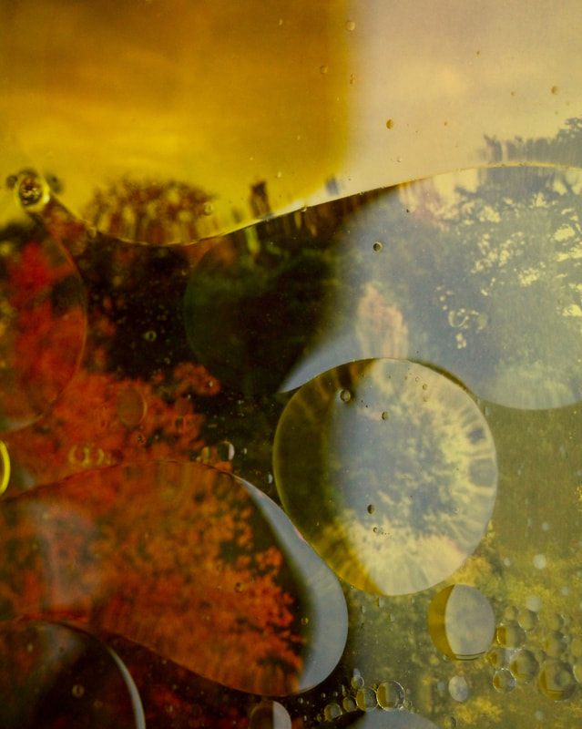
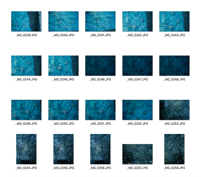
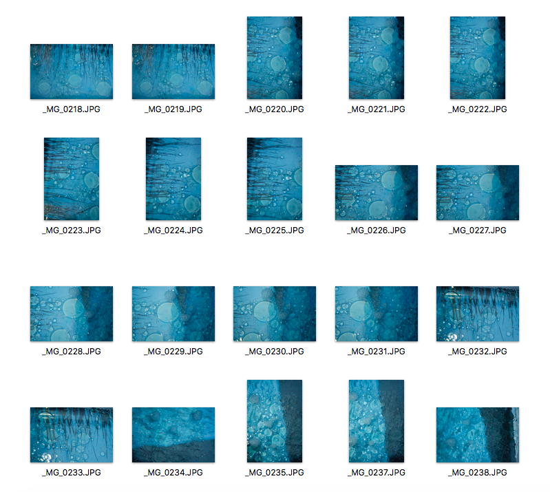
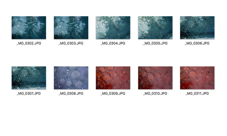
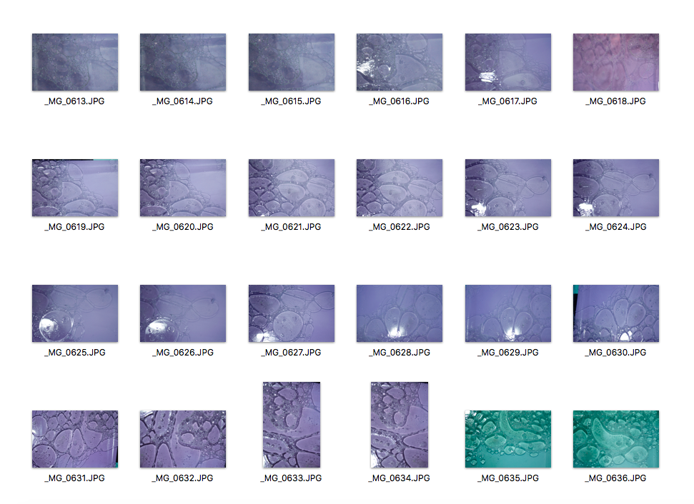
This is my second response and I actually used a different technique to the one I used previously to get the best possible outcome. I set up the clear container in natural light and I printed out my 6 images that I used as the background of the bubbles. I also had a few plain coloured A4 paper which I also used as the background. I filled the container with water and added a little bit of washing up liquid which made the bubbles more defined. I then added oil and mixed the container around. I didn't use food colouring this time as this would mean that I would have to keep on changing the water in the container. When I first started taking pictures I realised that the bubbles were quite dark as there was no colour in them. So to overcome this problem, I used a flashlight directly above the bubbles which made them look 3D and the reflections made it look like there were many more bubbles than there actually was. I think some of my images are not very well exposed and also, I zoomed in a lot for each one so some were not clear, so next time I will use a tripod above the bubbles to avoid camera shake. However, I am really pleased with my second response as the pictures are much more developed and I clearly improved my technique from the last time.
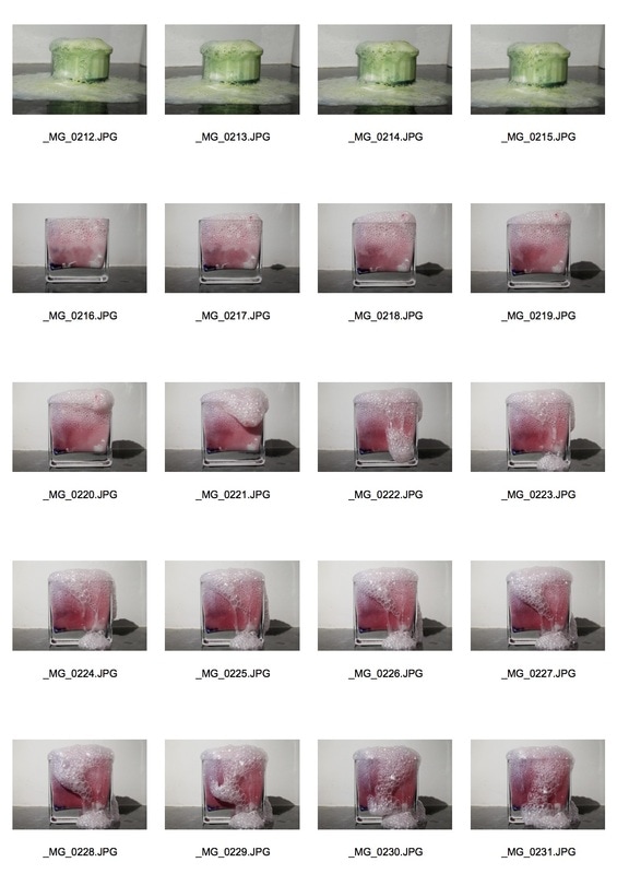
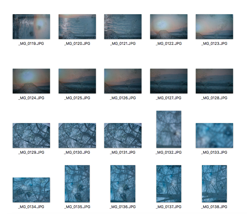
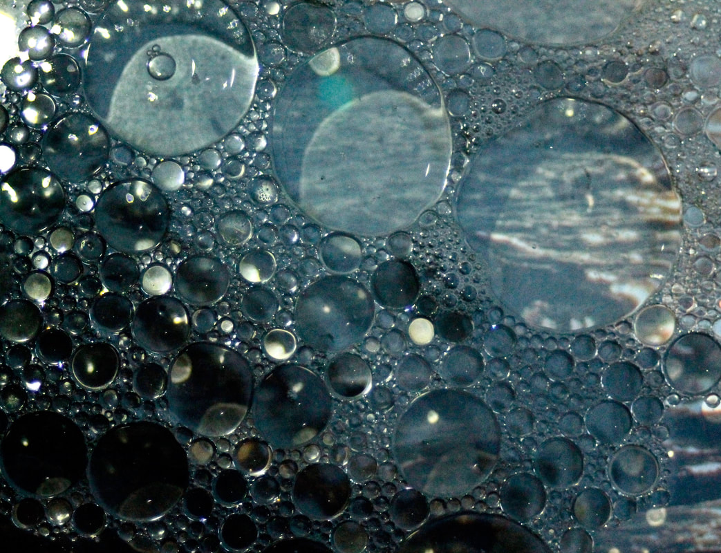
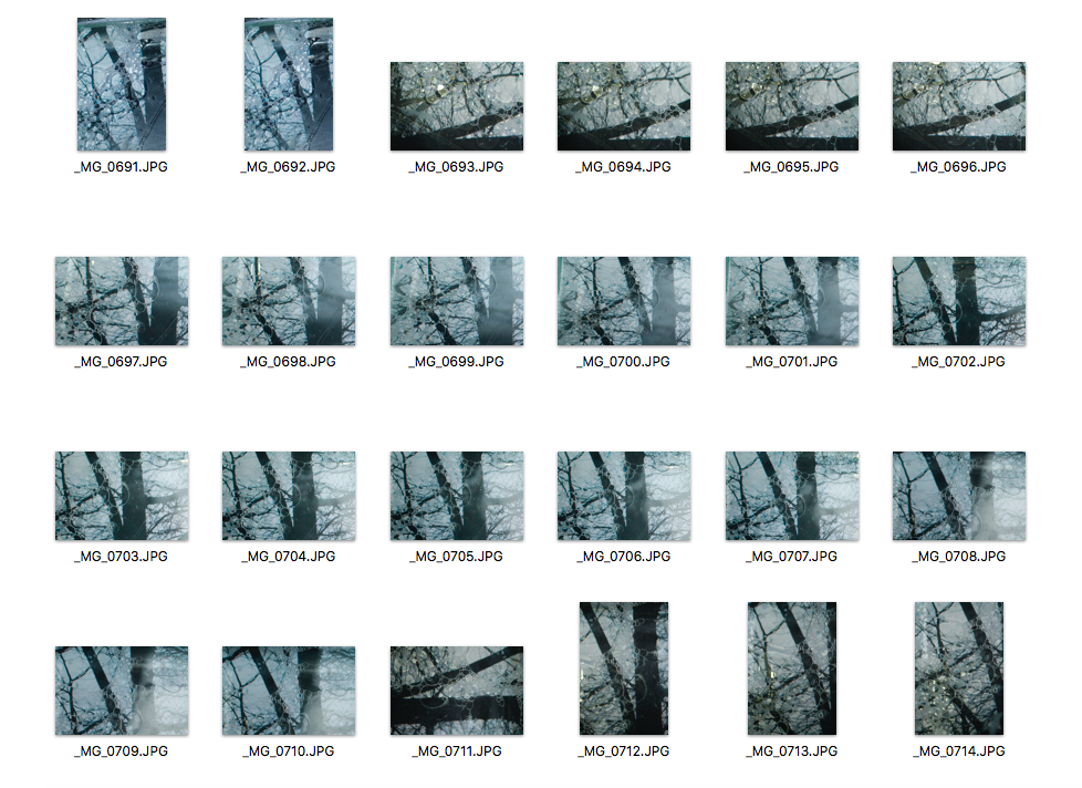
Third Response
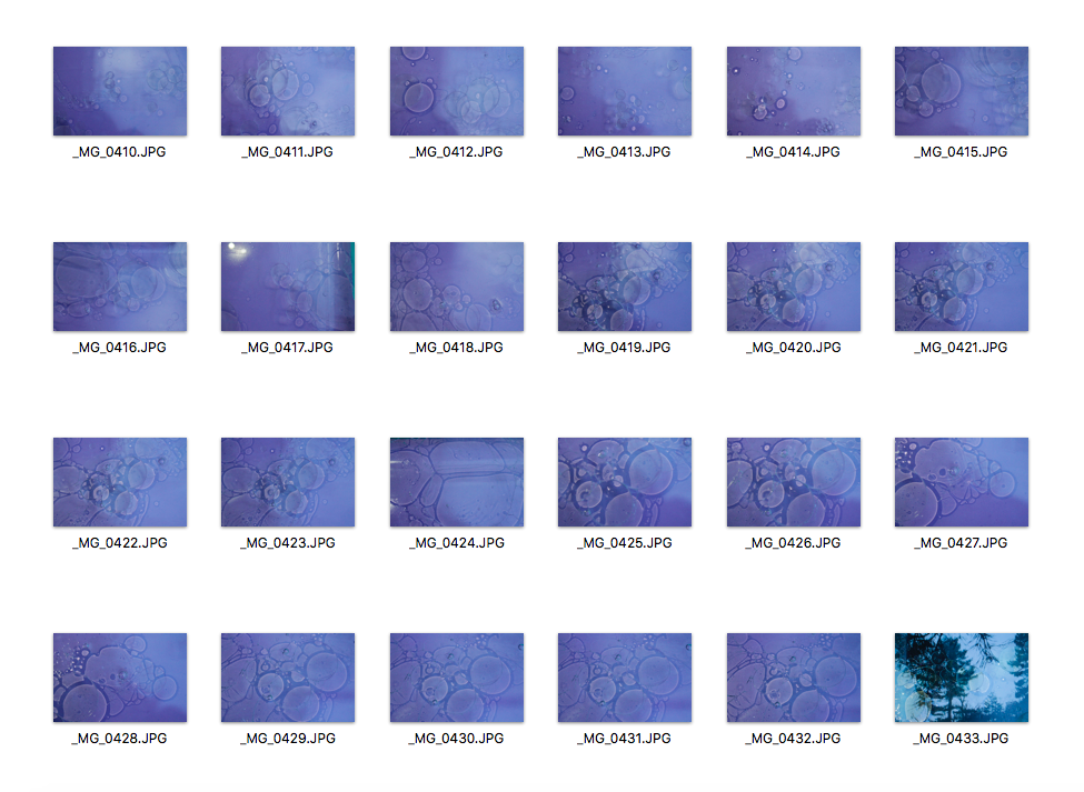
|
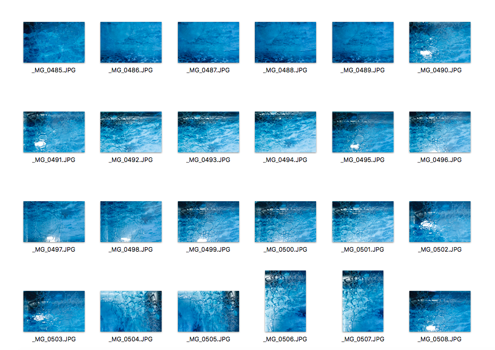

|
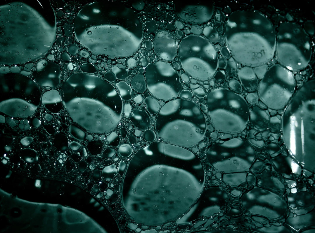
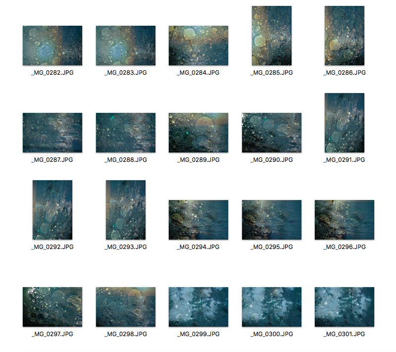
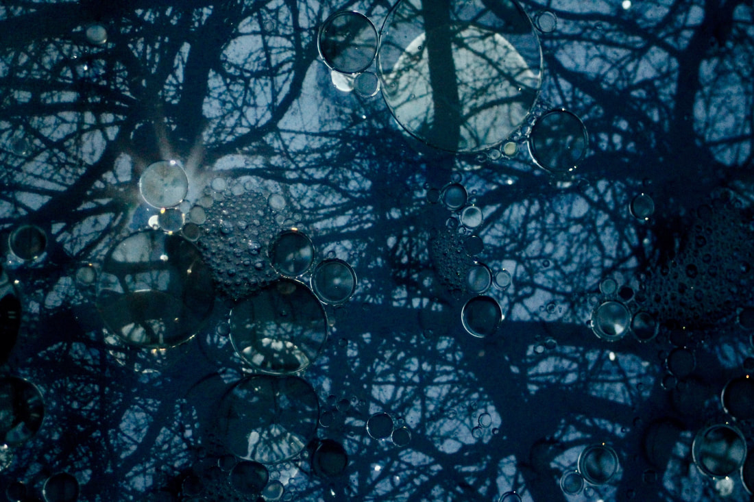
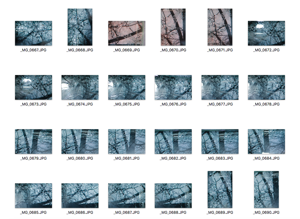
This is my last response and I think I have really developed my ideas compared to when I first started photographing oil in water. I used the same background images as before and I used oil and water again. However, this time I used flash on some of my images as it made the bubbles look much more clear. I managed my exposure very well. My ISO was set on 400 and I prioritised my shutter speed to freeze the moment the bubbles were moving around. I also prioritised aperture to manipulate depth of field.